A brand with personality. A platform with one too.
Senior Experience Designer on Dogfish Head’s Sitecore XM Cloud migration. One site for a brewery, distillery, restaurant, brewpub, inn, events, and merch, without losing what makes them them.
live site → dogfish.com
challenge
Dogfish Head’s brand is warm, weird, and specific. The old site was polished but generic.
The harder problem: this isn’t just a beer brand. One site has to carry brewery, distillery, restaurant, brewpub, inn, events, and merch, and serve as a foundation for other Boston Beer Company brands.
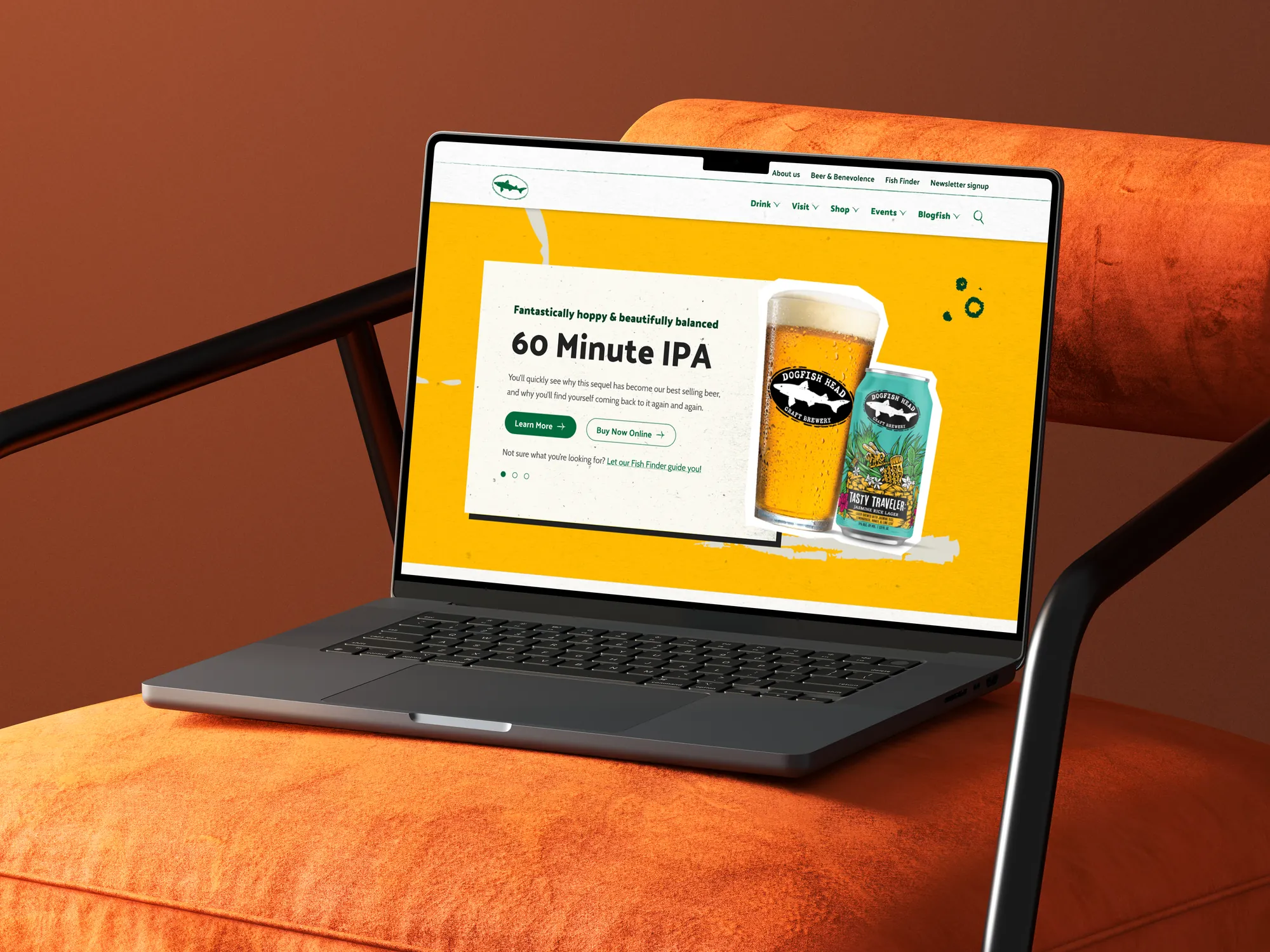
the brand at home: 60 Minute IPA on the new dogfish.com
mobile redesign
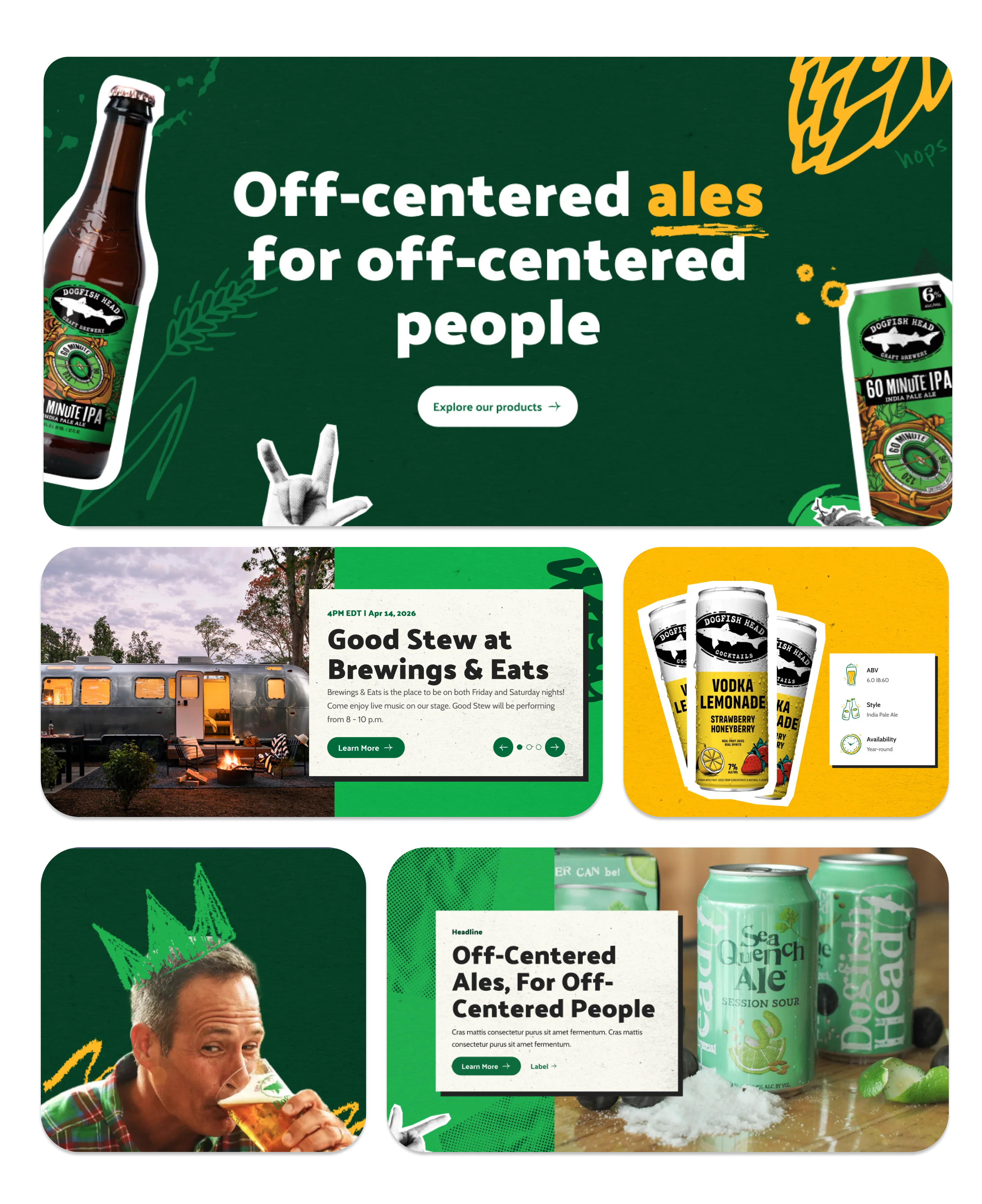
The brand's warmth and specificity had to hold at every screen size: brewery, spirits, hospitality, and storytelling surfaces all in one responsive system.
strategic foundation
Boston Beer commissioned third-party qualitative research with younger craft beer drinkers before our engagement started. Findings shaped the brief: Dogfish Head was at an inflection point with declining craft consumption among LDA drinkers in their 20s.
The Focus Session named the operating principle, quoting DFH co-founder Sam Calagione: “Marketing is less about what your product is or does than what it stands for.” That became the IA rule: Why beats How beats What. Stories first. Products second. Transactions third.
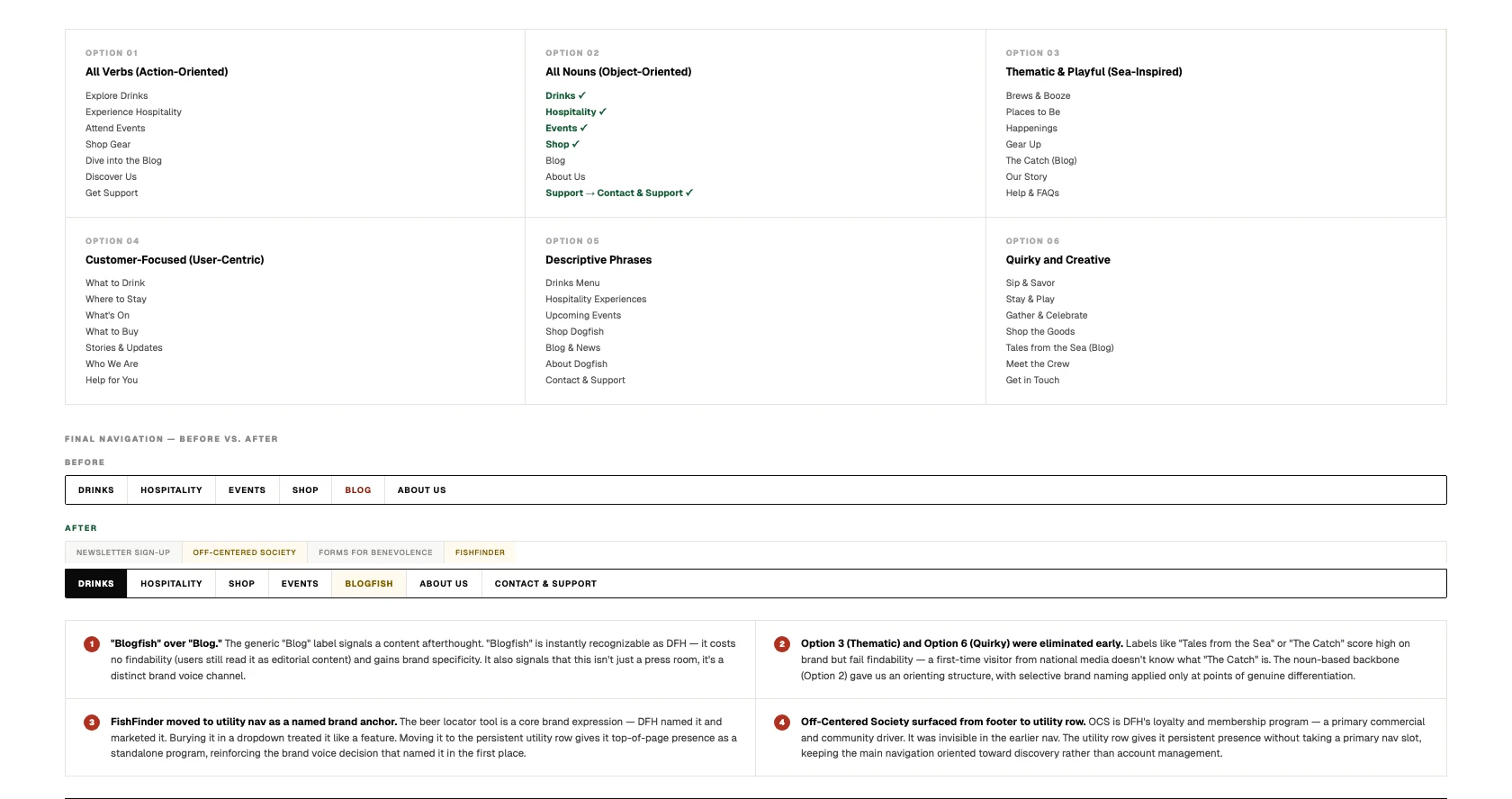
Naming the Navigation: Six Frameworks, One Decision
Navigation naming is IA strategy made visible. Dogfish Head is warm, weird, and specific. Generic labels like “Blog” read as borrowed from a different site. Six distinct naming frameworks were evaluated against two criteria: findability (can a first-time visitor get oriented?) and brand fidelity (does it sound like Dogfish Head?). The winning approach was mostly noun-based with selective brand voice applied where it added meaning rather than confusion.
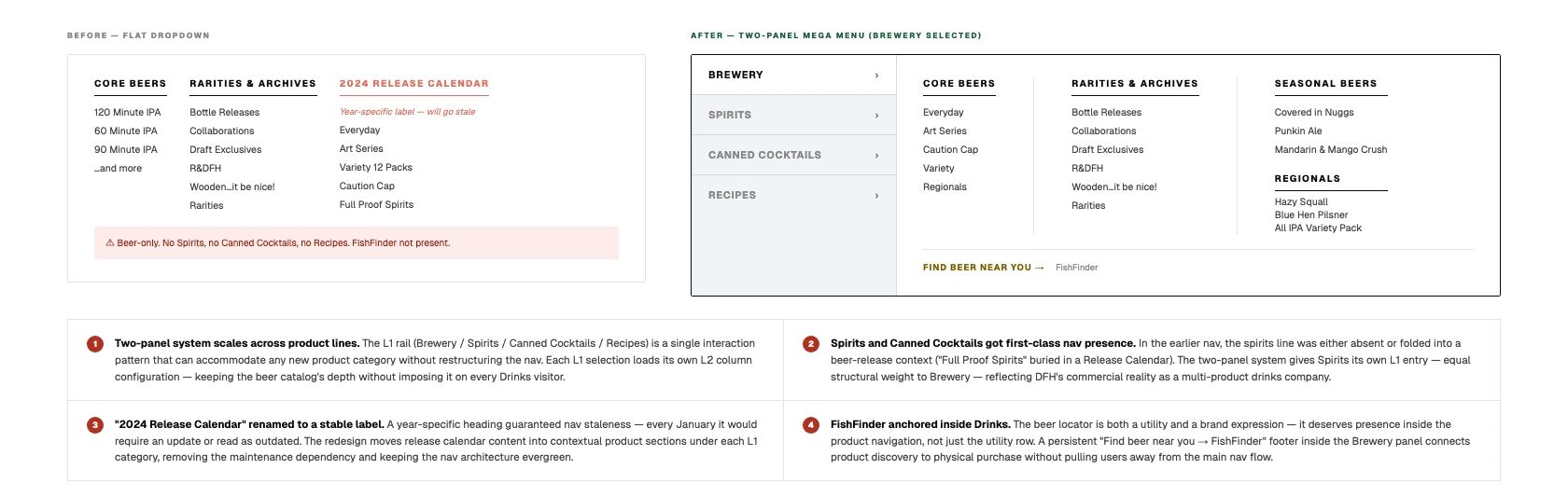
Drinks: From Beer Catalog to Multi-Product Mega Menu
The original Drinks nav was beer-only: a flat list of Core Beers, Rarities & Archives, and a Release Calendar. It treated Dogfish Head as a single-product brewery. By the time of the redesign, DFH also operated a full spirits line, canned cocktails, and a recipes section. The mega menu redesign introduced a two-panel L1 → L2 system: category selection on the left, contextual content columns on the right. The beer catalog stays rich without crowding out the distillery and cocktail lines.
deep dive 01: one platform, four lines of business
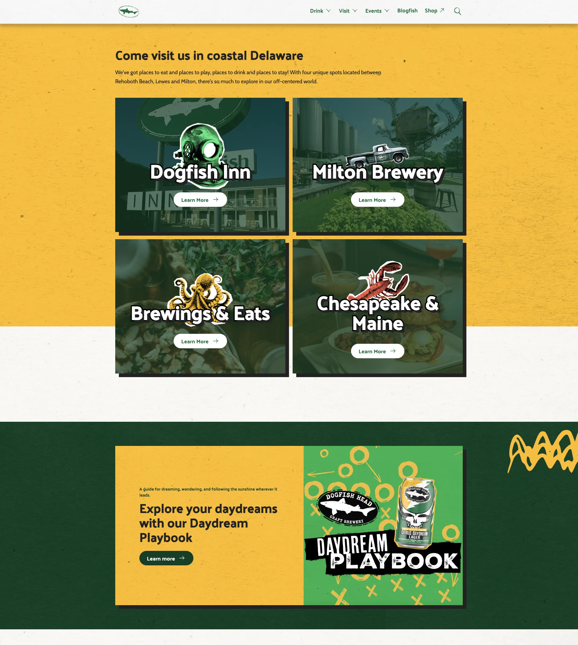
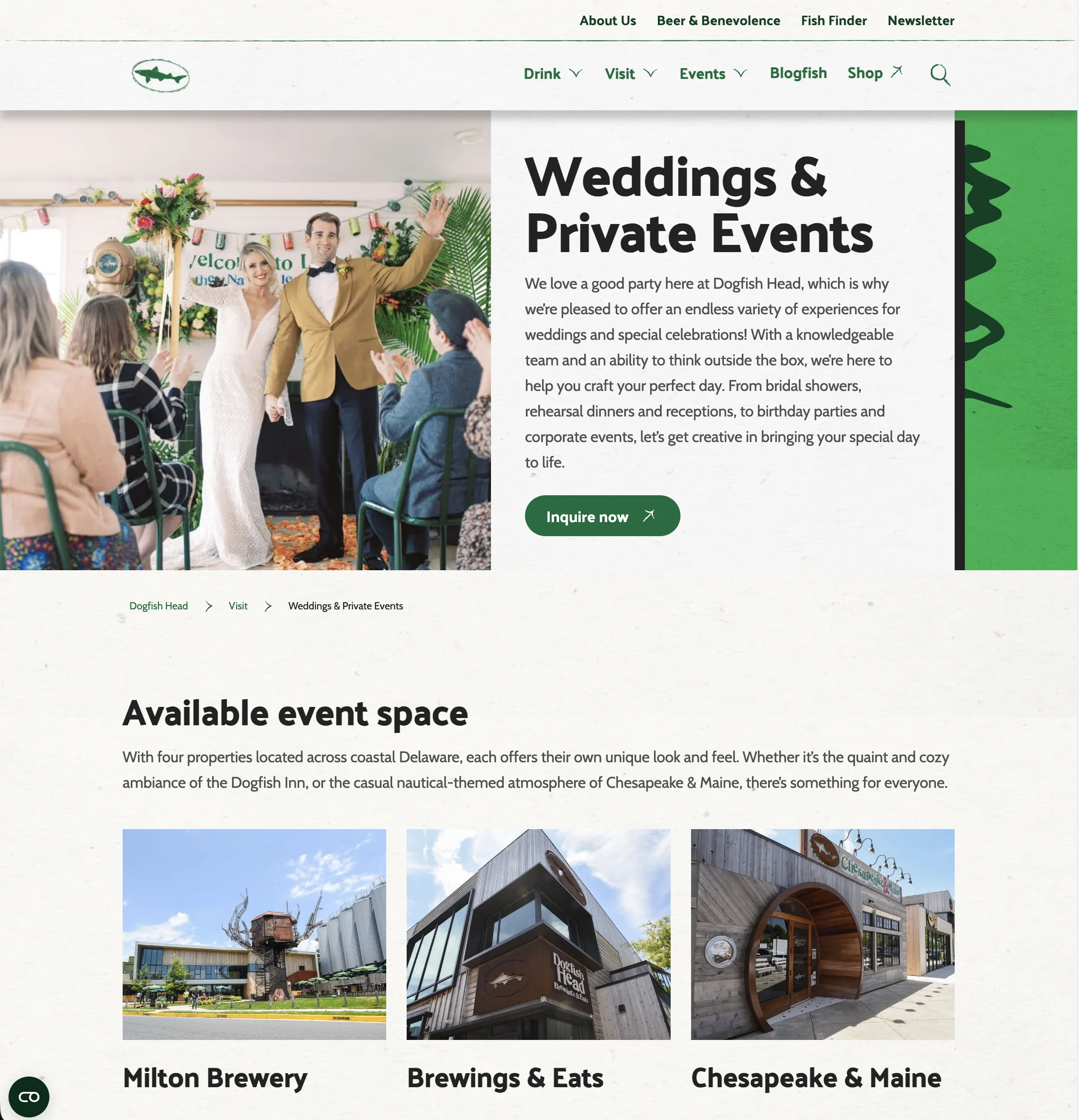
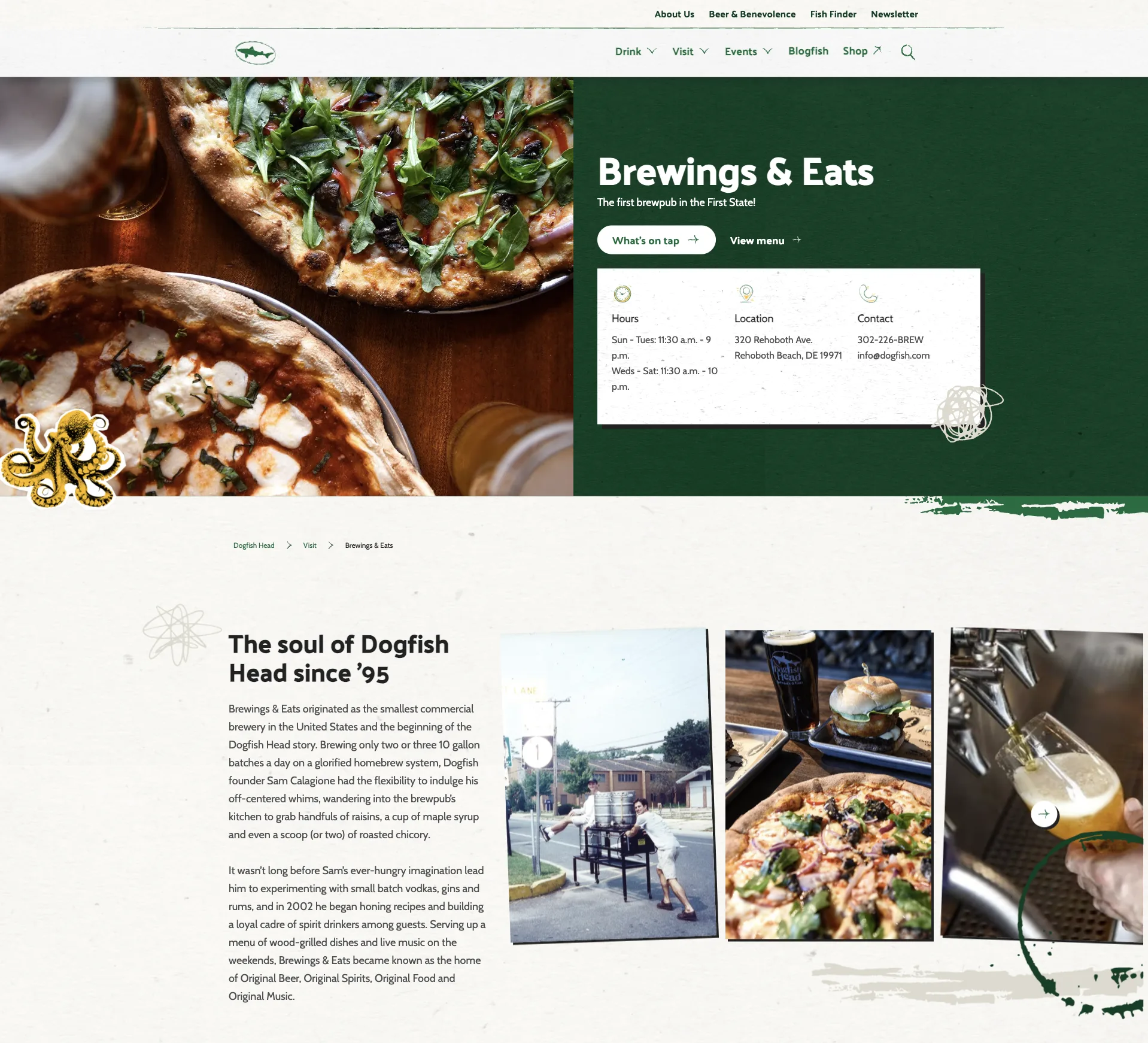
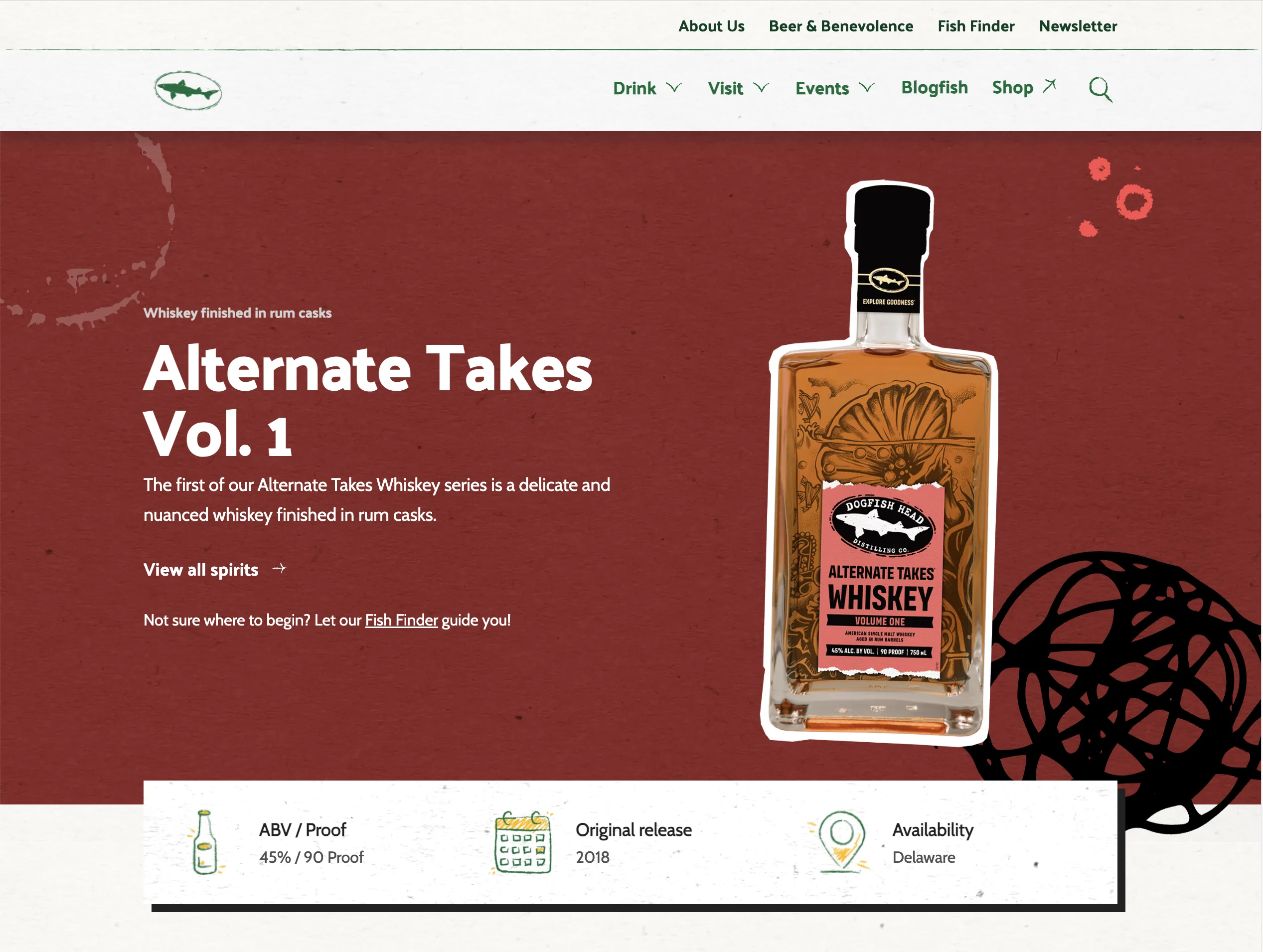
Most beer brand sites are catalogs with a contact page. This one had to support Chesapeake & Maine restaurant, Brewings & Eats brewpub, the Dogfish Head Inn, ongoing events, brewery tours, the Beer & Benevolence community program, and the merch shop.
The decision: don’t reinvent UX patterns for restaurant reservations or inn bookings. The brand does the work, not the patterns. One template family. Distinct brand codes per surface.
deep dive 02: two audiences, one IA
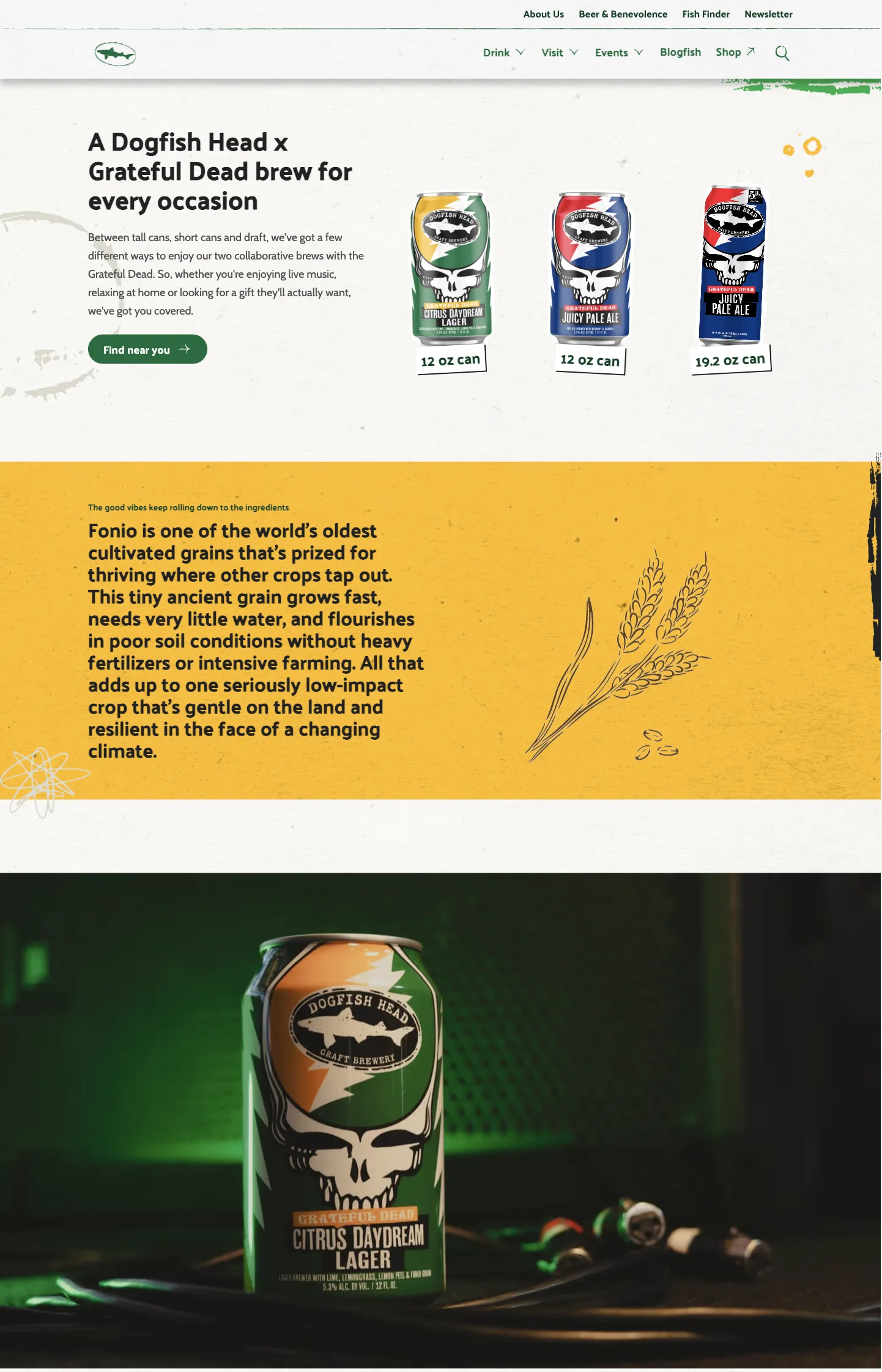
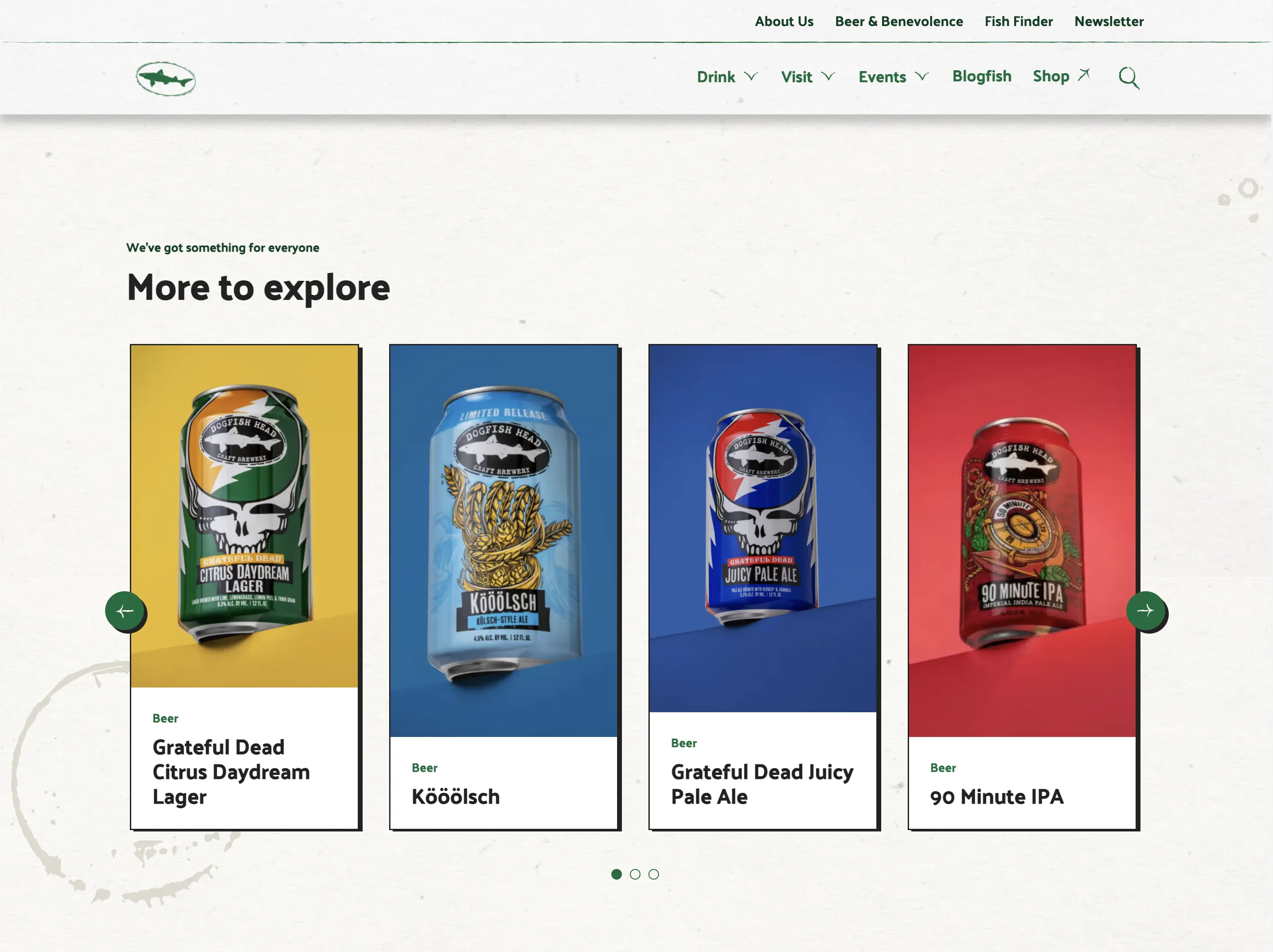
The Experience Strategy on a Page made the calculus explicit: secure the regional fan base through activation, while growing the national audience through engagement.
Activation = lines of business and innovative brews. Growth = storytelling and the Fish Finder, the named beer-locator that doubles as brand expression. Same nav, different jobs.
deep dive 03: system primitives
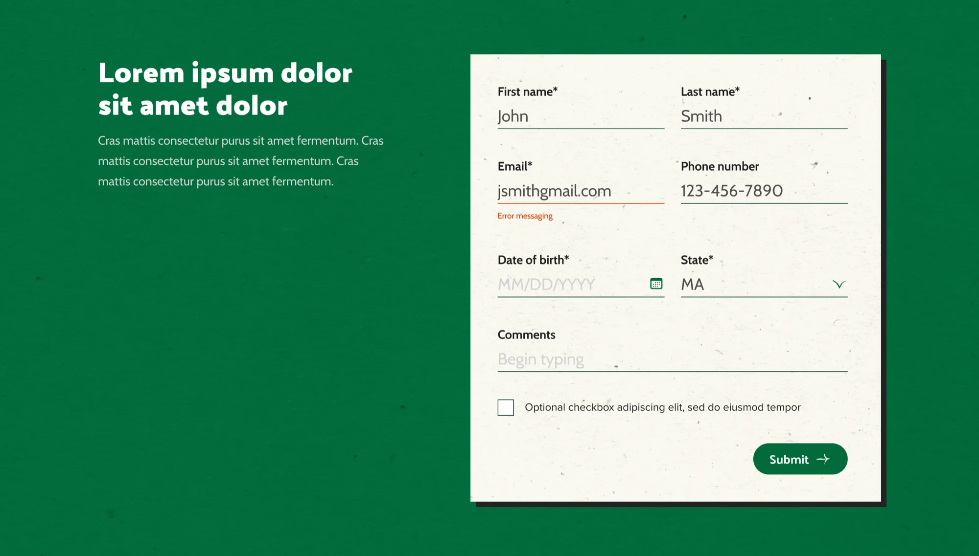
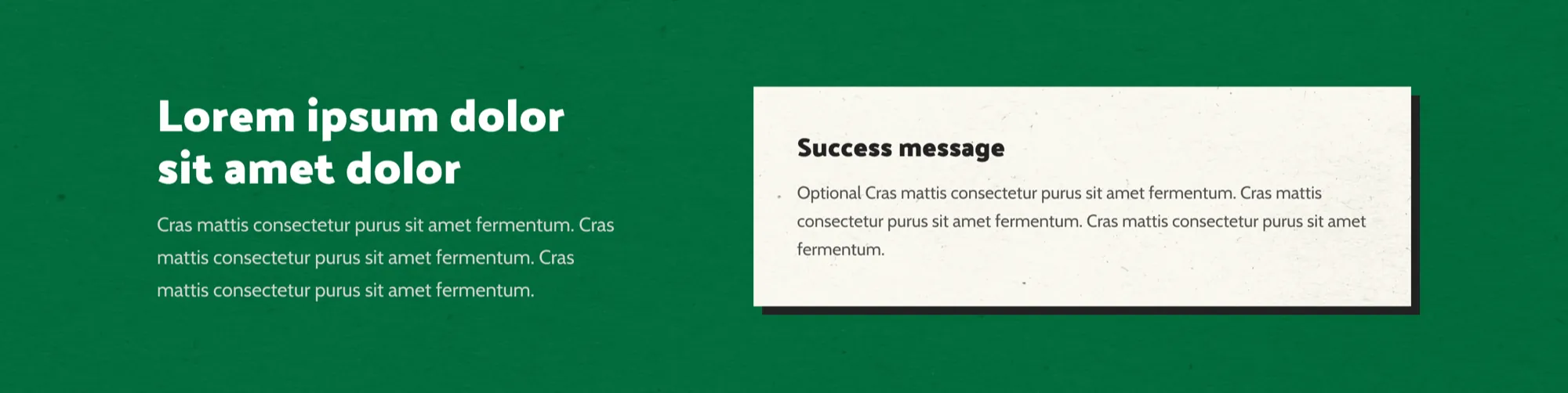
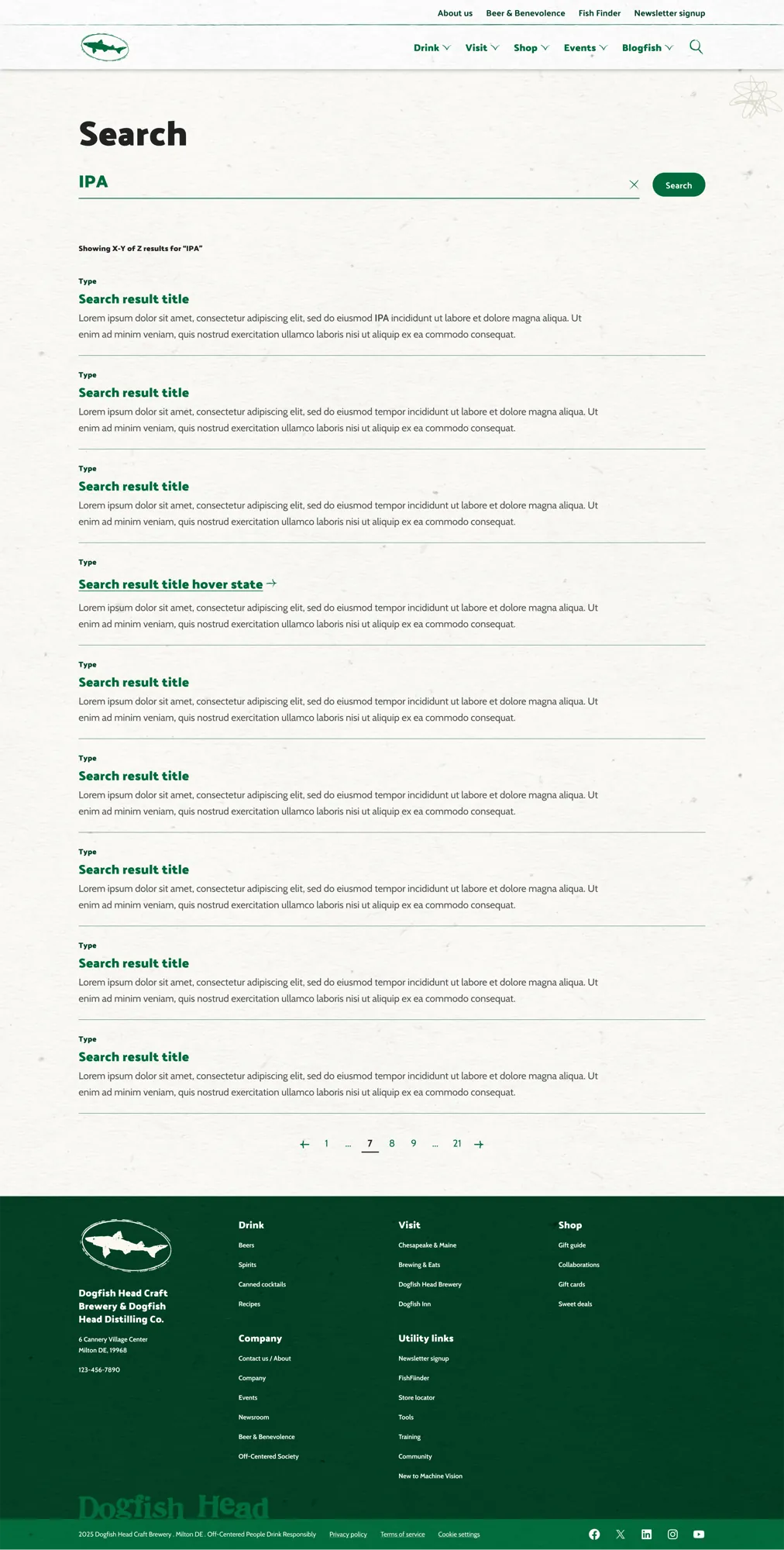
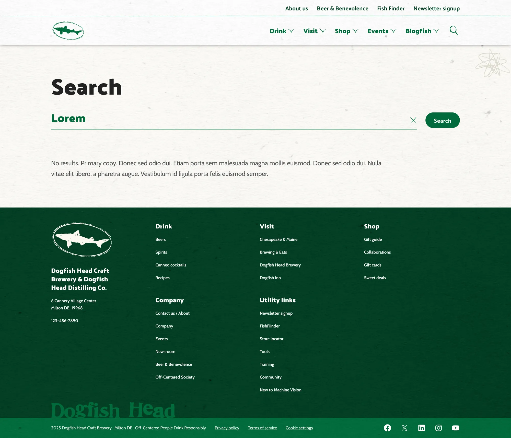
Nineteen templates and eleven product themes only work if the underlying primitives hold. Forms aren’t just forms. They’re base, error, success as named states. Empty results are a designed surface, not a leftover.
Contact form: three states
base → error → success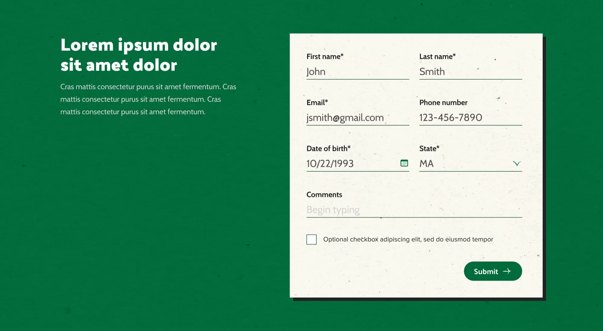
Warm and weird, structured and scalable.
The temptation in a project this big is to choose: lean fully into the brand’s eccentricity and lose the system, or build a clean scalable platform and lose the brand. The work was about refusing that choice.
Coastal Grit was the visual frame Brittany Janeczek named for it: coastal nautical softness plus rugged working-brewery toughness.
Every screen had to feel like the brand. Not just reference it.design intent, dogfish head
result
19
page templates designed across desktop and mobile.
11
product page color themes for line-of-business variation.
live
shipped on Sitecore XM Cloud at dogfish.com.
Three calls that shaped the site.
Two audiences with one IA.
Regional fans get activation surfaces: events, hospitality, drops. National fans get engagement surfaces: storytelling, the Fish Finder, articles. Same nav, different jobs.
Lines of business as content, not microsites.
Restaurant, inn, brewpub, events, donations all share template structure. The differentiation lives in brand expression, not the pattern.
System primitives, not screens.
Form base / error / success. Search with / without. Navigation as a four-state system. The 19 templates only hold up because the primitives underneath are explicit.