Velocity
A classroom of twenty-five. A product for one.
Velocity is Voyager Sopris Learning’s flagship adaptive K–5 platform. I led the redesign from classroom research through interaction design and into the system that engineering built from.
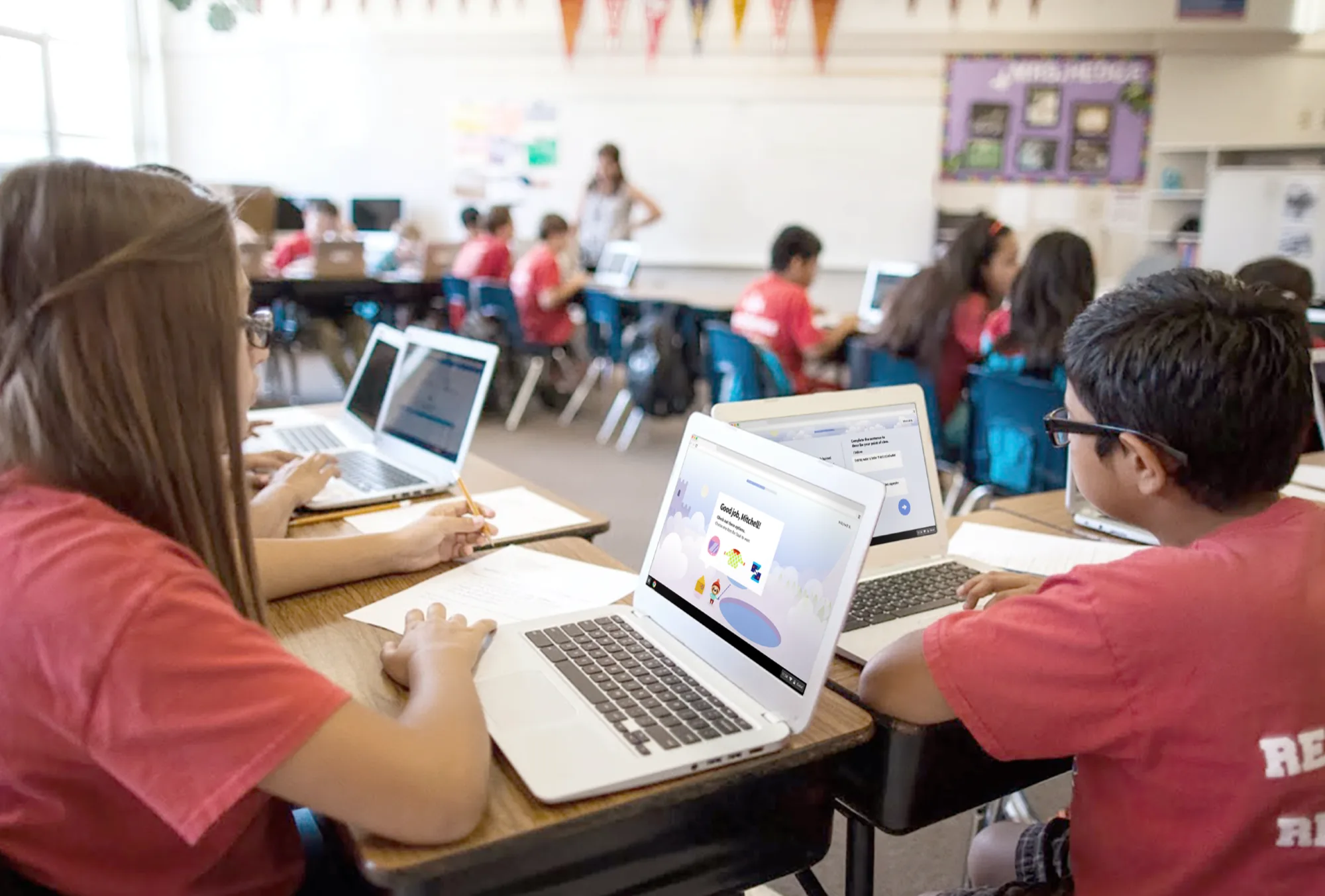
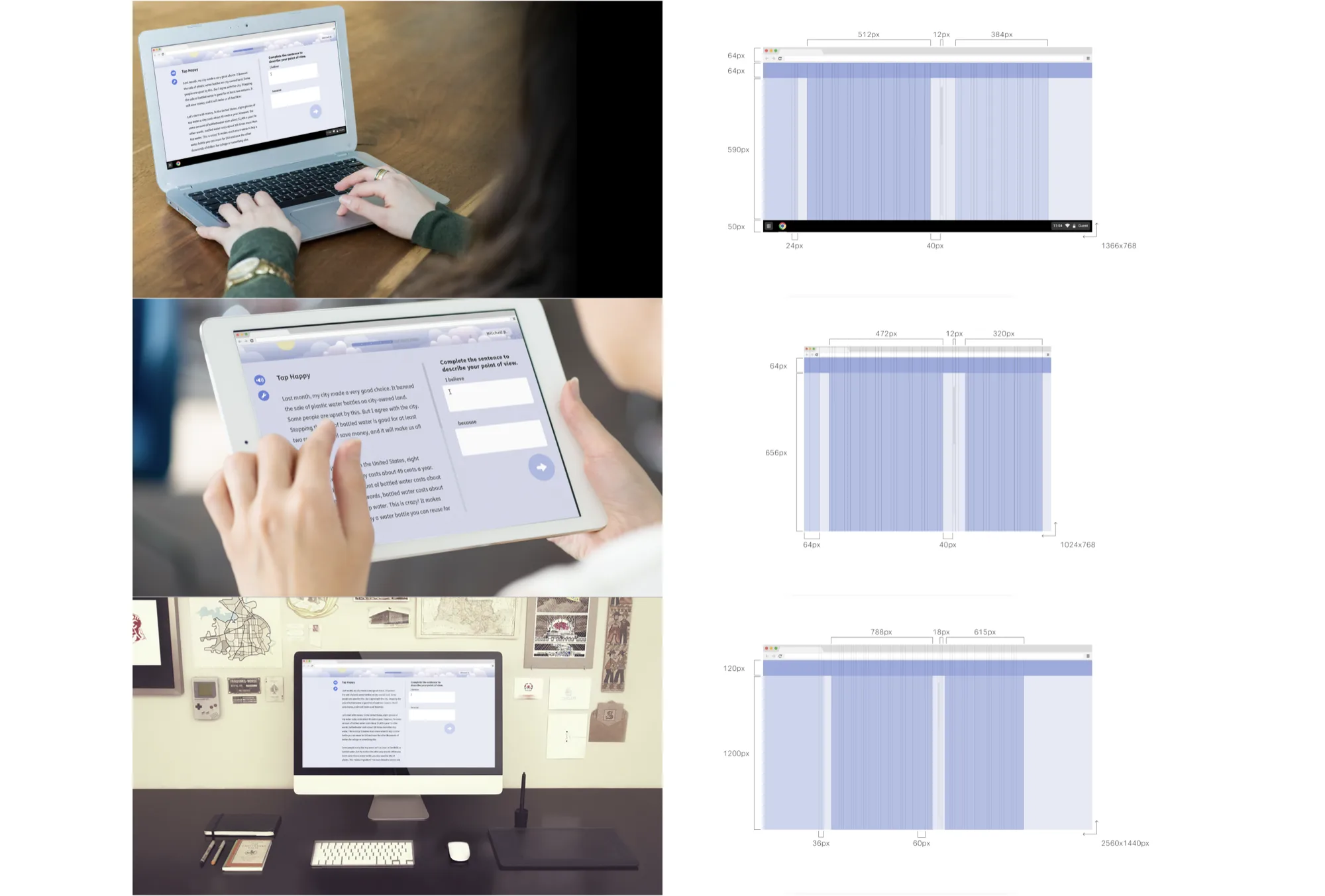
One product, two users: a student working alone and a teacher watching the whole room. All on aging school hardware in rooms where bandwidth was not guaranteed.
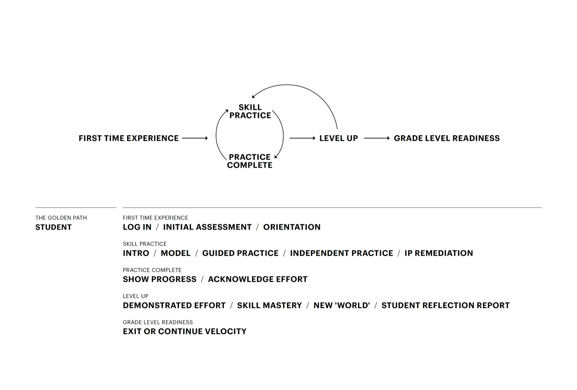
Velocity’s wide range of activity types got mapped into one consistent interaction model: a shell, a structure, and a golden path from login to grade-level readiness.
Student and teacher experiences designed in parallel, seven interaction types feeding the adaptive engine in real time, and a full design system handed to engineering, ready to build from.
Every decision had to hold up in a real classroom, not a design review.
Velocity had to serve two users at the same time: a student working independently and a teacher monitoring twenty-five at once. All on aging school hardware in rooms where bandwidth was not guaranteed.
Those constraints weren’t abstract. They were the brief.
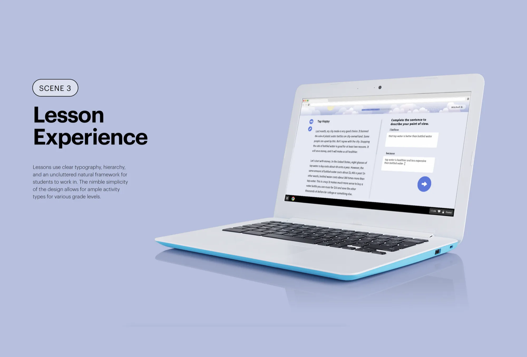
A shell, a structure, and a golden path from login to grade-level readiness.
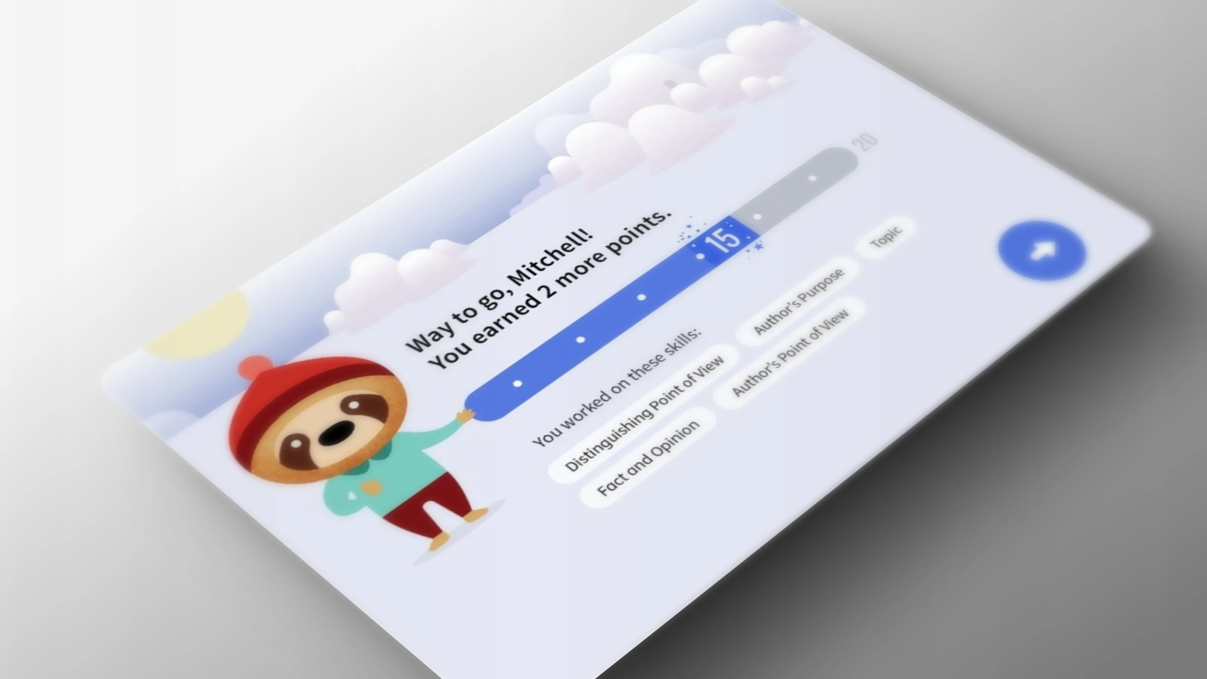
Velocity’s wide range of activity types (cold read, highlight, drag-and-drop, guided practice) got mapped into one consistent interaction model. A shell, a structure, and a golden path from login to grade-level readiness.
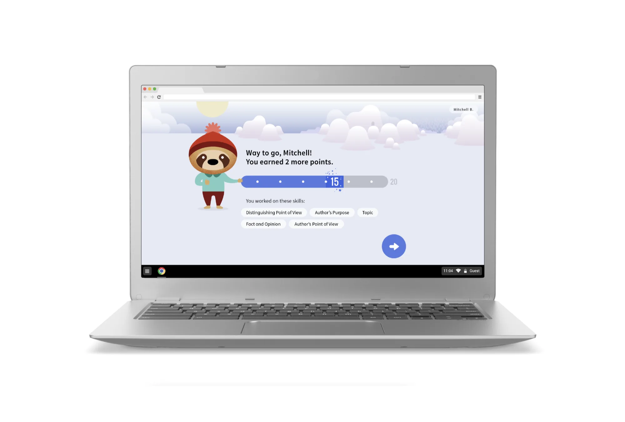
The visual language said learning tool without saying enterprise software. Approachable, clear, age-appropriate. Never condescending to the kids or the teachers.
The system underneath every screen.
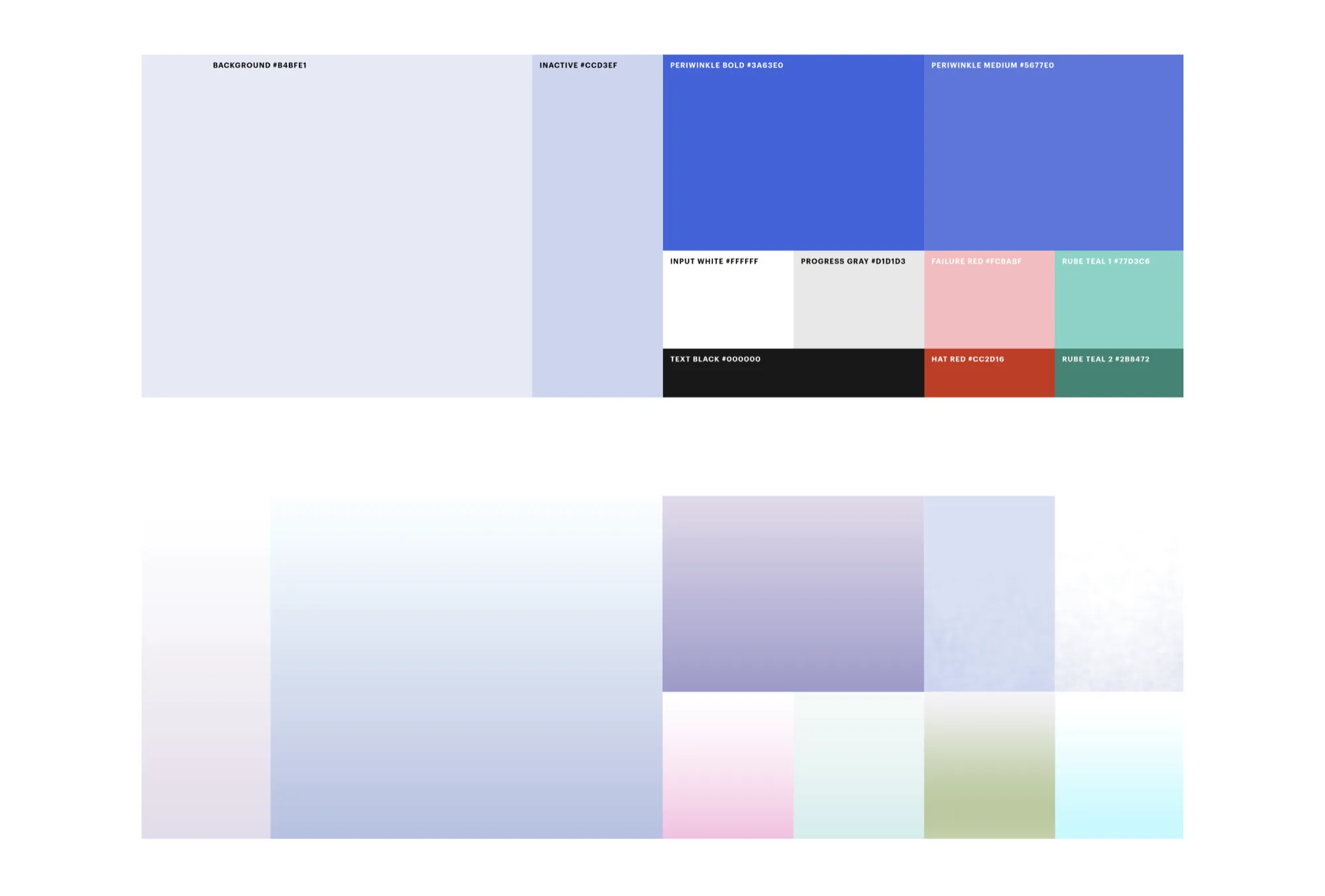
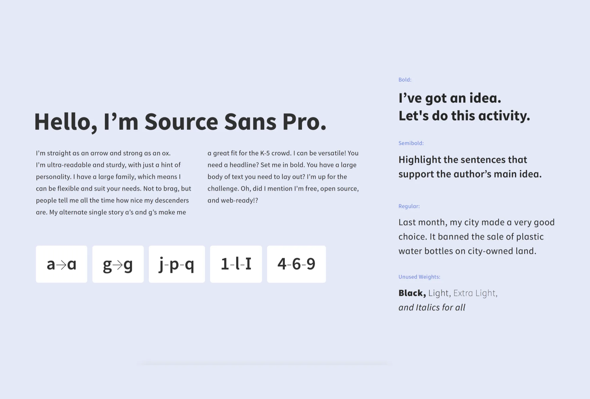
Approachable, age-appropriate, never condescending: a warm primary palette with clear semantic accents, and type readable at every age, scaled across modalities.
Designed for the kid. Documented for the team.
That was the design intent for Voyager Sopris Velocity: one consistent shell across activity types, celebration without infantilizing the student, and screens designed for the Chromebooks and tablets actually in classrooms.
student and teacher experiences designed in parallel.
feeding the adaptive engine in real time.
handed to engineering, ready to build from.