Cognex
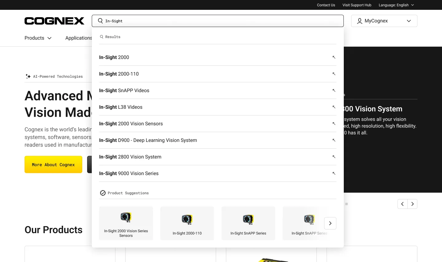
Everyone typed a model number. So search became the front door.
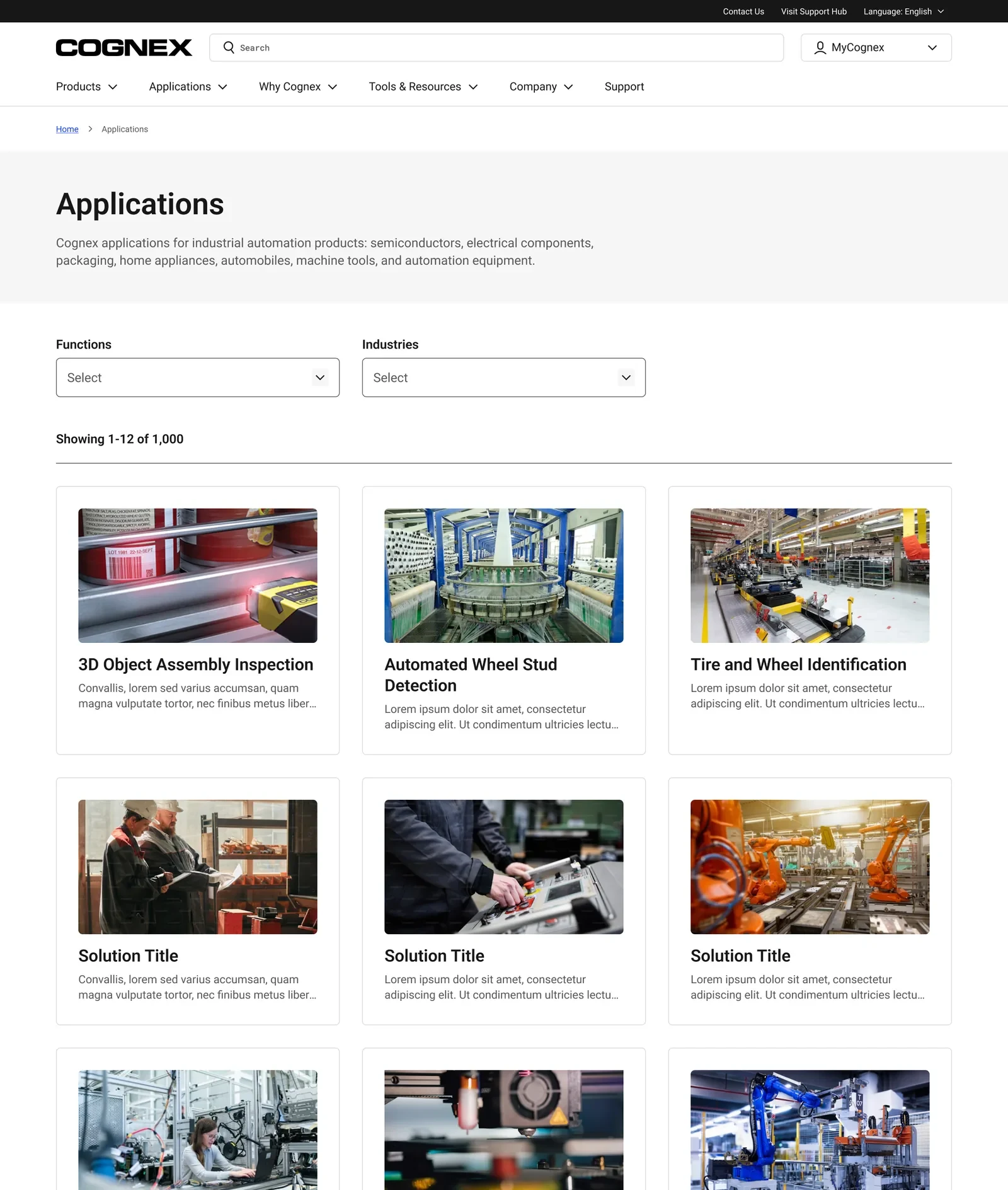
Cognex’s marketing, support, and product catalog lived in separate properties that didn’t agree with each other. The catalog is too large for any buyer to remember.
Factory operators and procurement engineers search by model number. The site made them browse like consumers.
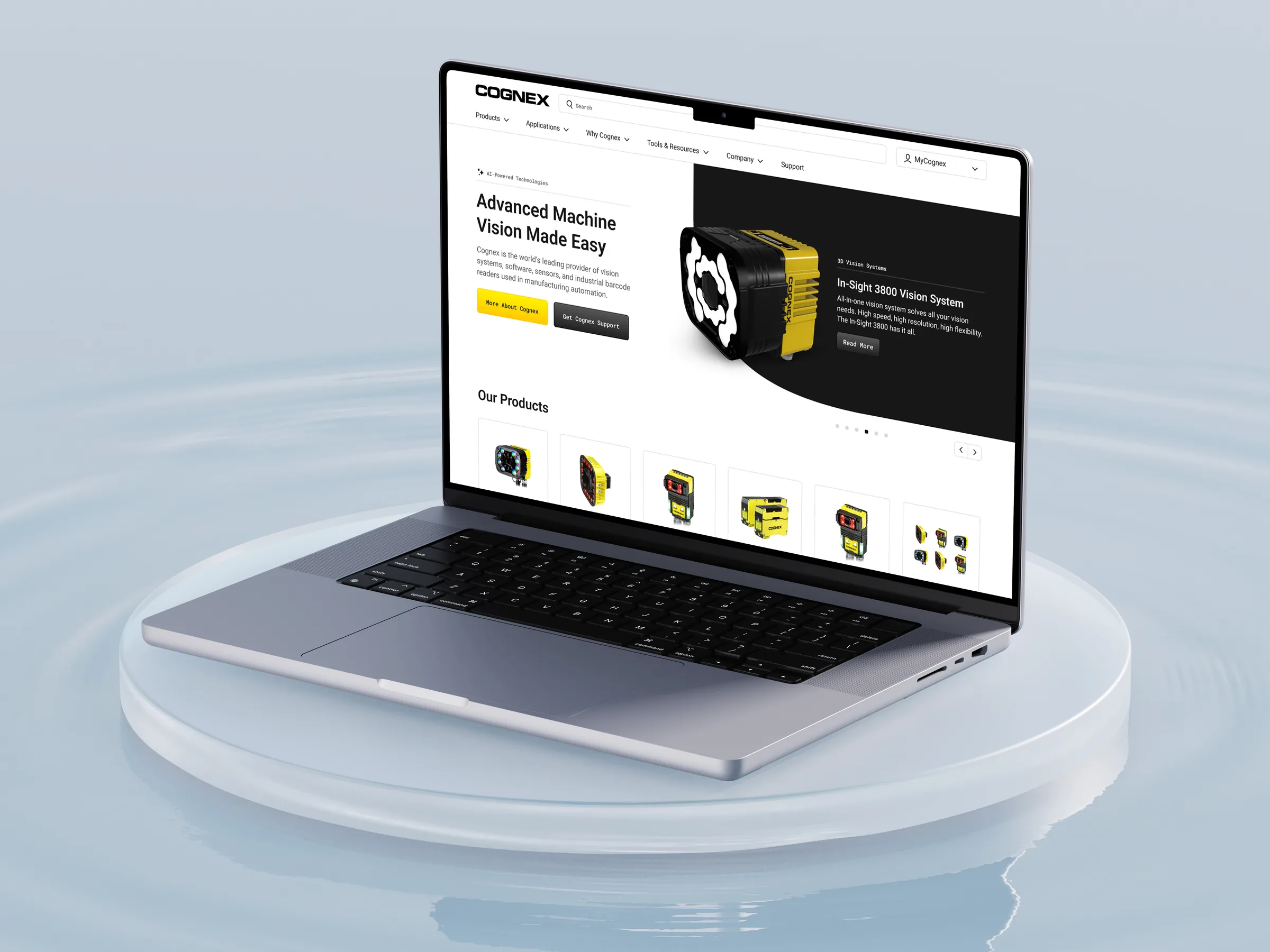
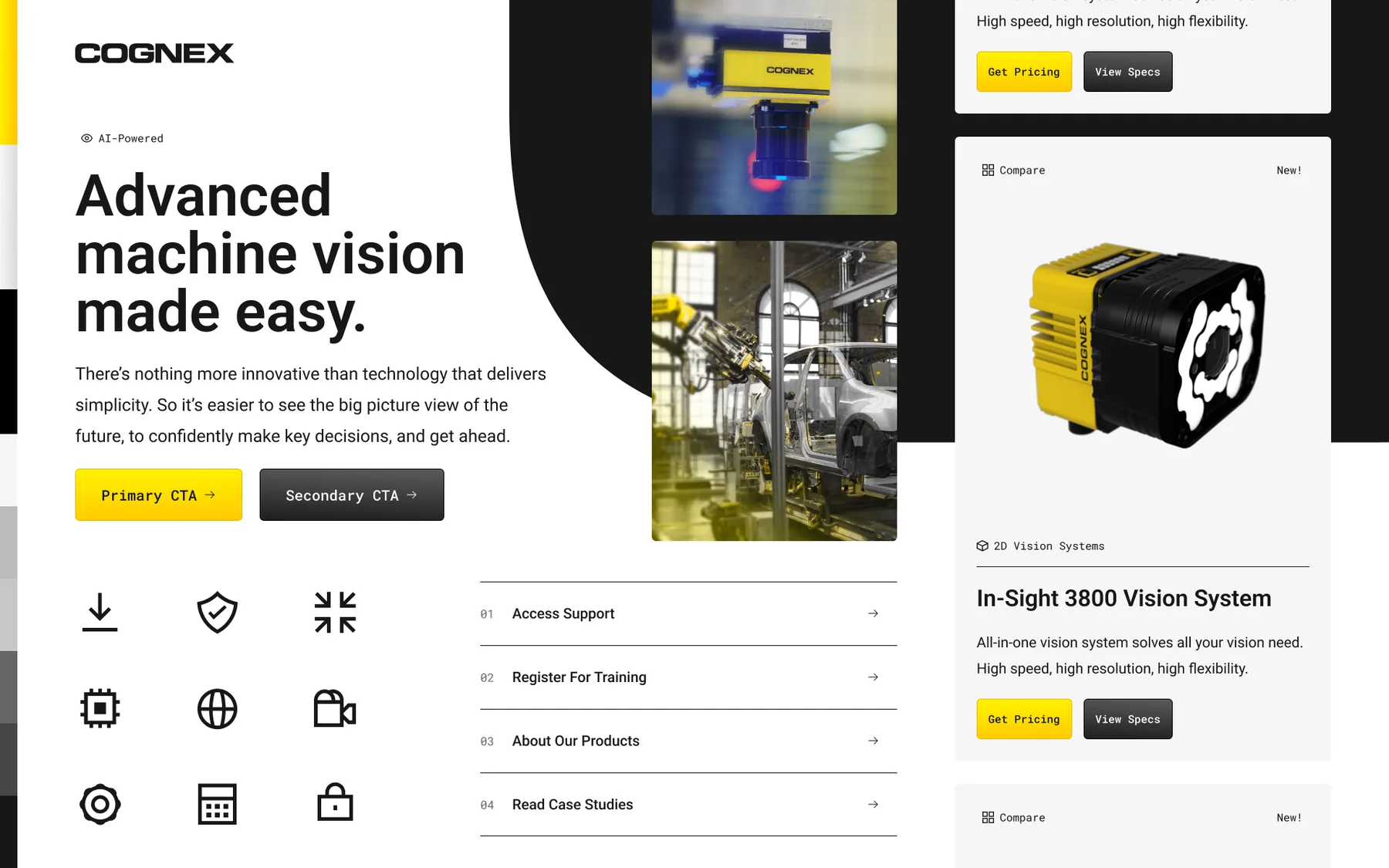
I helped lead a multi-property redesign built around how buyers actually search, unifying cognex.com marketing, MyCognex support, and the information architecture connecting them.
Live at cognex.com and support.cognex.com. A clearer path from discovery to support, with engineering, marketing, and customer success working from one system.
Tested in four languages. The same answer every time.
Moderated testing in English, Japanese, Mandarin, and Korean showed the same pattern every time: users went straight to the search bar, typed “DM375,” and judged us by the results. Many ignored the navigation we thought was most important.
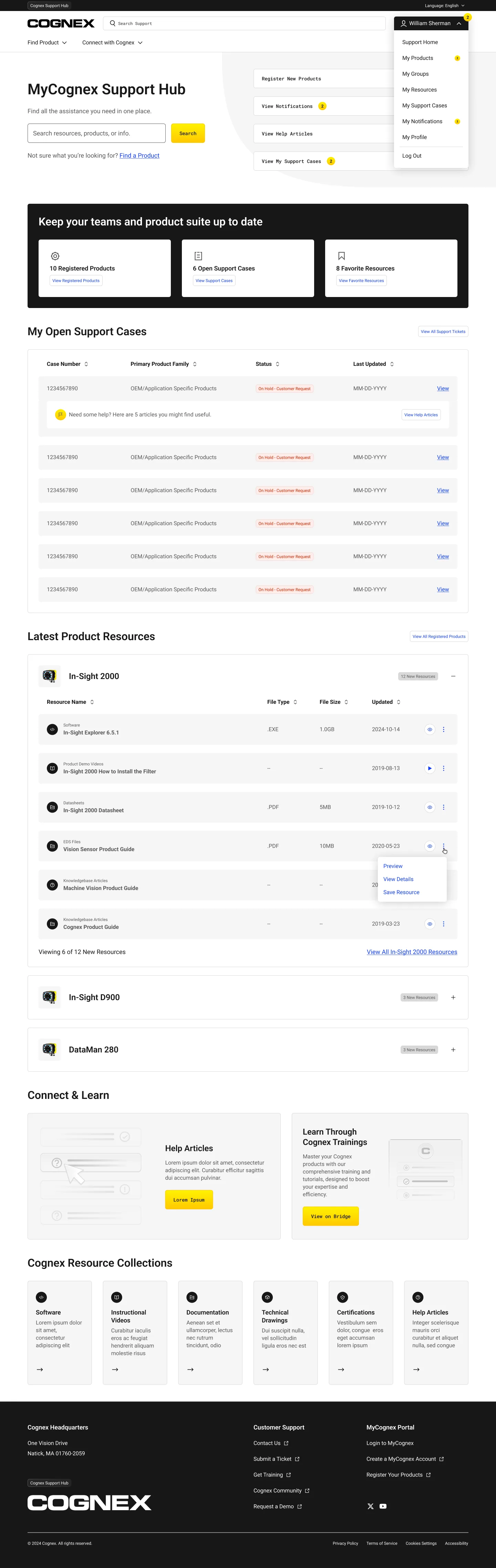
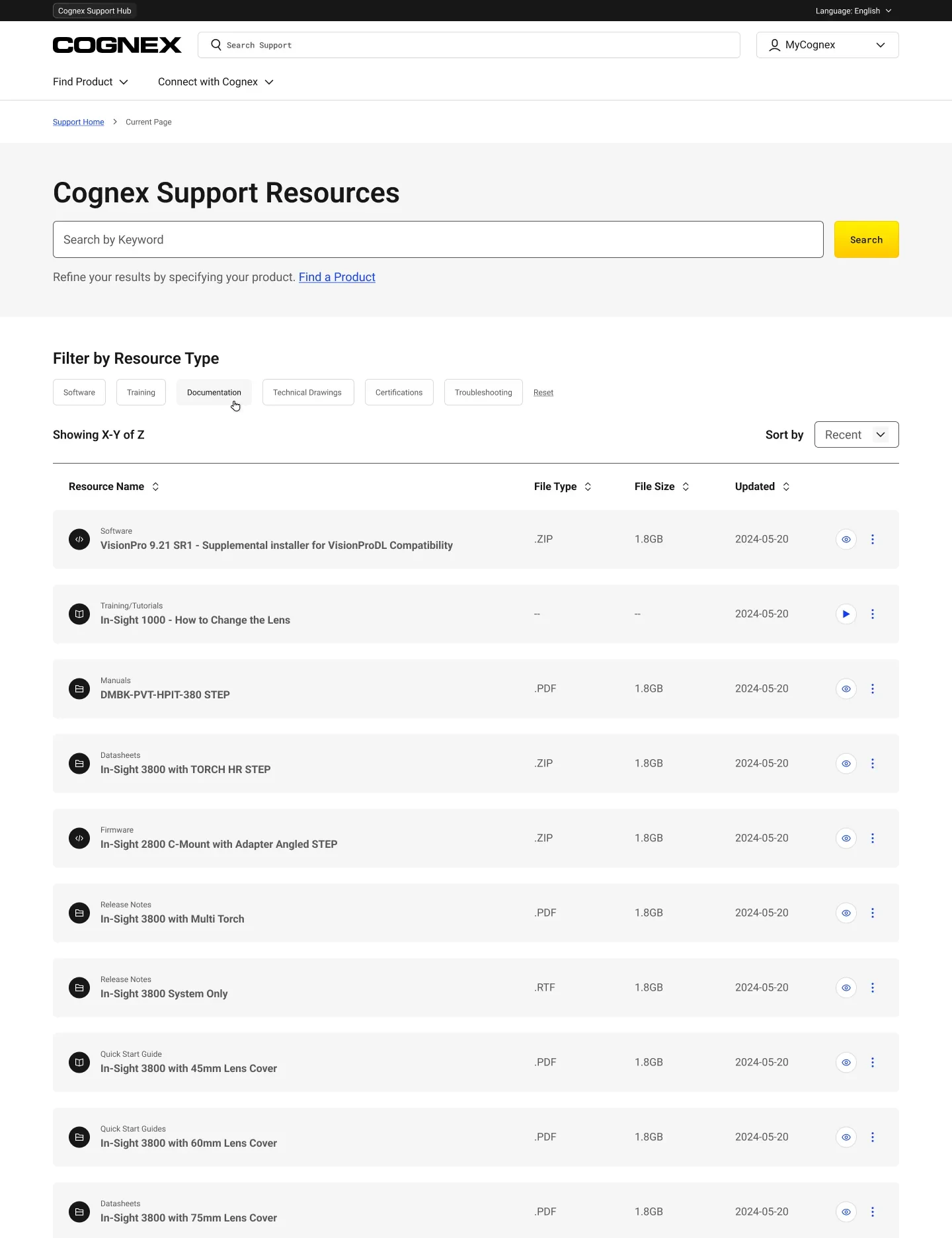
Users called the old account profile “wasted space.” They wanted a description and a date before downloading a large file. Most came for documentation and drawings, so that is what we designed for.
A guided path from product type to the exact download.
Few users touched the filters, so we couldn’t rely on them for discovery. The Product Finder steps users from product type to the exact file, showing type and size before the click, with a path for discontinued products.
This is the live, working version. Pick a category and try it.
The mega-nav stayed, and earned its keep.
It would have been easier to remove the navigation. Instead we made it more useful: a Product Finder entry point in Products, applications organized the way people think, and articles inside the menus, not just links.
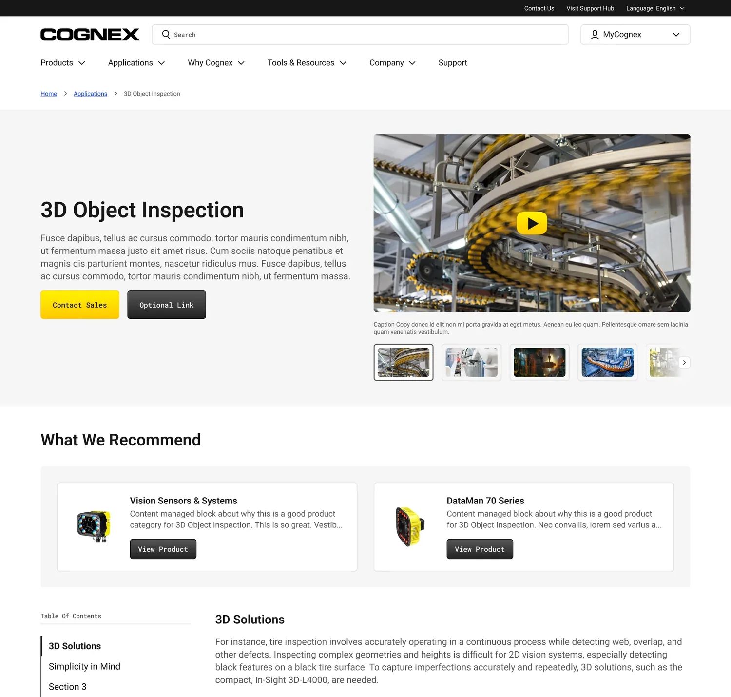
Support moved onto the product itself. Contact Sales, Download Data Sheet, and View Product Support sit at the top of complex pages, designed to answer questions before they become tickets.
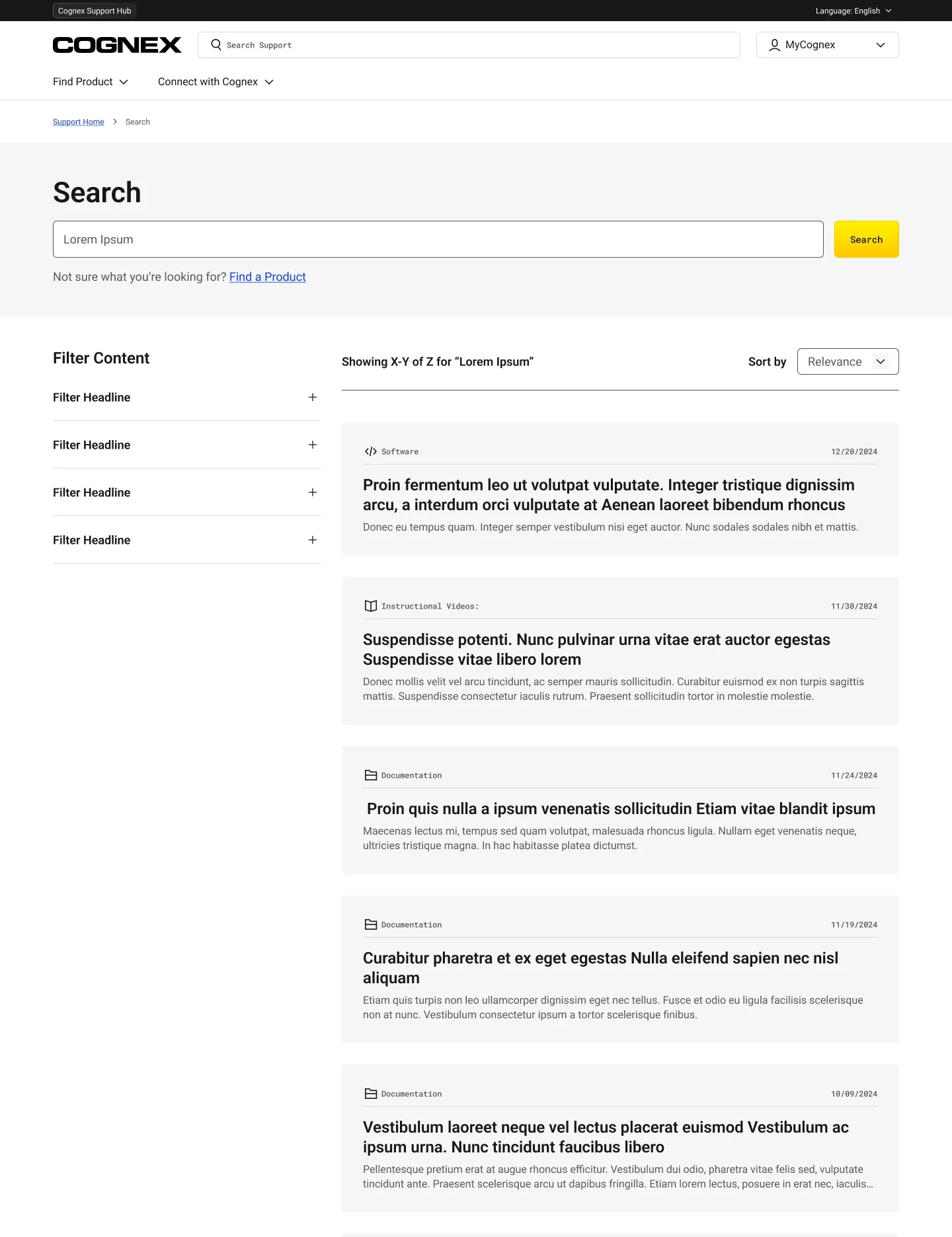
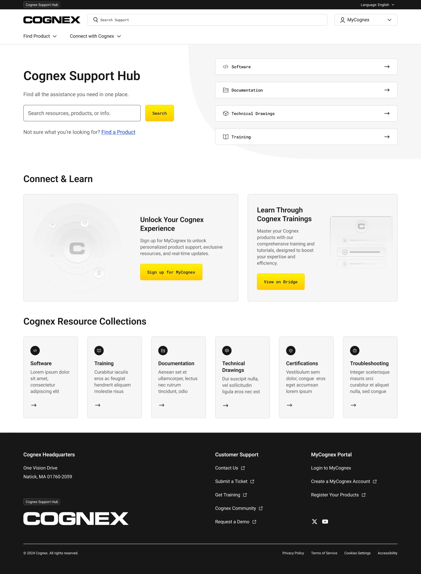
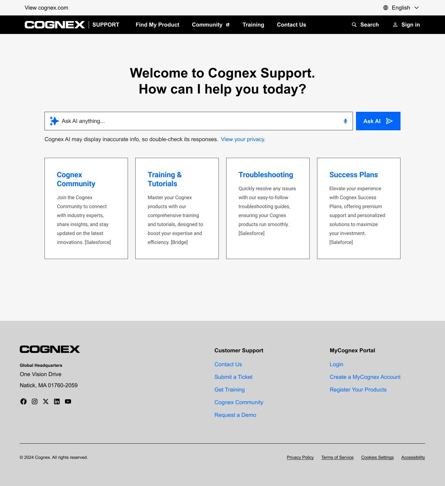
Search-first, everywhere.
The MyCognex hub starts with a search and adapts to each user. Members see their registered products, open cases, and favorites. Everyone else sees popular and recent resources.
The shipped hub matched the designs essentially one-to-one.
Three directions, one chosen.
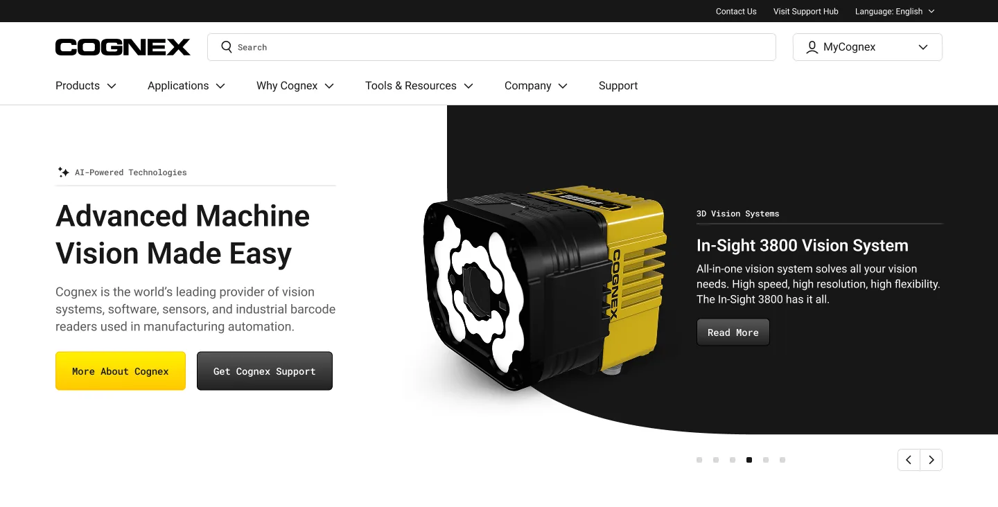
The visual system reads beams of light as color gradients over black, white, and Cognex yellow. The direction was tested with real users, from category newcomers to automation experts.
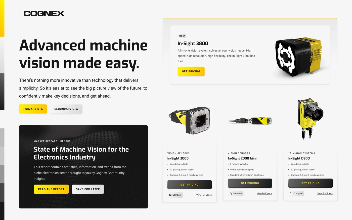
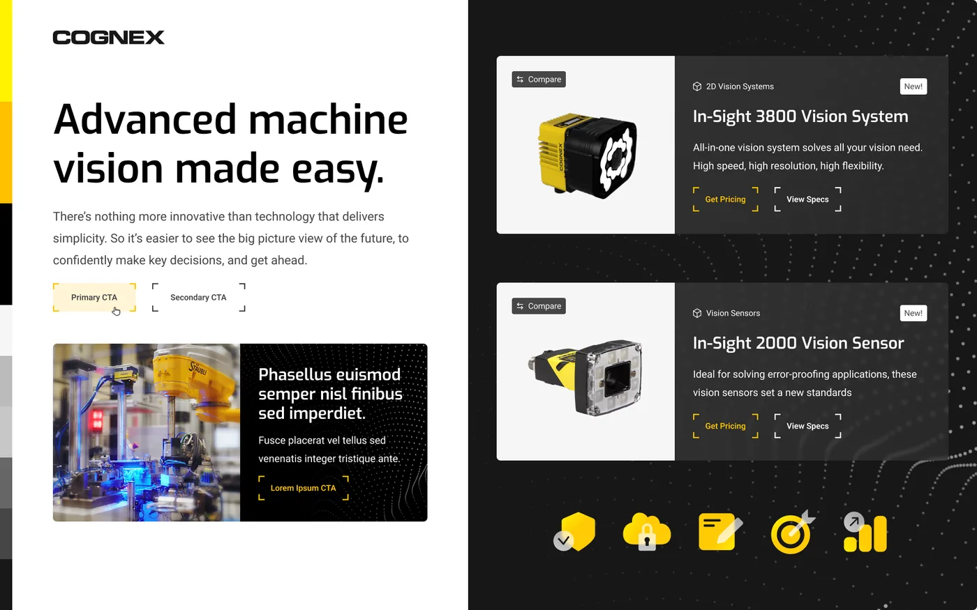
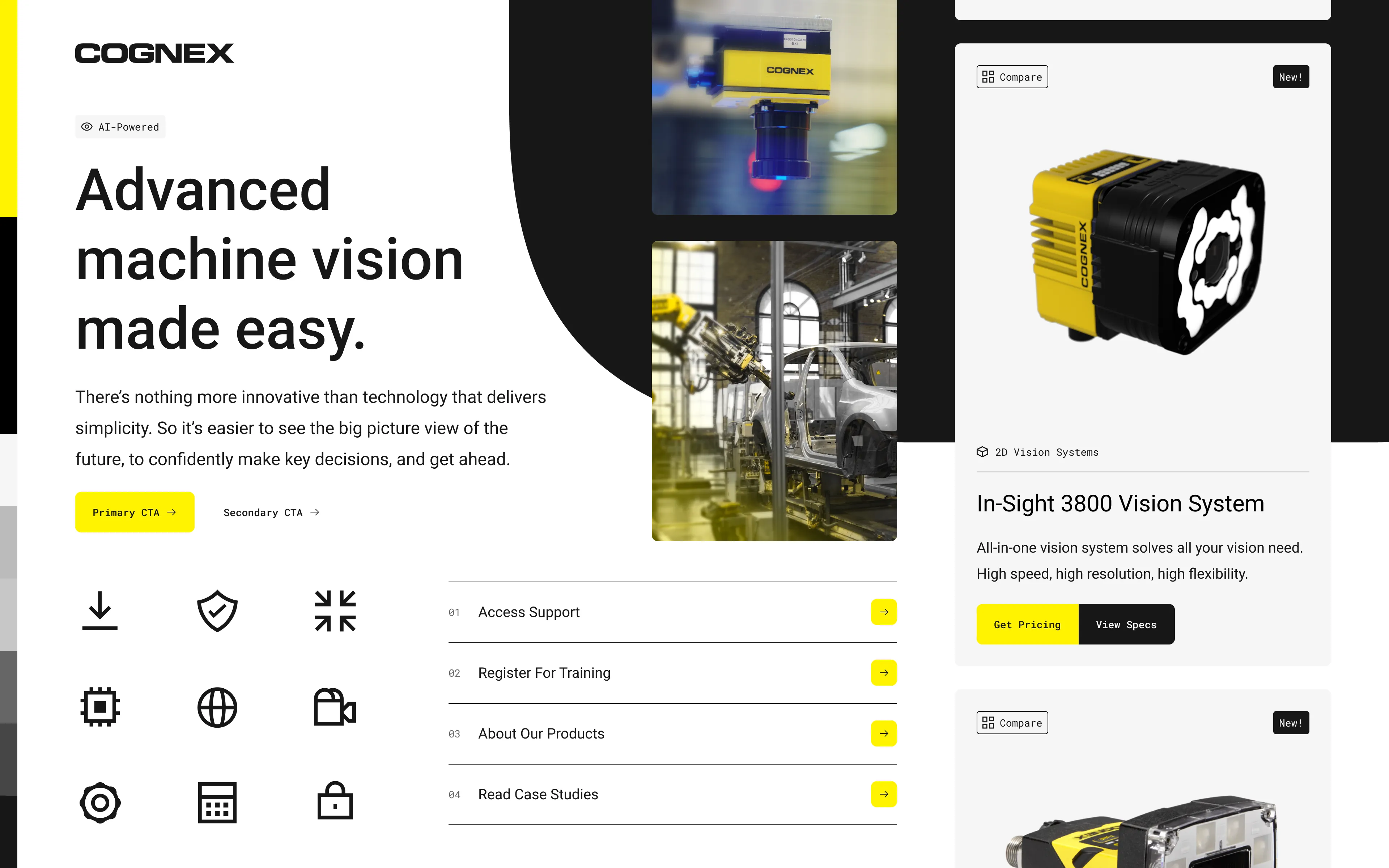
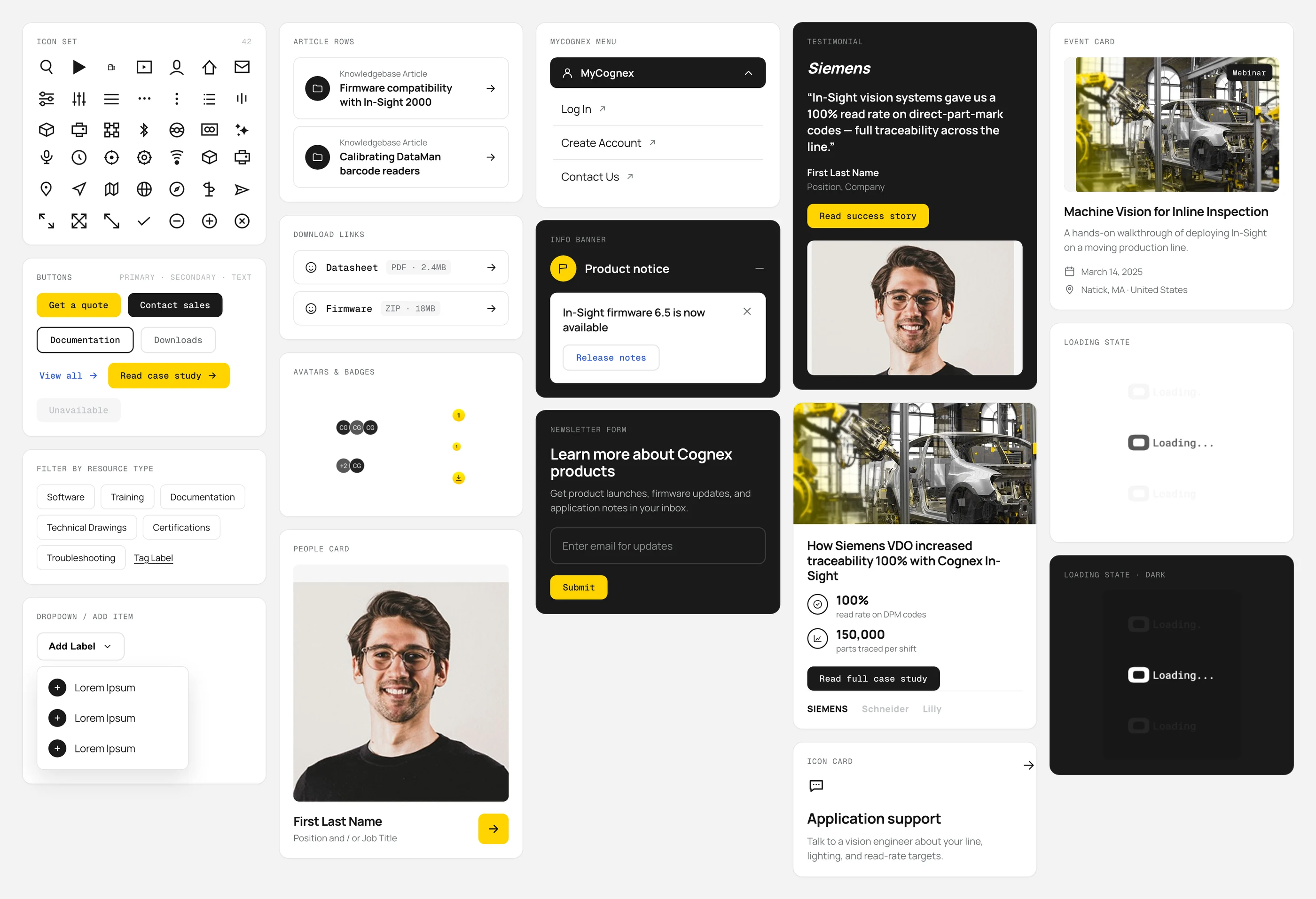
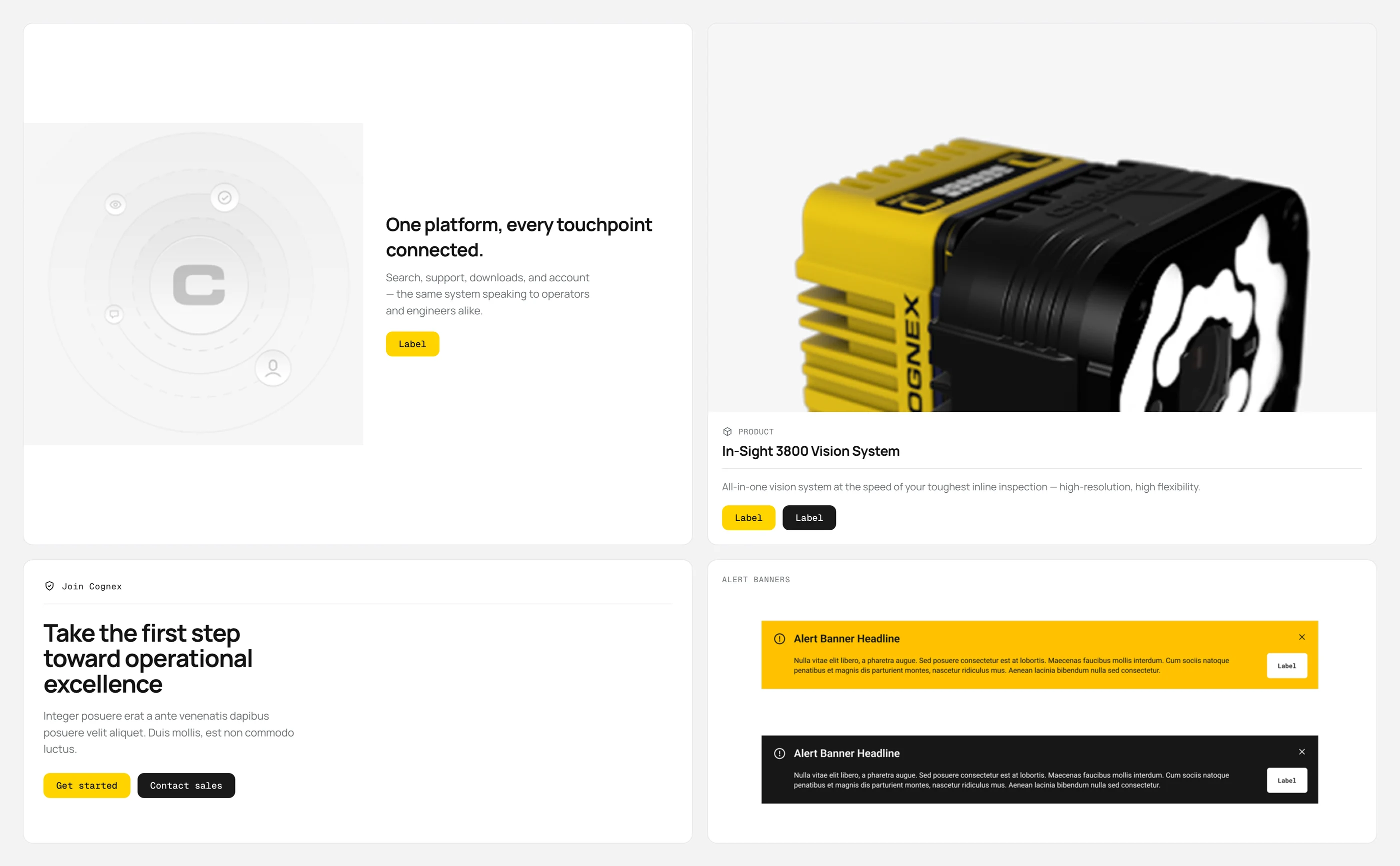
A visual language, built into a component library.
One visual language with two very different jobs: factory operators on cognex.com, procurement engineers inside MyCognex. I helped define the system and turn it into a documented library both properties share.
Most users skipped the navigation we worked hard on. We designed for that too.
We kept the mega-nav for people who browse, and made search and the guided Product Finder the main tools for everyone else.
We also prototyped an AI assistant, ai12z, for vague queries like “I bought one, but can’t remember the name.”
cognex.com and support.cognex.com, in production.
English, Japanese, Mandarin, Korean prototypes and scripts.
moderated sessions across four core experiences.
the support hub shipped essentially one-to-one with the designs.
Designed for search-first, not nav-first.
Users typed model numbers before touching navigation. Search and the Product Finder became the main tools of both sites.
Put support on the product, not three clicks away.
Product pages lead with the support path, the datasheet, and a jump-to nav, heading off tickets before they start.
Cut the wasted space, lead with what’s useful.
The hub now opens with personalized, popular, and recently updated resources, adapting to the signed-in user.