FedEx Address Book
Years of friction. One clean tool.
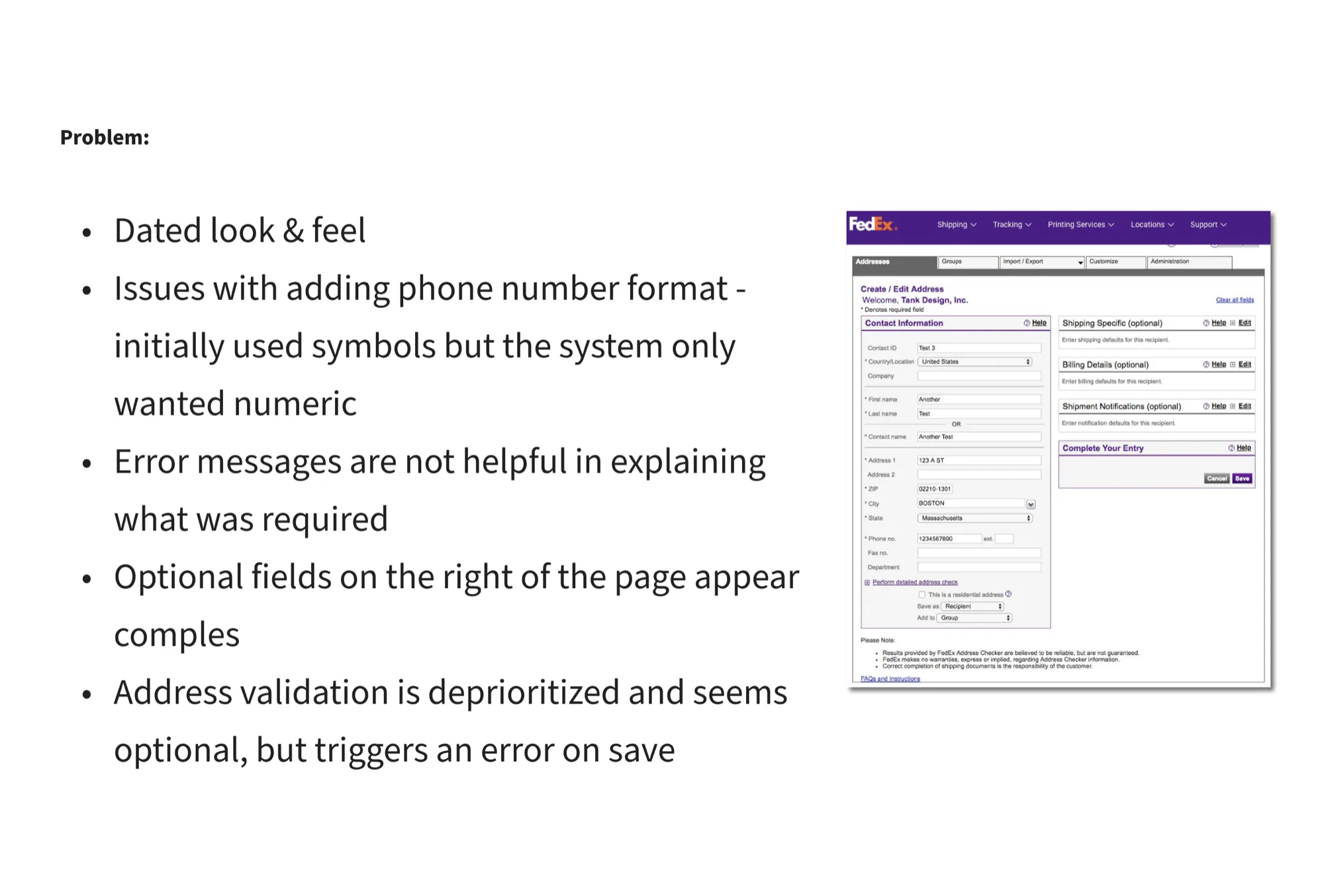
FedEx’s address book is one of the most-used tools in their shipping ecosystem, relied on by enterprise shippers managing thousands of contacts. It hadn’t been redesigned in years and the problems had compounded.
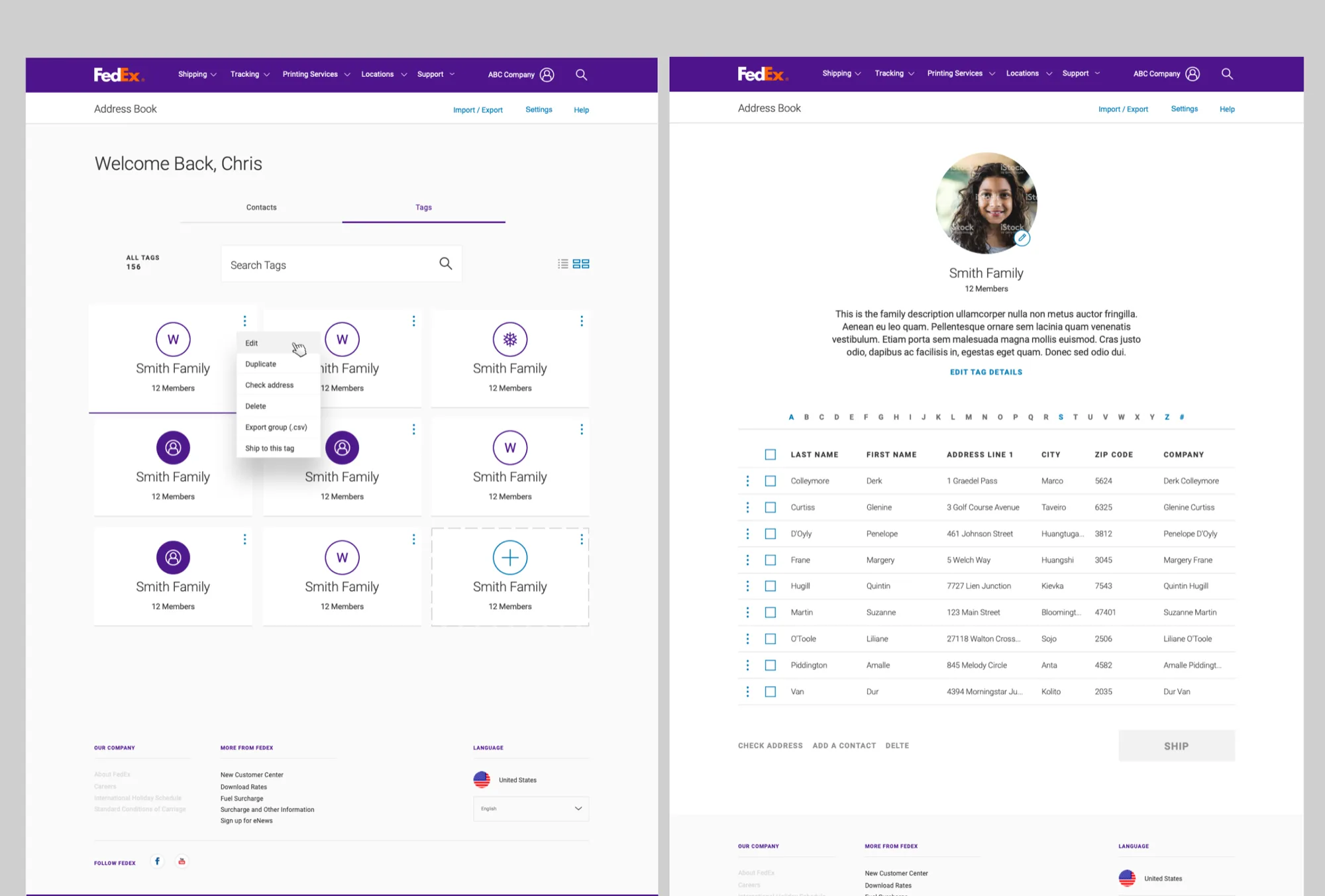
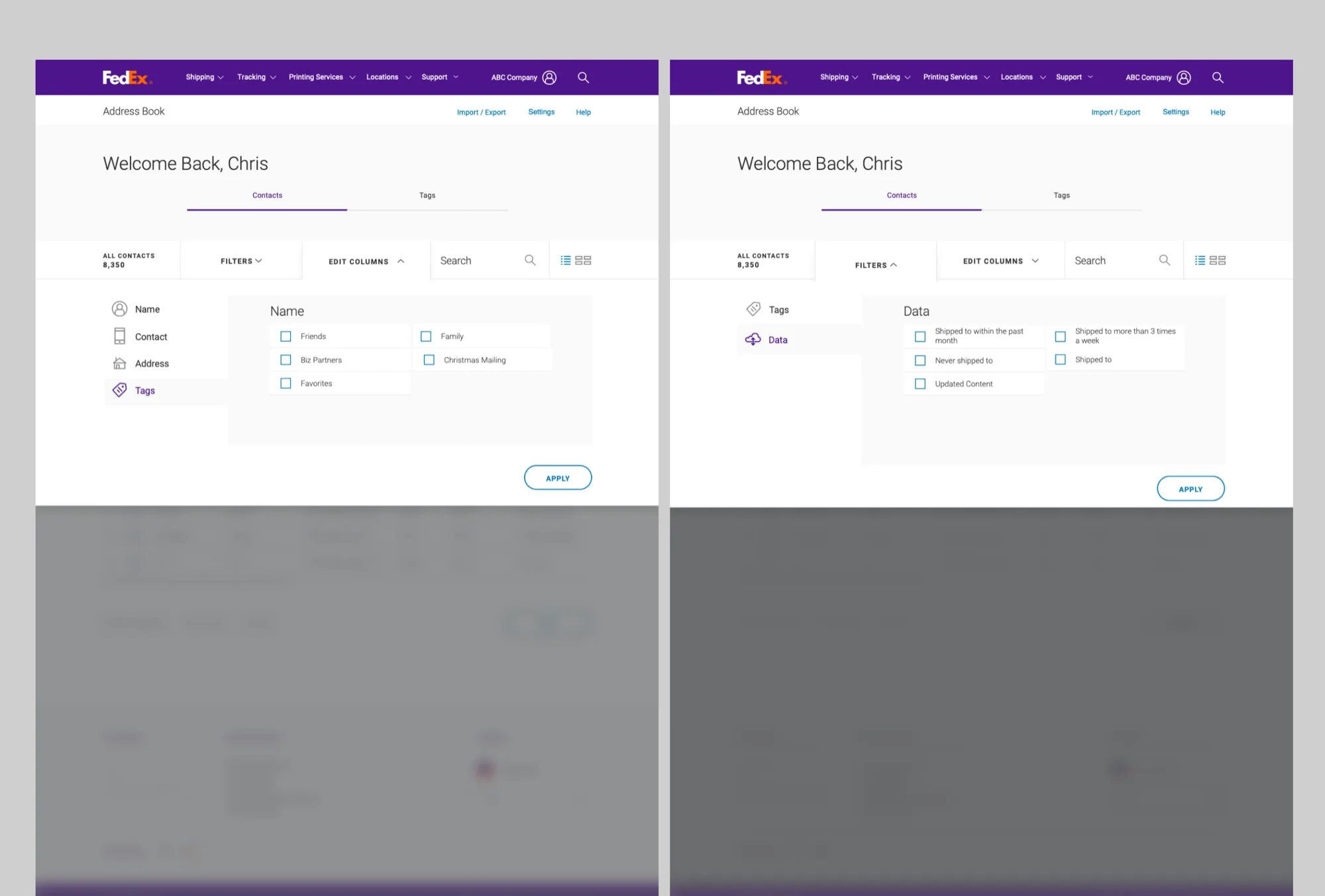
The legacy address book had known usability issues, but no one had a clear picture of how they connected or which users were most affected. The same tool serves an enterprise shipper with thousands of contacts and a retail user shipping twice a year.
I led the usability research that surfaced what was actually broken, and the redesign that followed. Five clear patterns became the organizing logic: modernize, clarify, anticipate, simplify, flex.
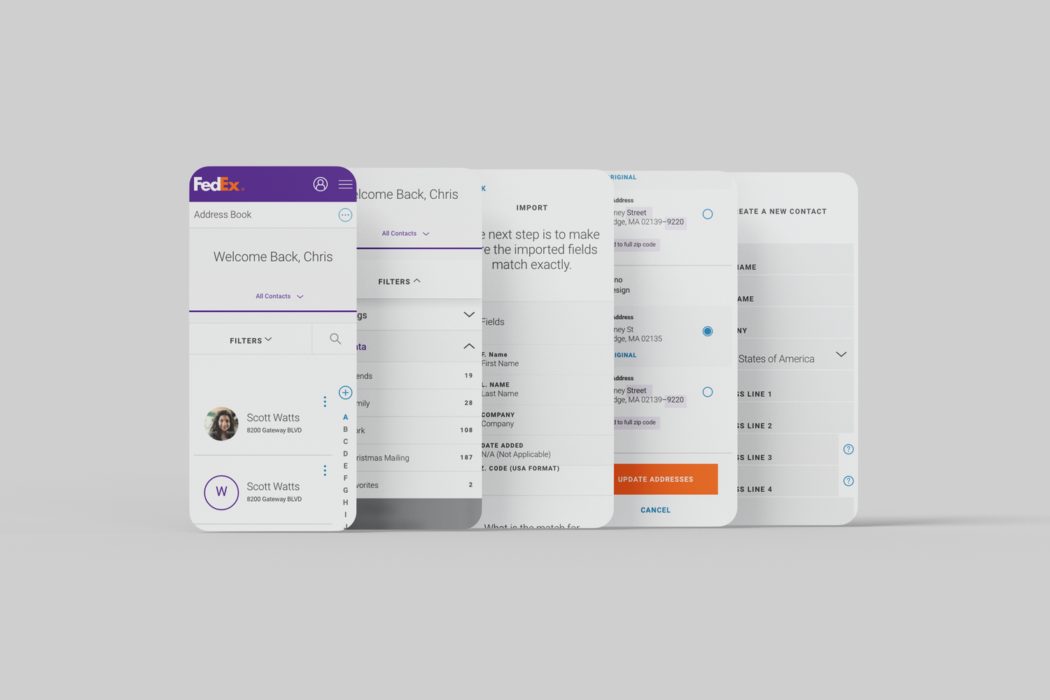
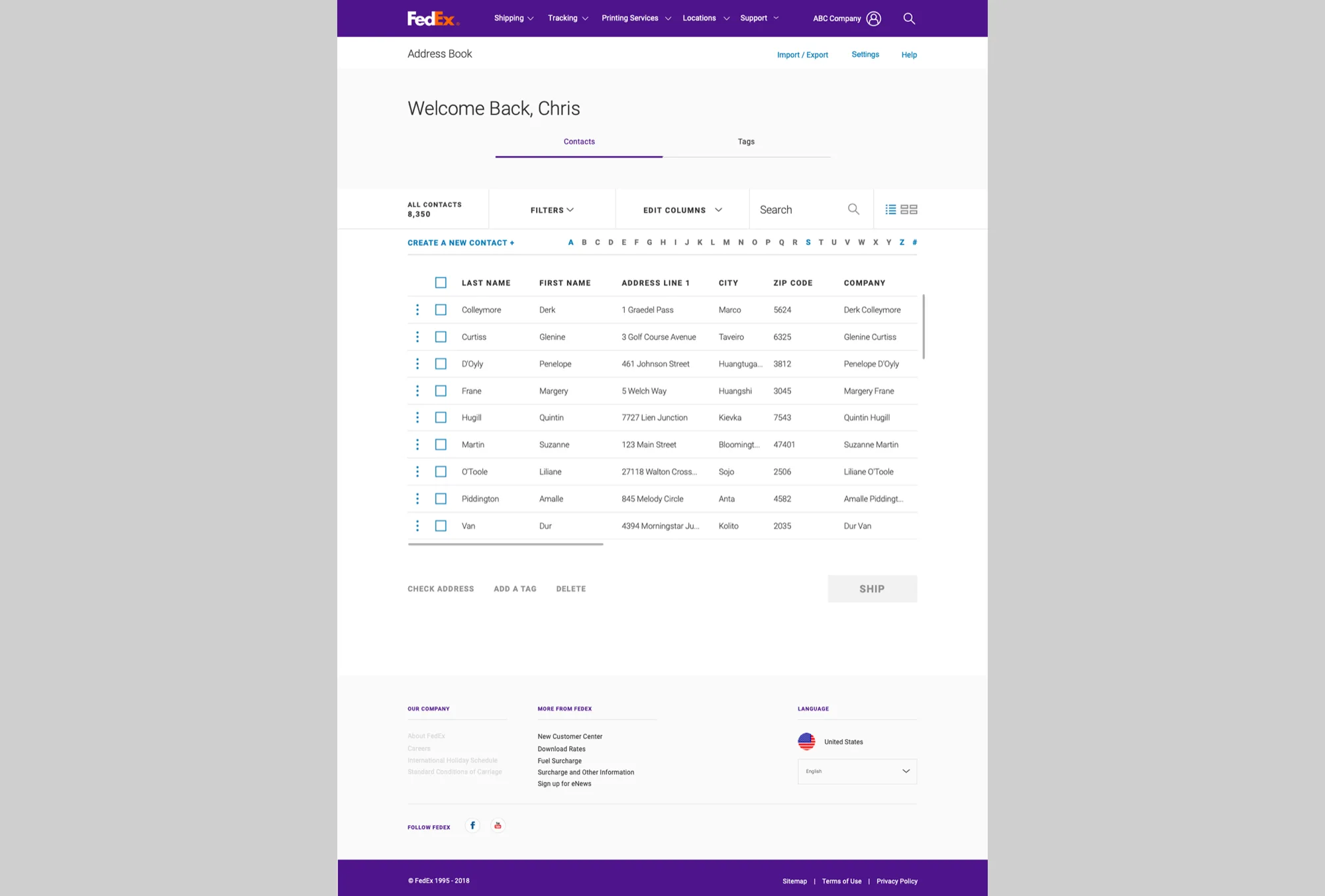
A unified cross-platform experience serving 220+ countries, with a spec-ready handoff engineering could build without interpretation.
Research, not assumptions.
The legacy address book had known usability issues, but no one had a clear picture of how they connected or which users were most affected. Before designing a solution, we had to understand the real scope of the problem.
That meant starting with research, not assumptions. The same tool serves an enterprise shipper with thousands of contacts and a retail user shipping twice a year.
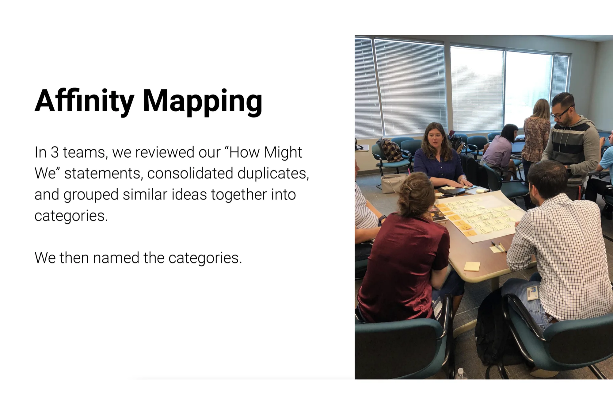
Five clear patterns in how users were struggling.
Research surfaced five clear patterns in how users were struggling. Those patterns became the organizing logic for the redesign: modernize, clarify, anticipate, simplify, flex.
Small interaction. High frequency. Get the details right.
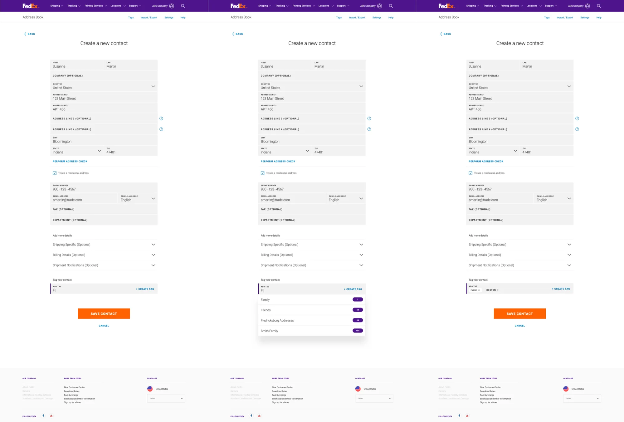
The work focused on reducing steps for the most common tasks while keeping edge cases reachable. Address entry is a small interaction with high frequency. The details matter more than they look like they should.
shaped every downstream design decision.
served by the unified cross-platform experience.
engineering could build without interpretation.