Forrester
A trusted name. A site to match.
Forrester Research is one of the most respected research and advisory firms in the world. Their digital presence didn’t reflect that. A four-year engagement at Tank Design, one that shaped how I think about design systems and editorial UX.
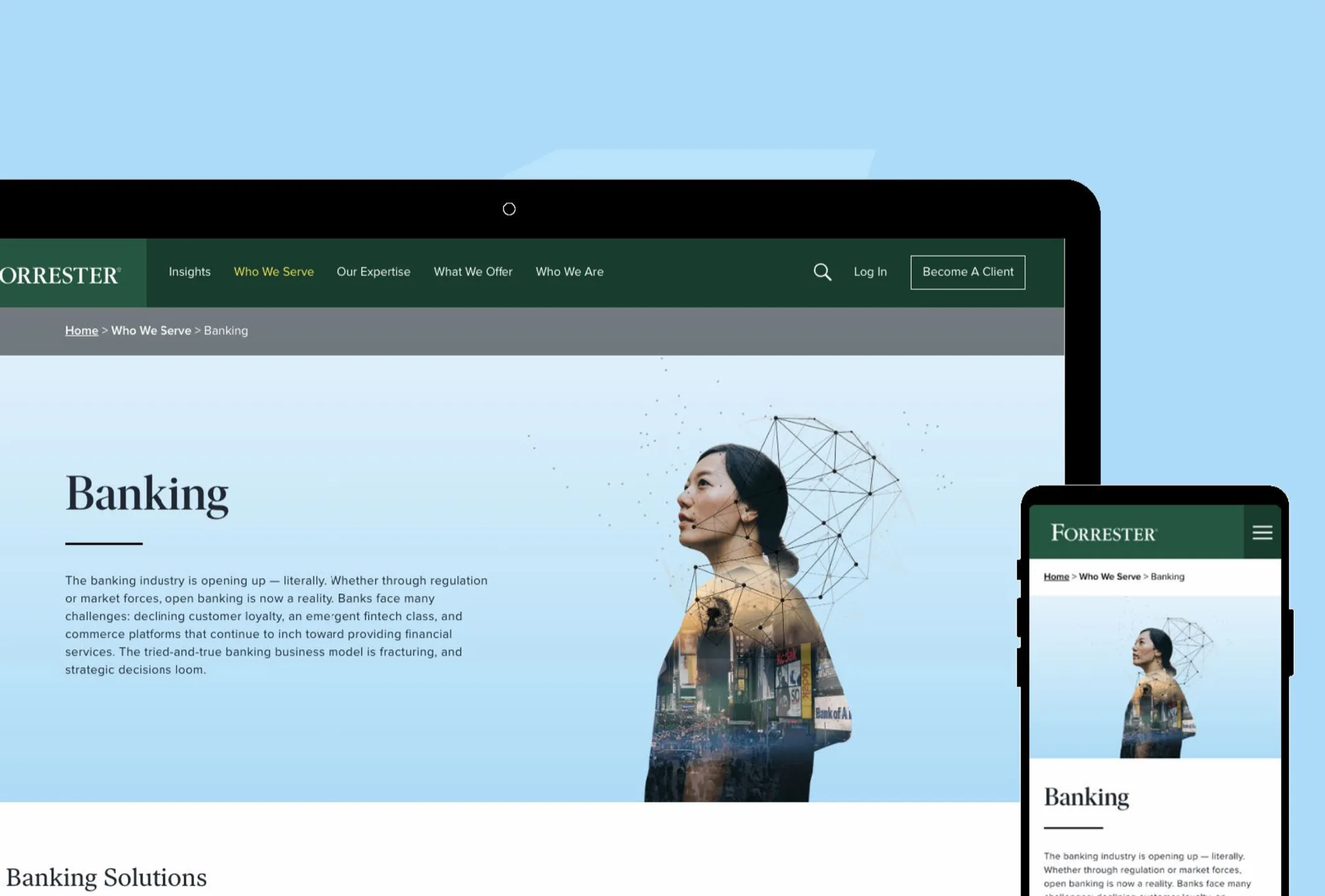
The site served multiple audiences at once: working analysts, enterprise buyers, individual subscribers. None of them had a clear hierarchy, and the visual language had accumulated inconsistencies across years of independent decisions.
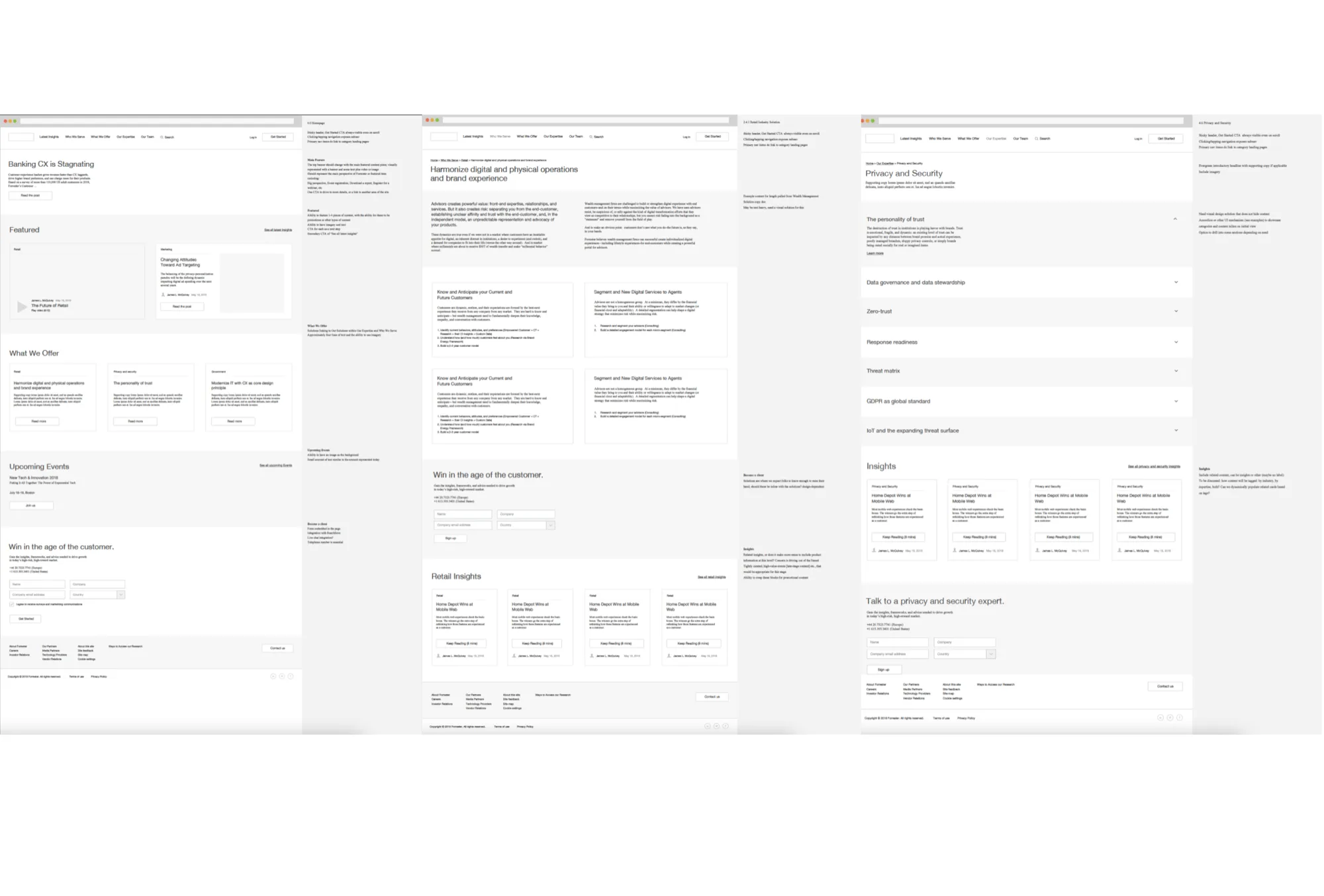
I helped redesign the visual identity and build the component library that unified Forrester’s digital products — a visual language distinctive enough to feel like Forrester, flexible enough to handle hundreds of content types.
Four years building and evolving the system across digital products and channels, then handed off with documentation so the team could extend the system without us.
Multiple audiences at once, and none of them had a clear hierarchy.
The site served multiple audiences at once: working analysts, enterprise buyers, individual subscribers. None of them had a clear hierarchy.
The visual language had accumulated inconsistencies across years of independent decisions. The site worked, technically. It just didn’t communicate the authority of the brand behind it.
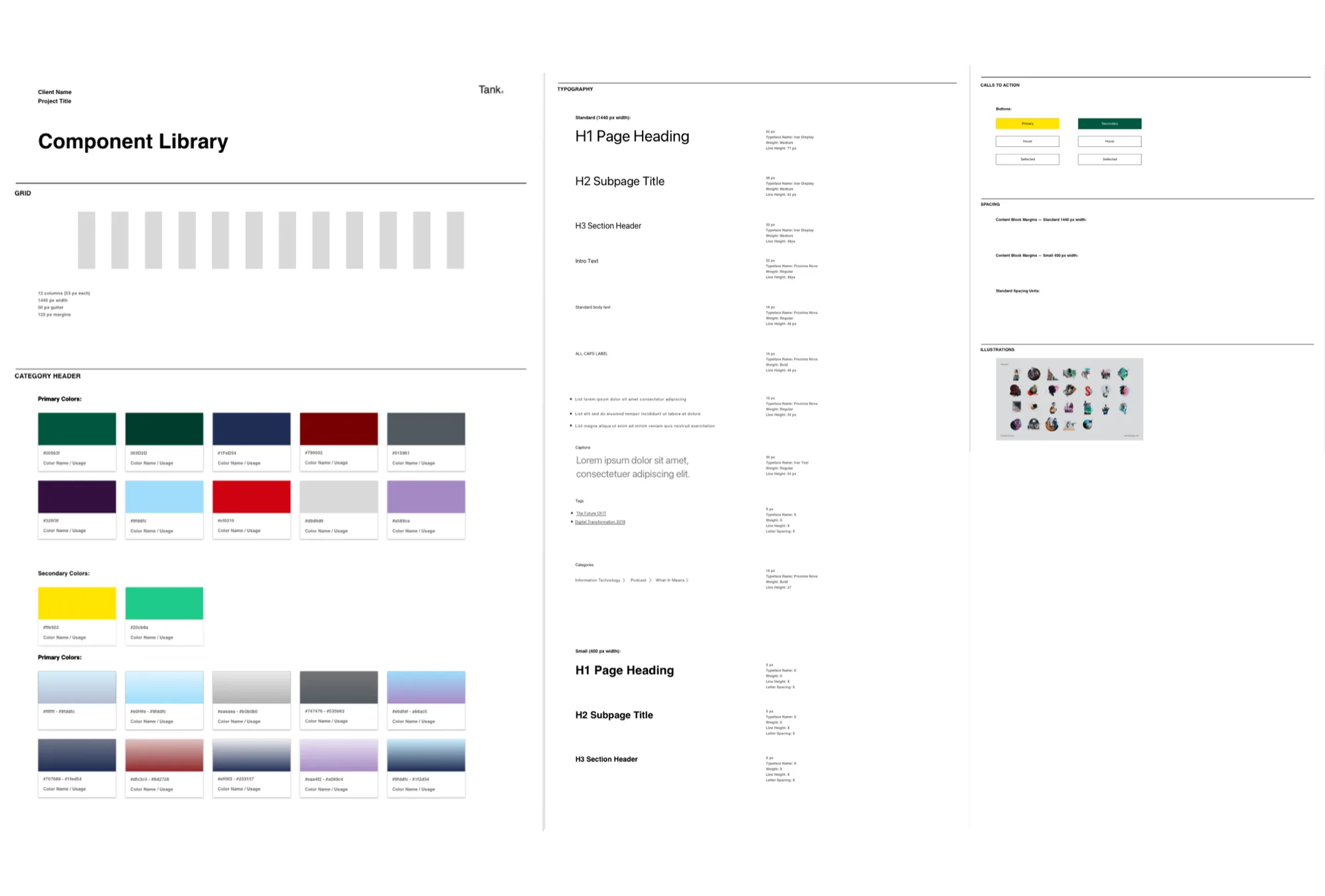
Strong visual equity, finally given a system.
Forrester had strong visual equity but no system for applying it consistently. The redesign built that system: a visual language distinctive enough to feel like Forrester, flexible enough to handle hundreds of content types.
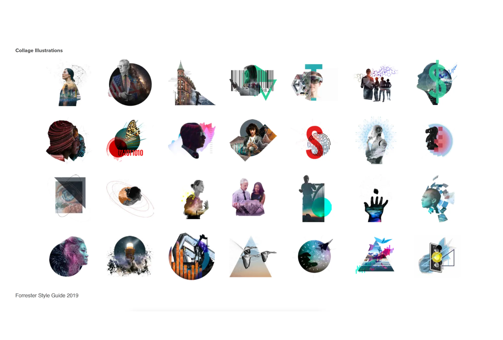
At the heart of it: a collage illustration system with documented rules for themes, metaphors, and composition. Any designer could produce on-brand work without starting from scratch.
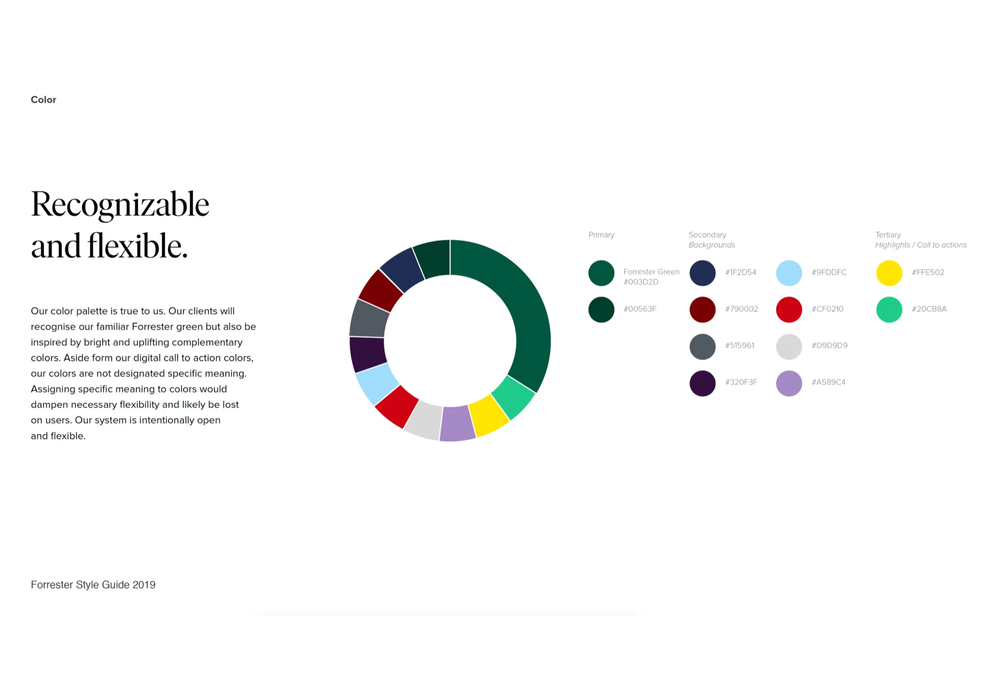
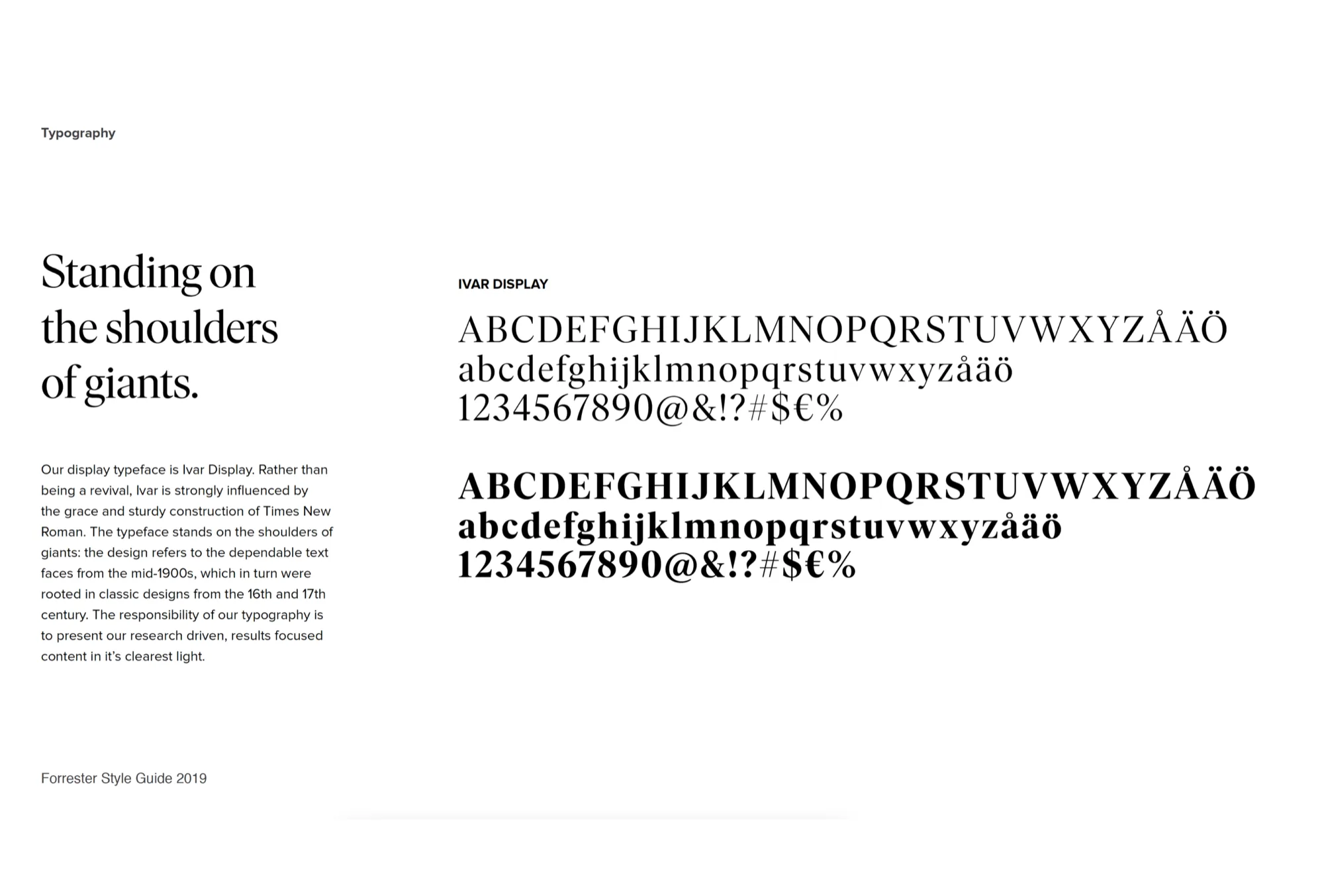
Color, type, and components: documented for the team.
The system credentials — color, type, and components — were documented for the team as the building blocks of go.forrester.com.
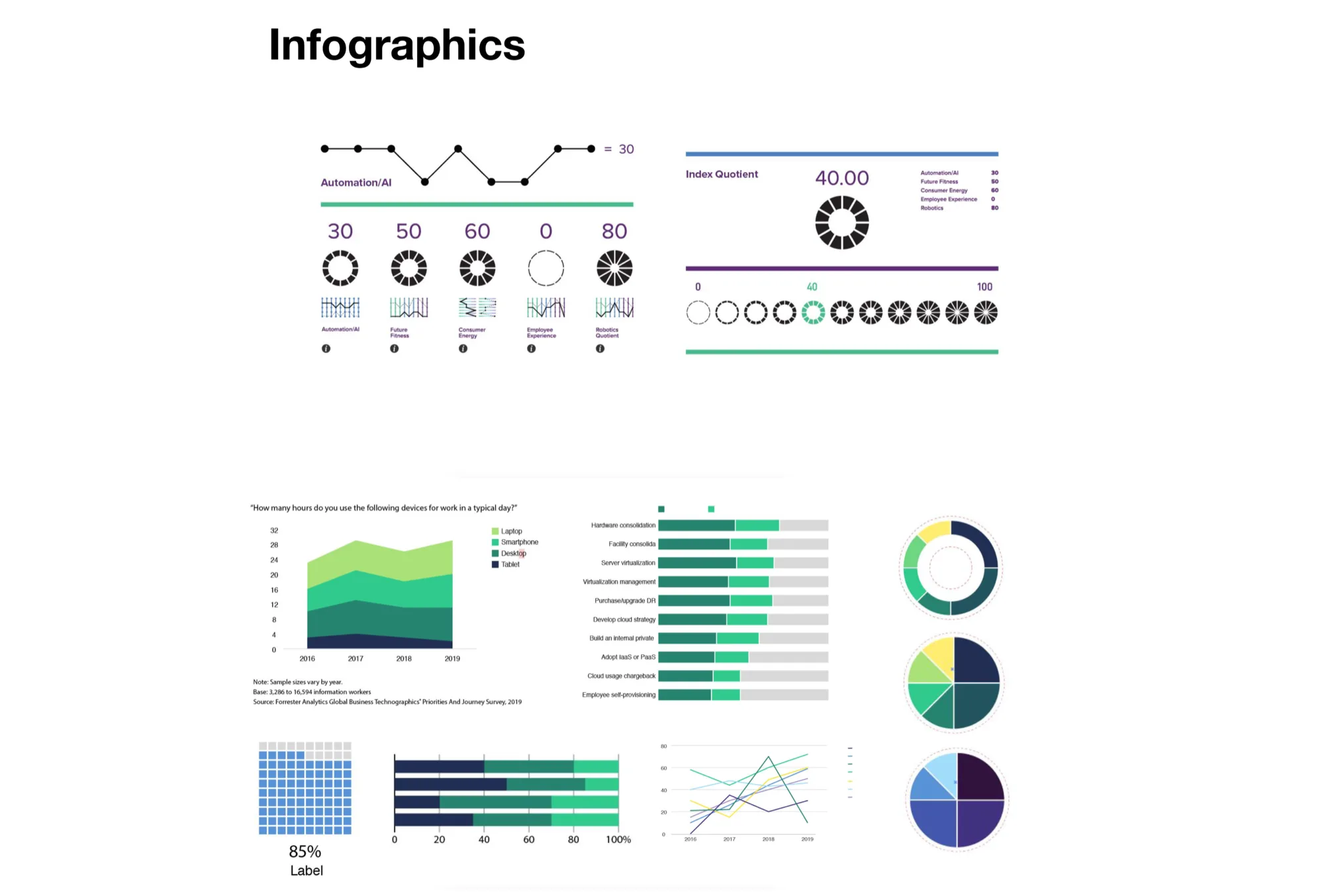
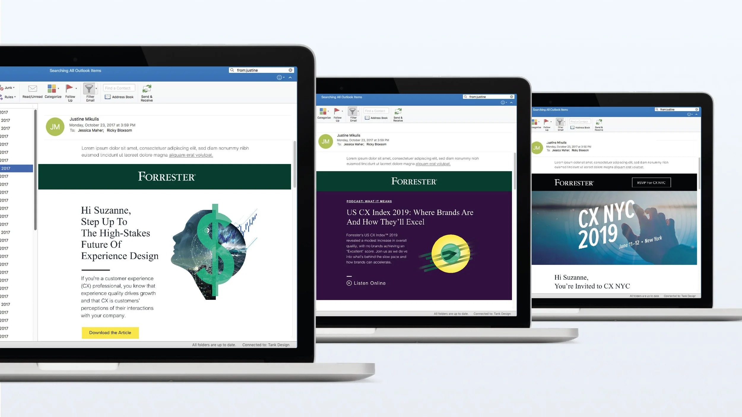
The system extends past the website.
The design intent throughout the Forrester Research visual identity: distinctive enough to be Forrester, flexible enough to scale. Infographic templates and email templates carried the system into research artifacts and messaging.
building and evolving the system across digital products and channels.
covering Forrester’s research verticals.
the team could extend the system without us.