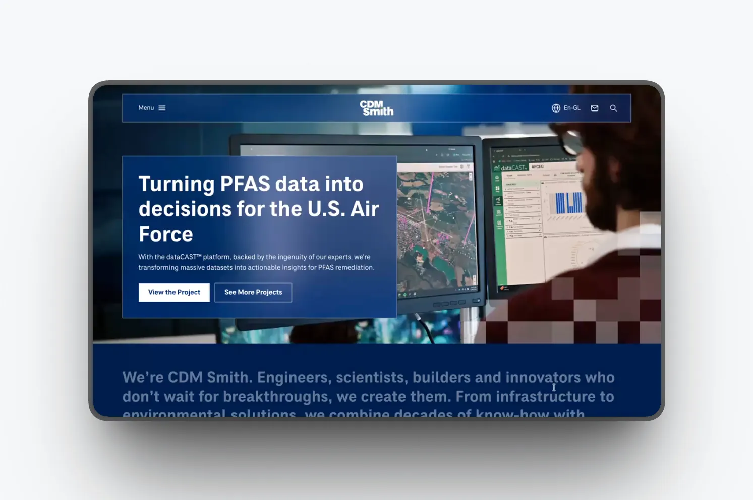
Transforming the way Cognex sells its catalog and assists its customers.
As Senior UX, I worked on Cognex’s two main digital platforms: the cognex.com marketing site and the MyCognex support portal. We rebuilt both sites to match how industrial buyers and engineers actually use them. Most people search by model number and look for documentation, so we focused on those needs.
live site → cognex.com
live support → support.cognex.com
challenge
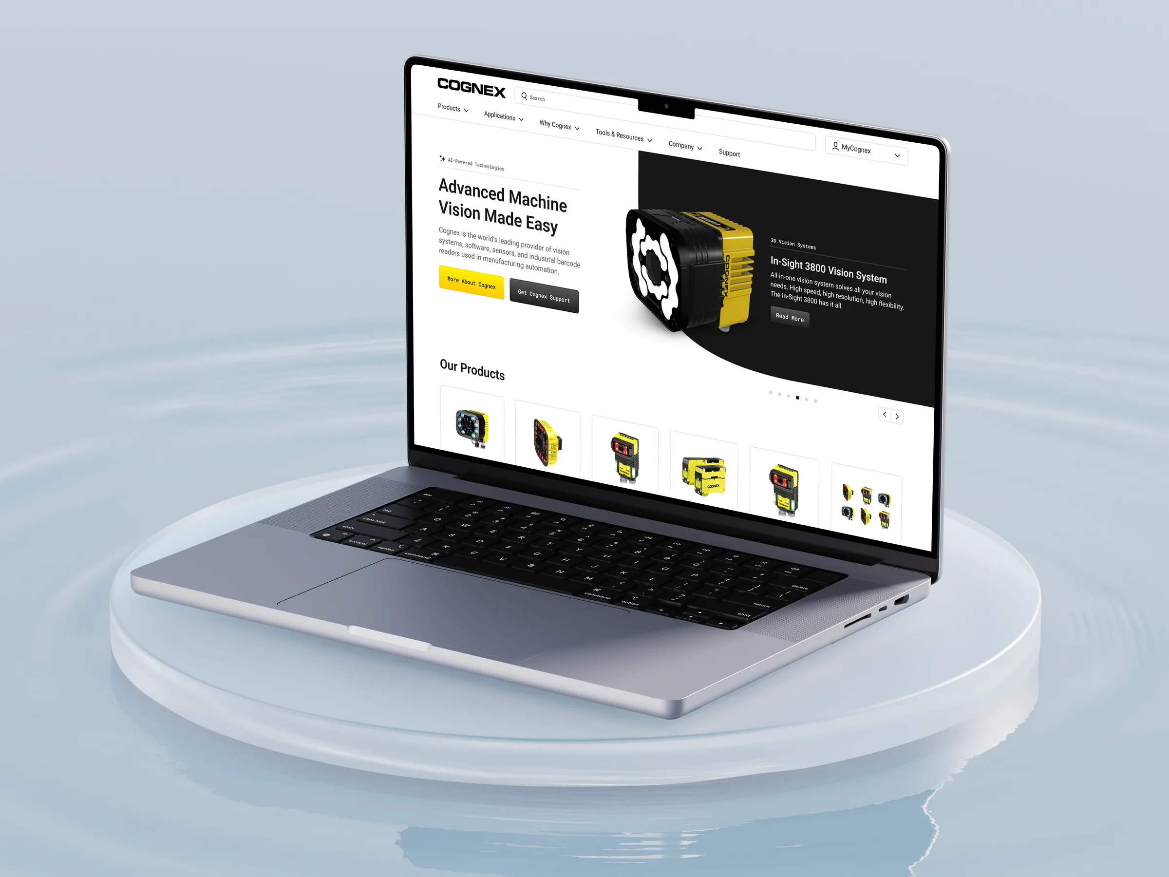
Cognex makes machine-vision systems, barcode readers, and software used in factories around the world. The product catalog is too large for any buyer to remember. We needed two sites: cognex.com for sales and the MyCognex support portal to help customers keep things running.
Both sites were hard to navigate, and support teams felt the impact — engineers looking for a datasheet or drawing often ended up opening a support ticket. The redesign needed to make the large, technical catalog easier to find on both sites.
voice of customer
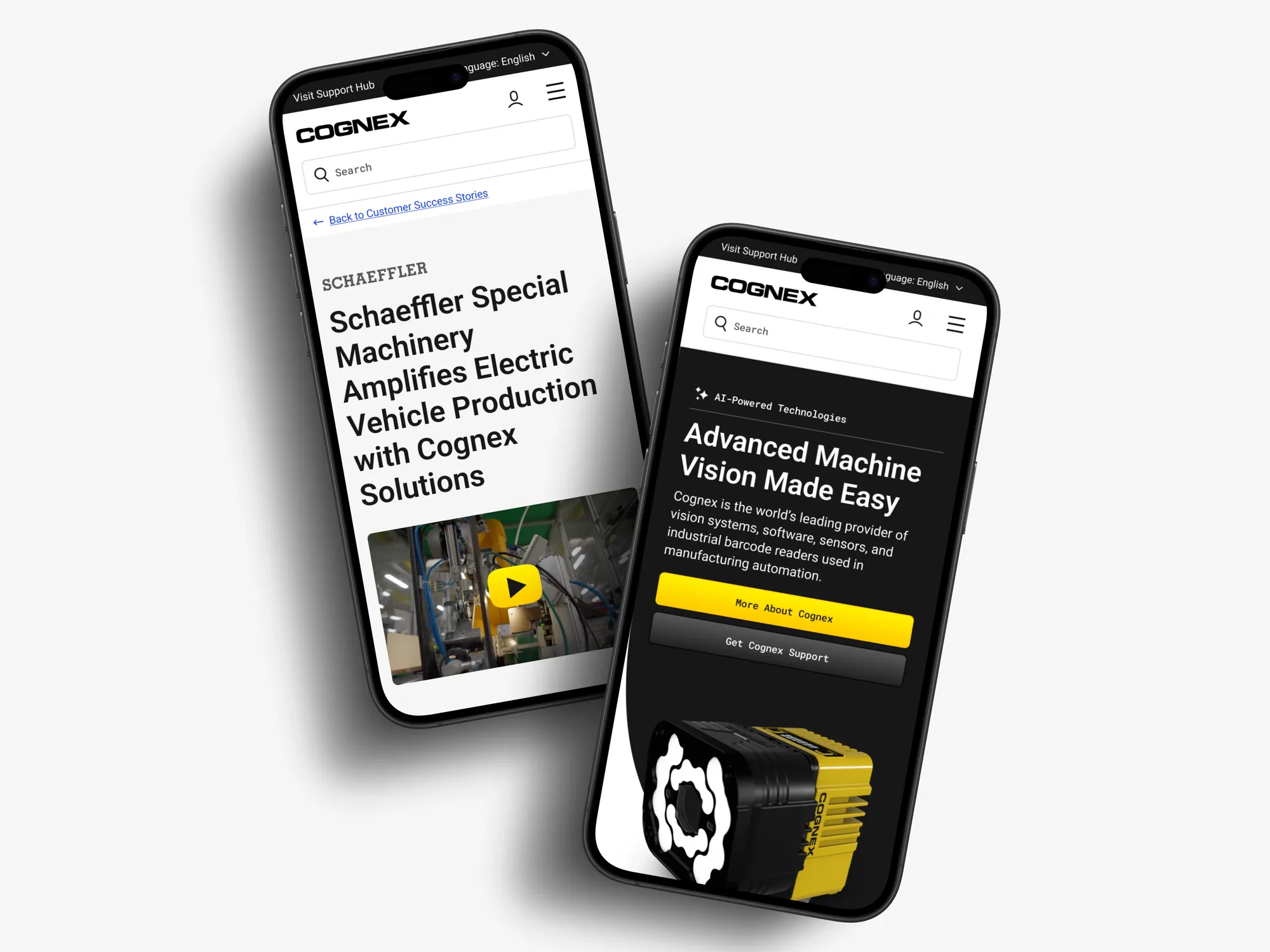
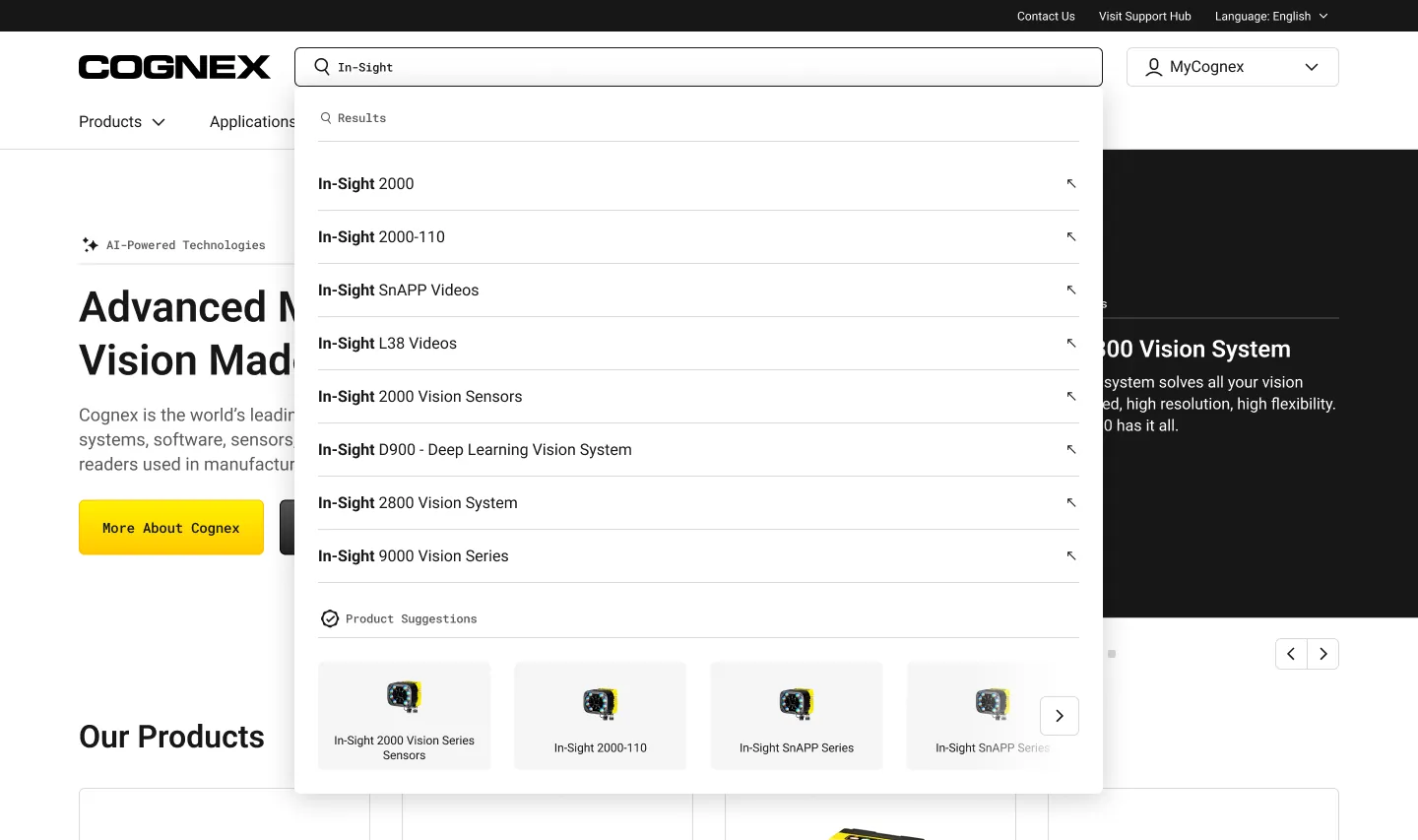
We ran moderated tests before finalizing the design and saw the same pattern every time. Everyone used the search bar first and typed in a model number, like “DM375” or “DataMan 375.” Most users ignored the top navigation and simply skipped past it.
Other feedback was just as clear. Users called the account profile “wasted space.” They wanted a short description and a date before downloading a large file. Few people used the left-hand filters. Most visitors came to the support site for documentation and drawings, so we focused our design on those needs.
how the work operated
The project was more than a basic usability check. We ran three phases: discovery interviews, high-fidelity prototype tests, and a live-site survey. Each phase included about twelve 30-minute moderated sessions per topic, covering the home page, application pages, product details, and the support flow.
Because Cognex’s customers are worldwide, we translated and tested prototypes and scripts in English, Japanese, Mandarin, and Korean, with most testers based in Asia. Before showing any Cognex screens, we studied how people find documents on Dell and Honda support sites. We used these findings in our wireframes.
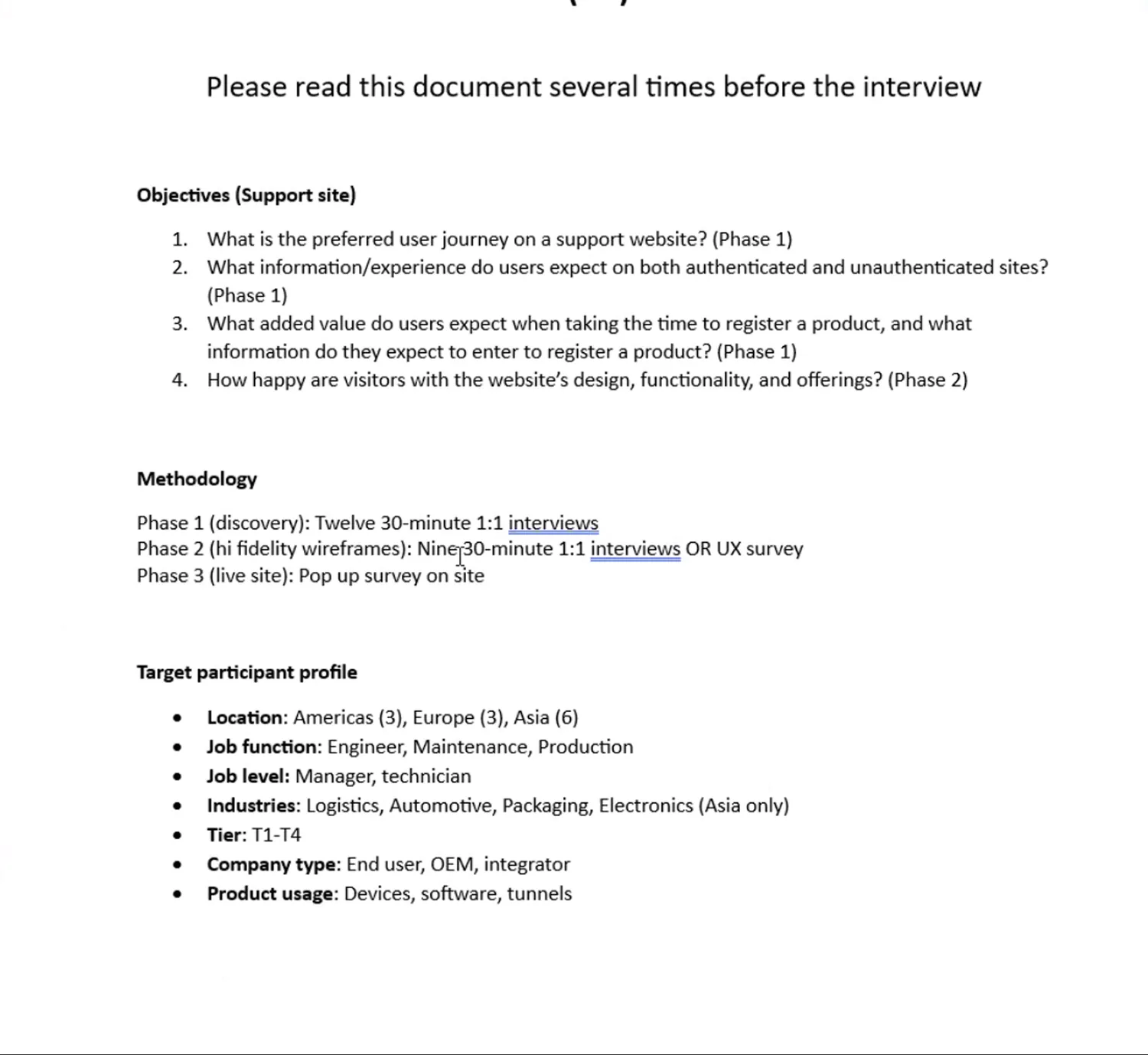
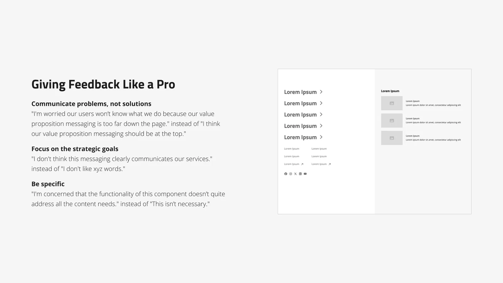
the product finder
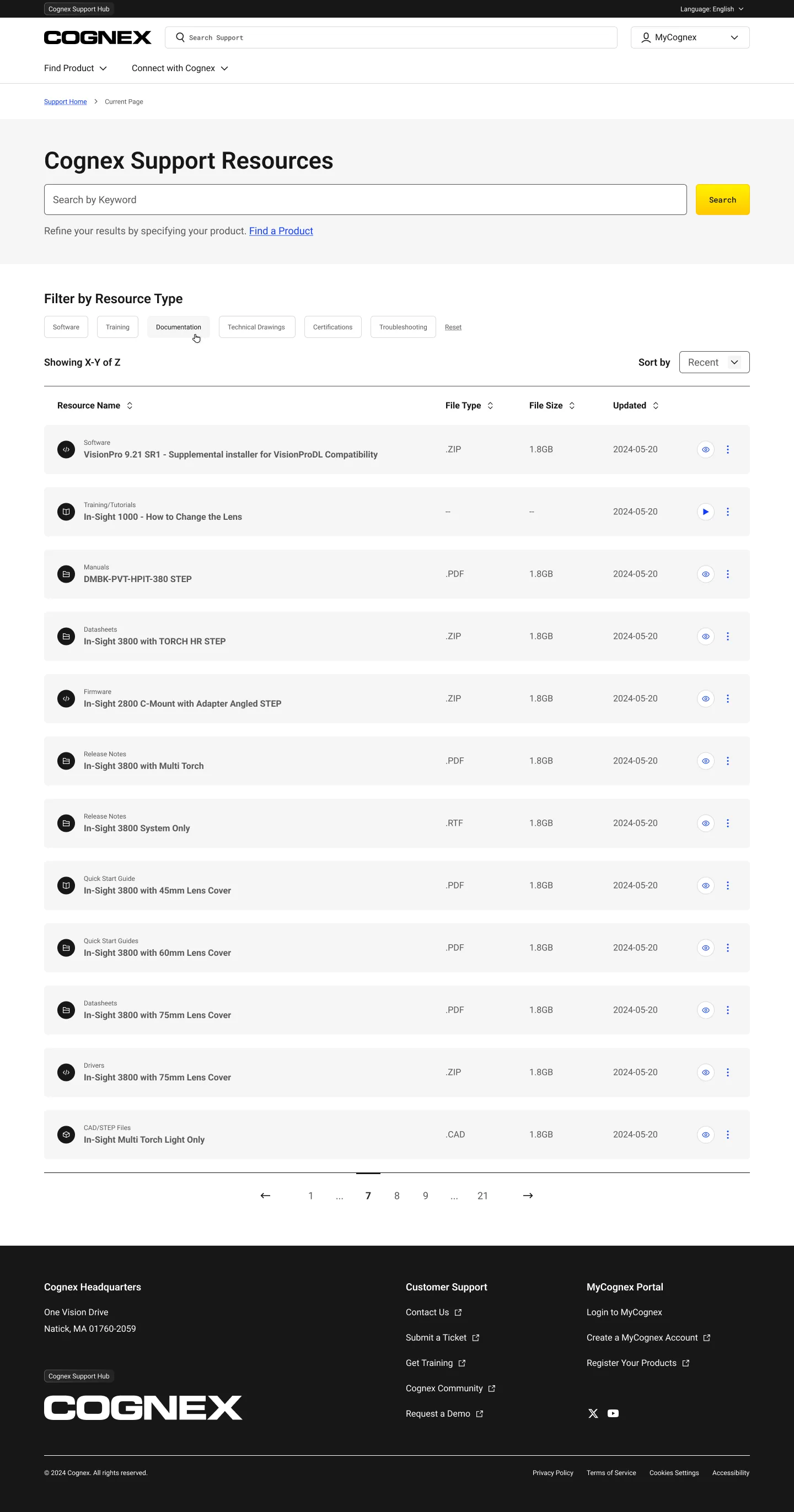
Few users used the filters, so we couldn’t rely on them for discovery. Instead, the Product Finder guides users step by step from product type to the exact downloads. It shows the file type and size before clicking and includes a way to find discontinued products, since customers often ask for older assets.
This is a live, working version of the tool. You can pick a category and try it yourself.
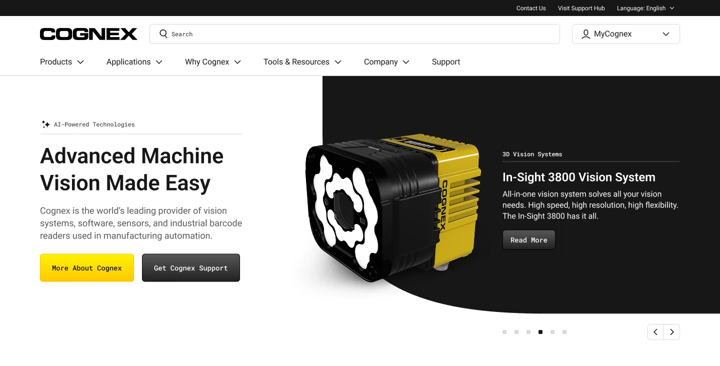
The Mega-Nav, Kept and Earned Its Keep
Given the depth of the catalog, it would have been easier to remove the navigation. Instead, we kept the mega-nav and made it more useful. Products now include a Product Finder entry point. Applications are organized in ways people actually think. Menus feature articles, not just links. The navigation helps people who like to browse, while search and the Product Finder help those who prefer searching.
Support, Put On the Product
The main tasks were finding documentation and drawings, so on complex product and application pages, we put the support options up front. Contact Sales, Download Data Sheet, and View Product Support are near the top. A sticky jump-to navigation keeps long, technical pages easy to read. Every download shows its type, size, and date. This design helps answer questions before they turn into support tickets.
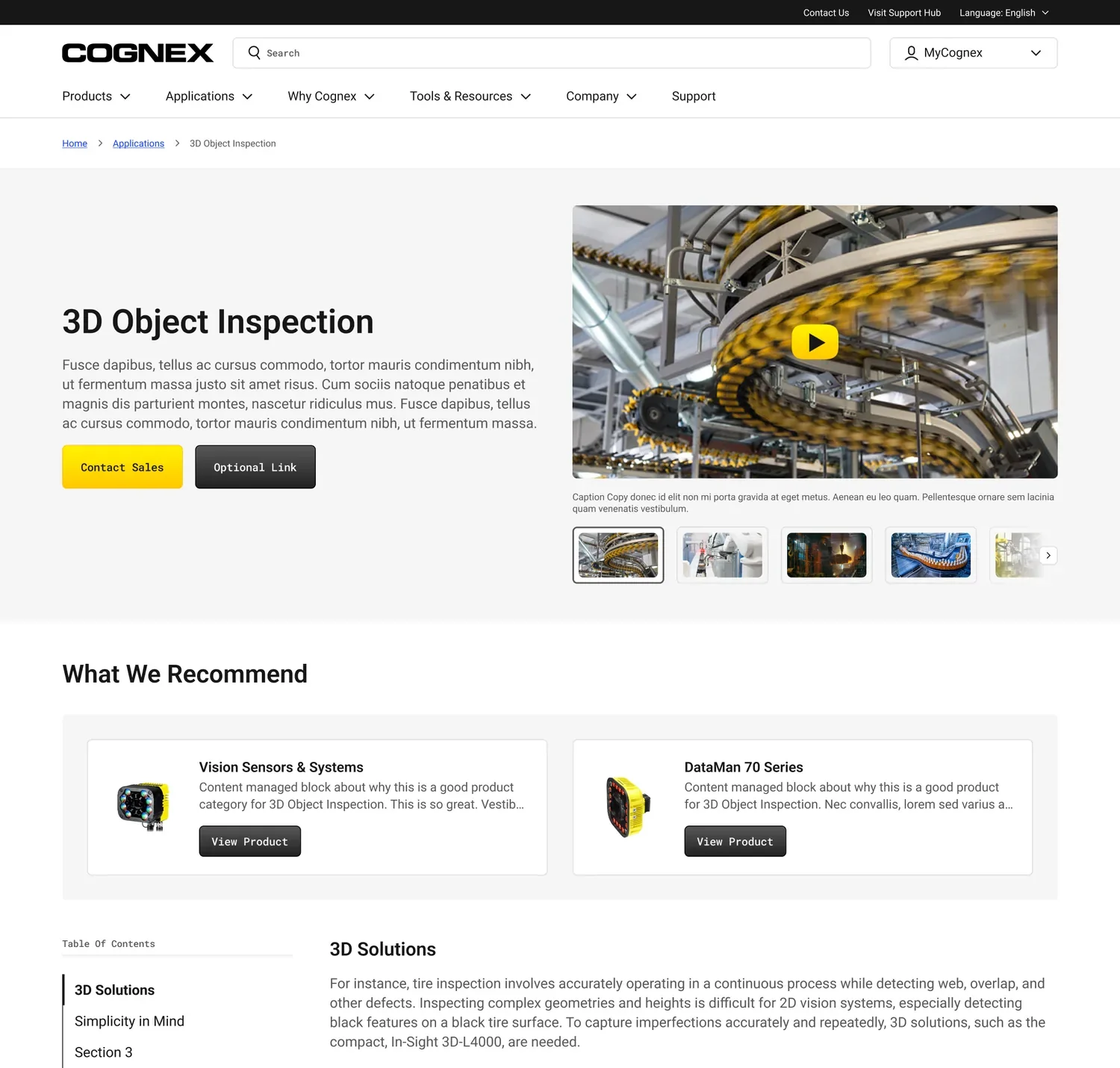
applications, two ways in
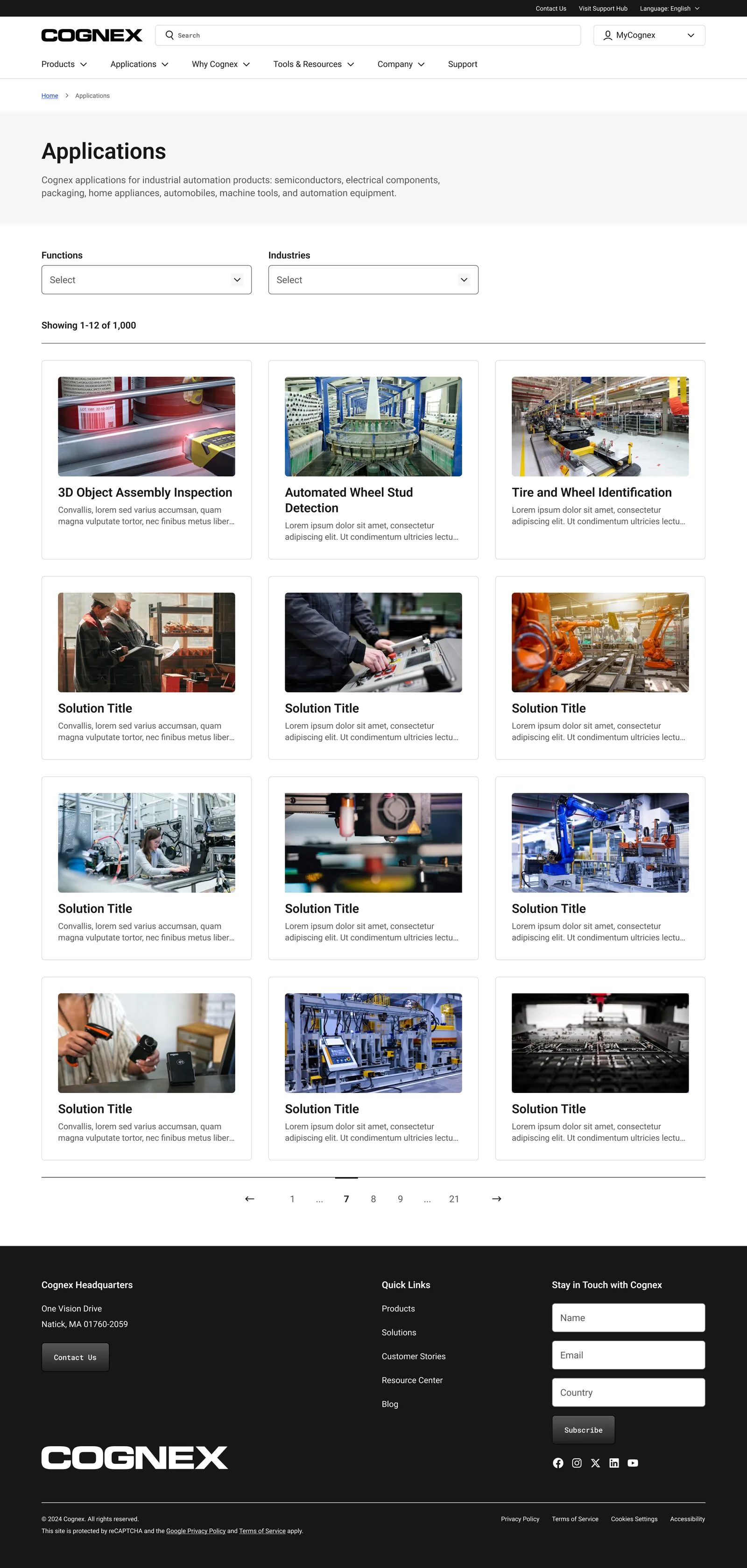
The same content is organized in two ways that match how people think: by function, such as code reading, defect detection, measurement, and guidance, and by industry, like automotive, electronics, logistics, and life sciences.
Solution and safety guides are placed at the top, where buyers looking to scope a project will actually see them, instead of being buried further down the page. The structure matches the questions users are asking.
the support hub, shipped one-to-one
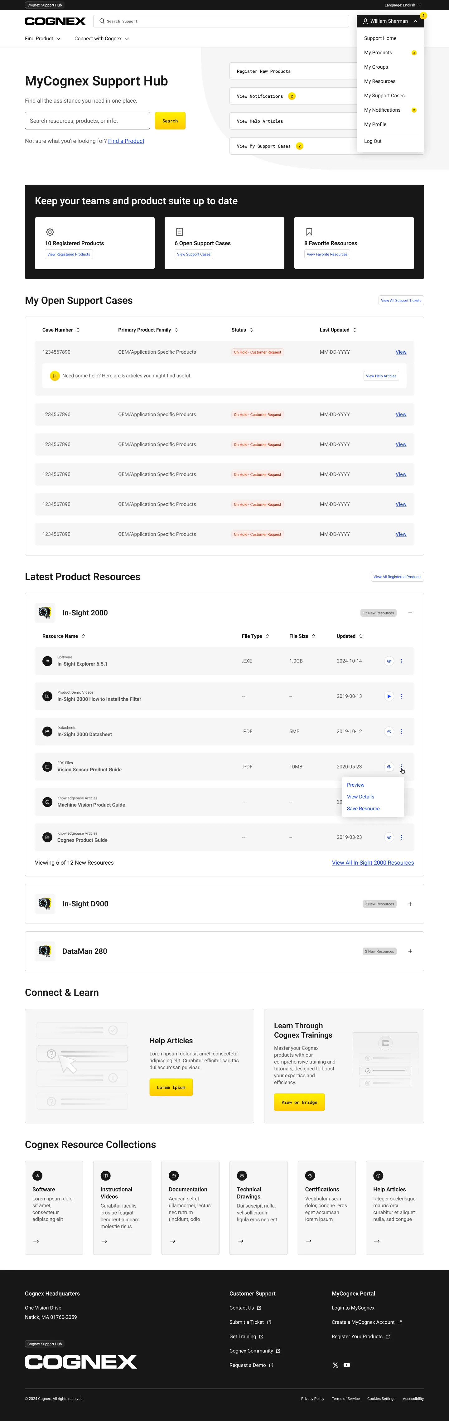
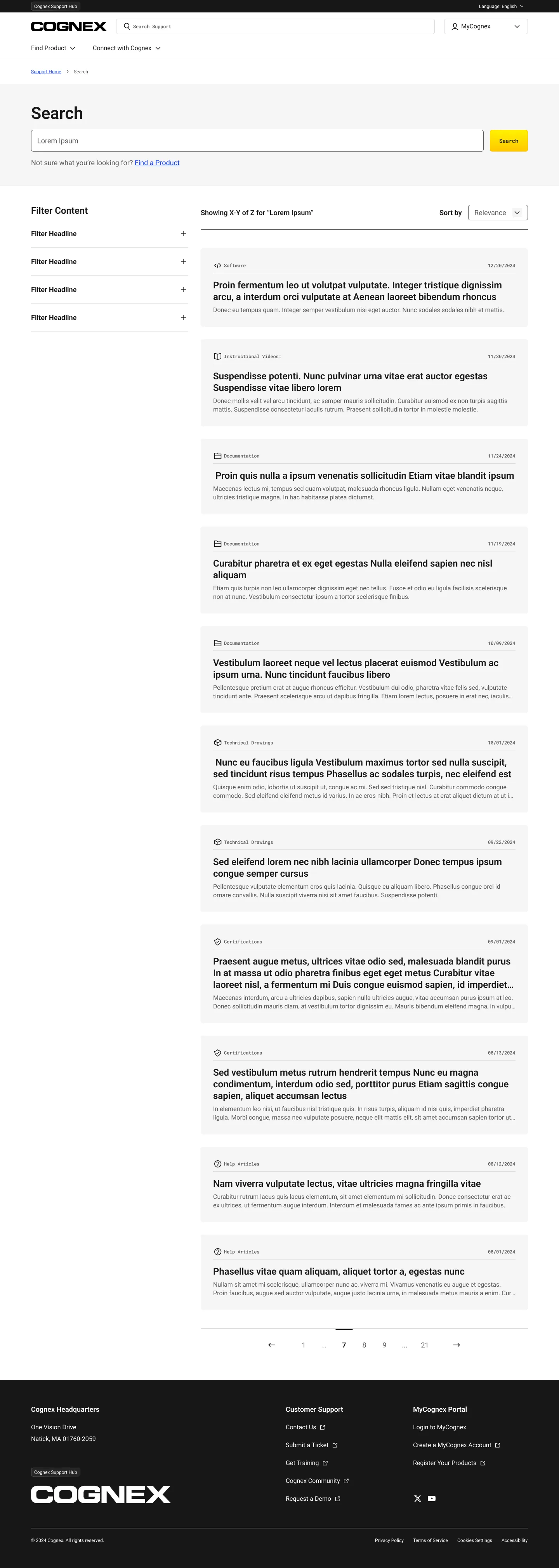
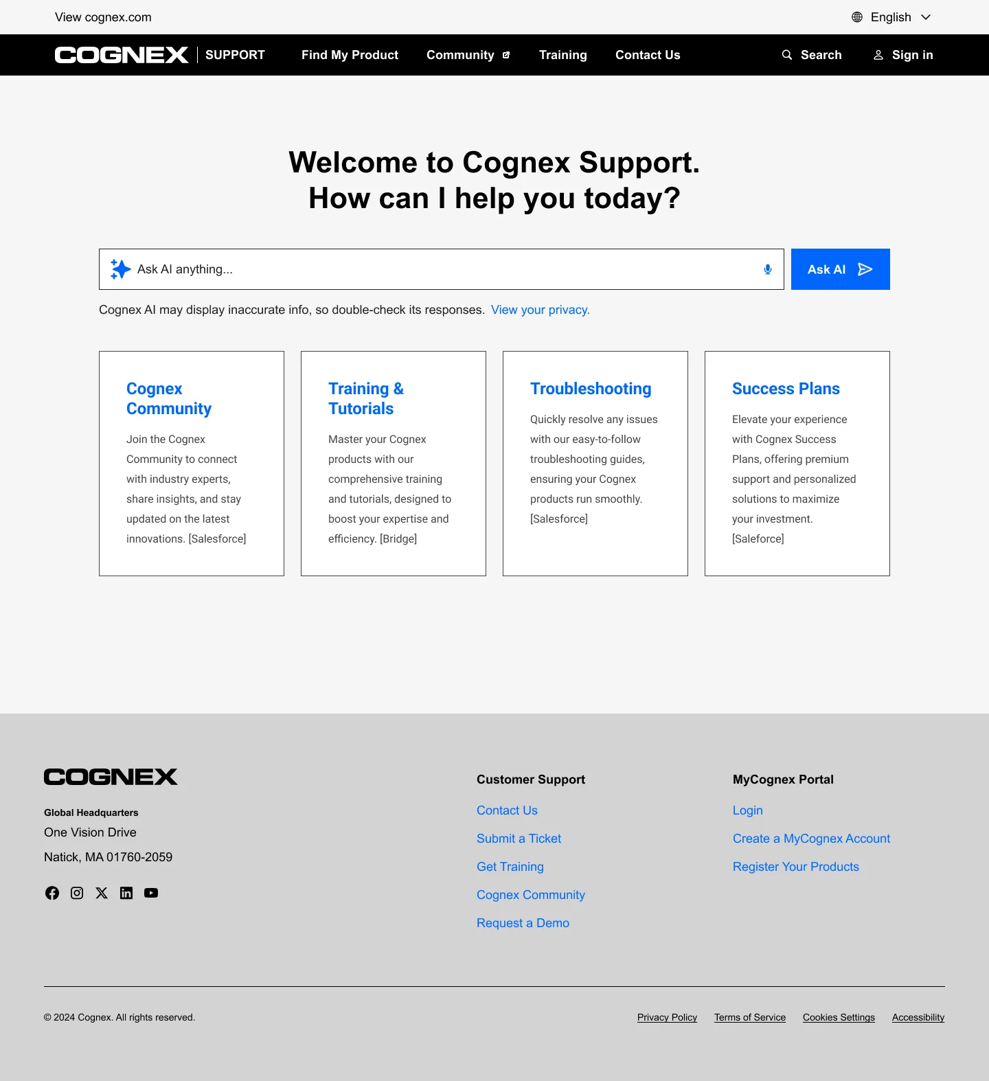
The MyCognex hub starts with a search and adapts to each user. Members see their registered products, open cases, and favorites, while everyone else sees popular and recent resources. Below that, a row of resource collections such as software, documentation, technical drawings, certifications, help articles, and how-to videos makes the top support tasks easy to find.
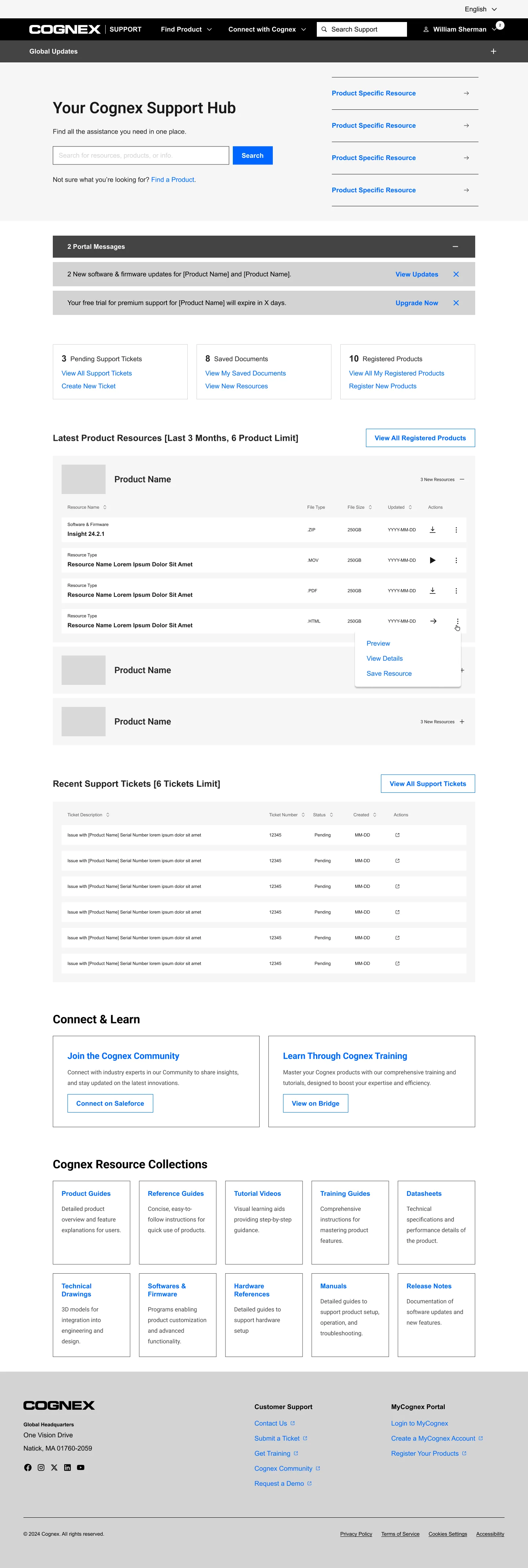
The final product closely matched the original design. You can drag to see how it evolved, from an earlier blue-accented version to the live hub.
 shipped
 earlier
the support hub: earlier exploration → shipped
Search-first, everywhere
logged-out hub · global search · resource listing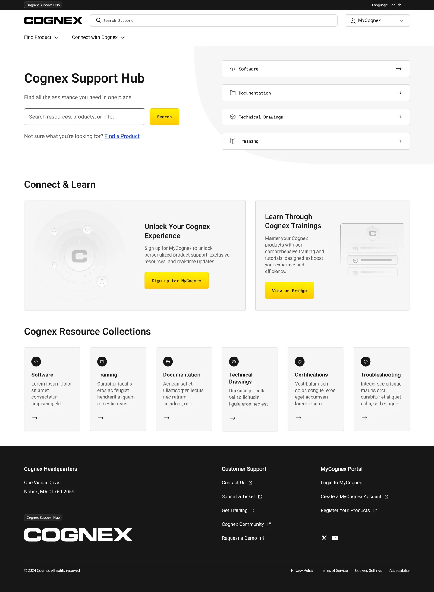
a real account system, not a profile
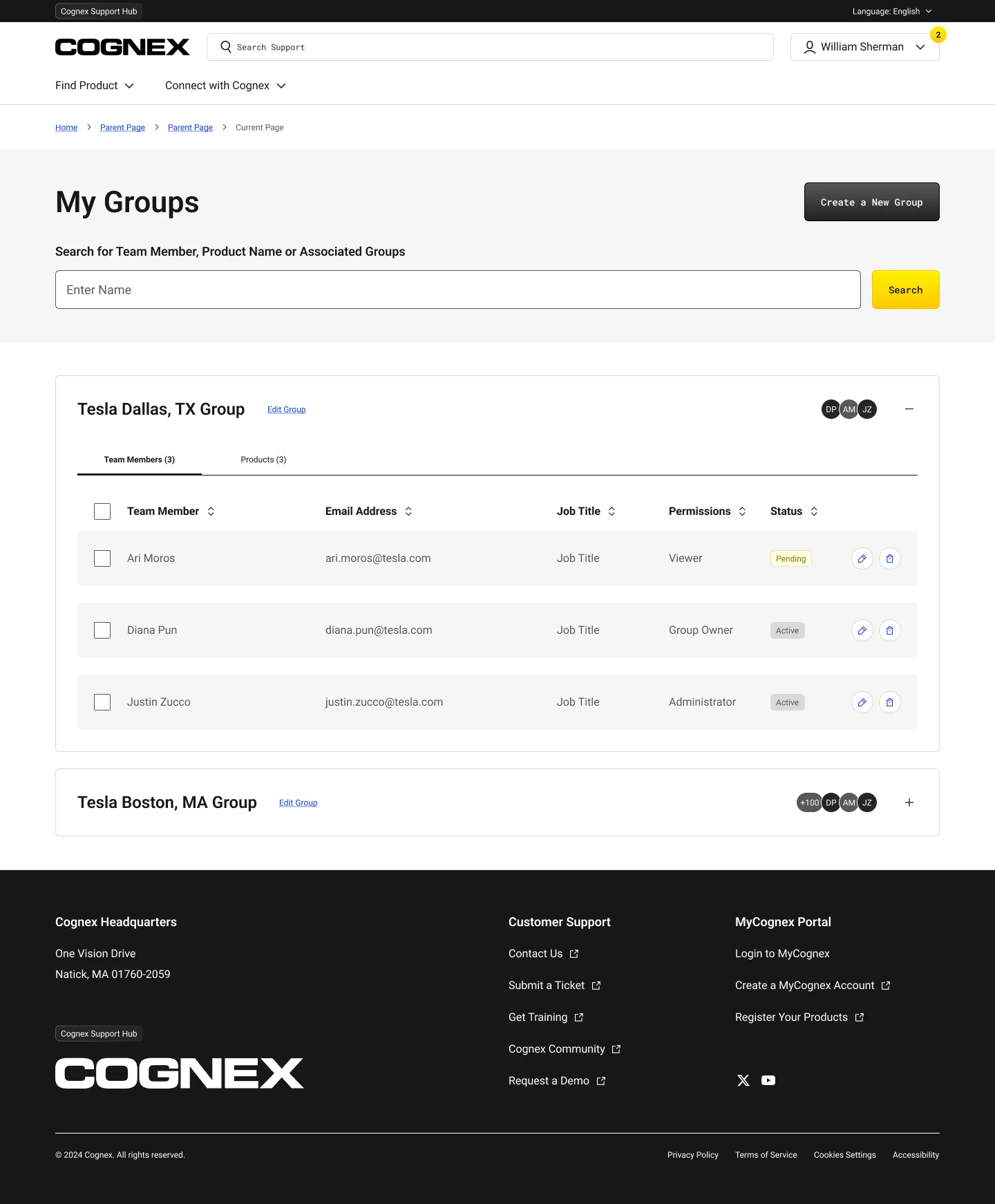
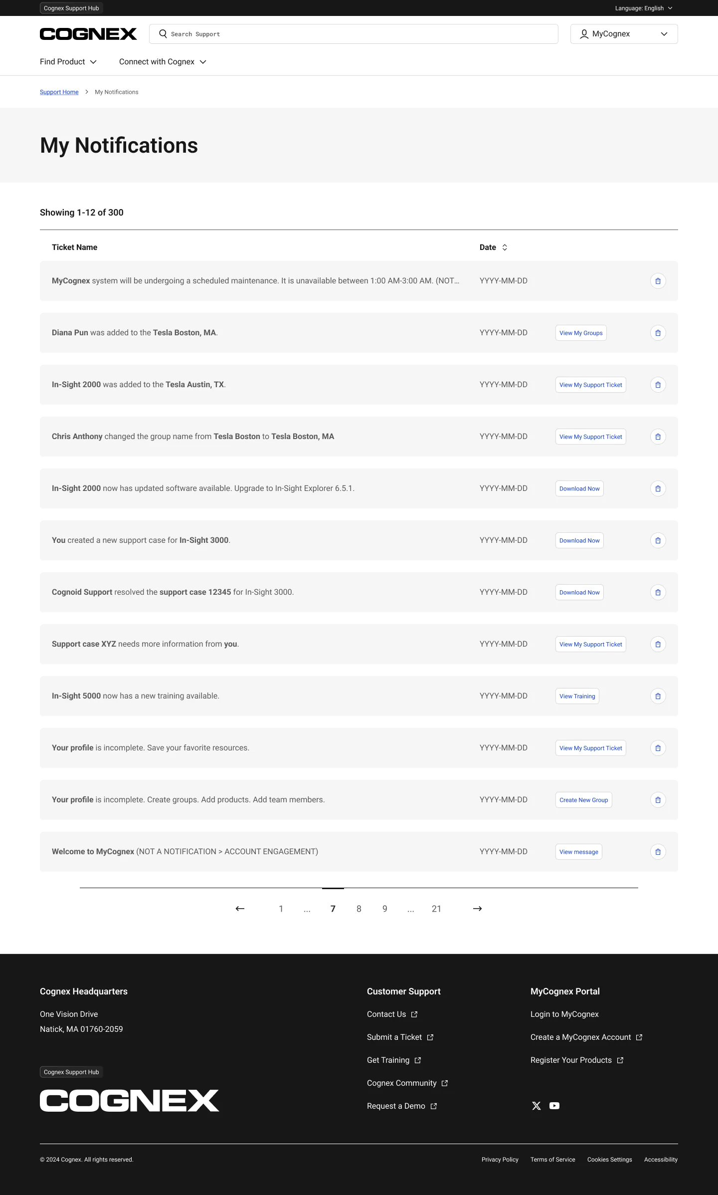
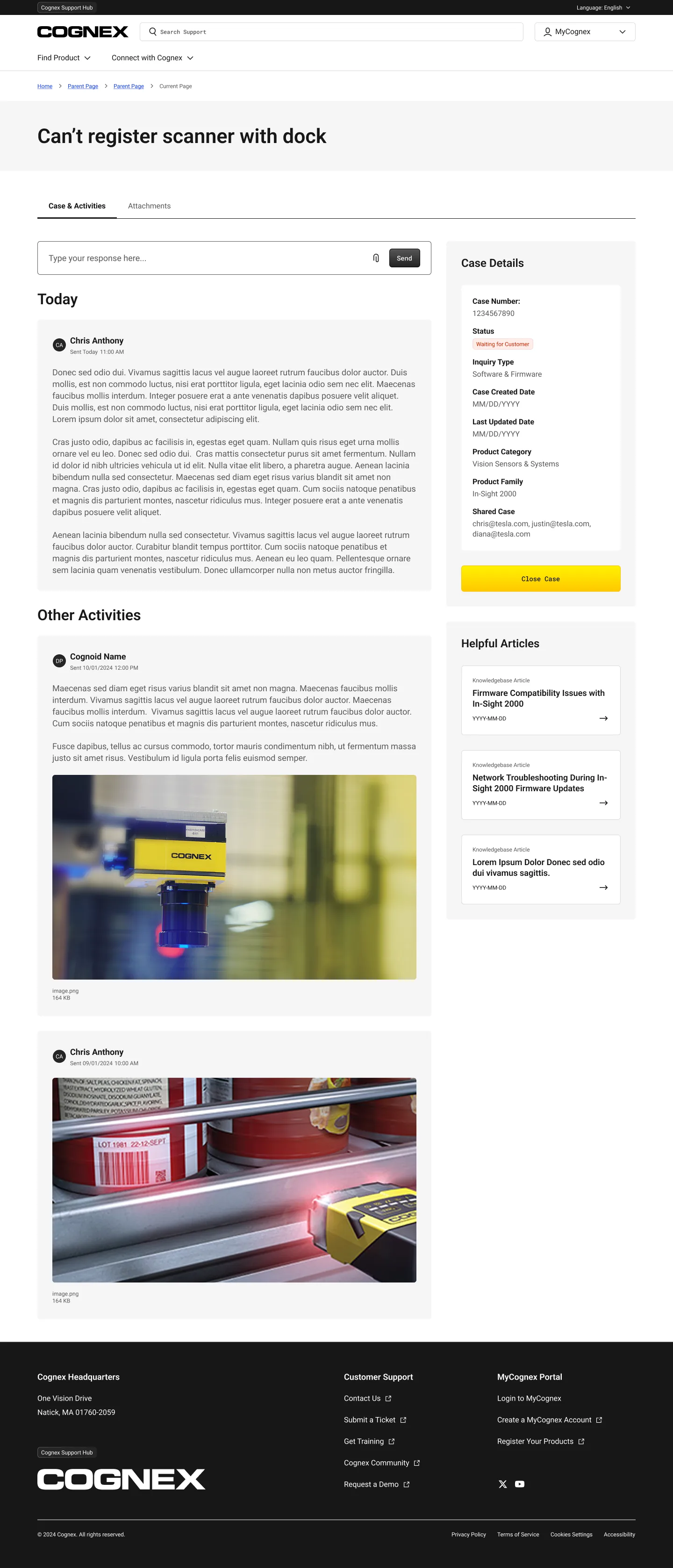
What users once called “wasted space” is now the most useful part of the support site. MyCognex now registers products, shows you what’s new since your last login, manages teams and permissions across sites, and provides a notifications feed and threaded support cases.
This is enterprise B2B account management, with registered products, teams, permissions, notifications, and cases, all designed in a consistent style with the rest of the platform.
Inside MyCognex
registered products · teams & permissions · notifications · support cases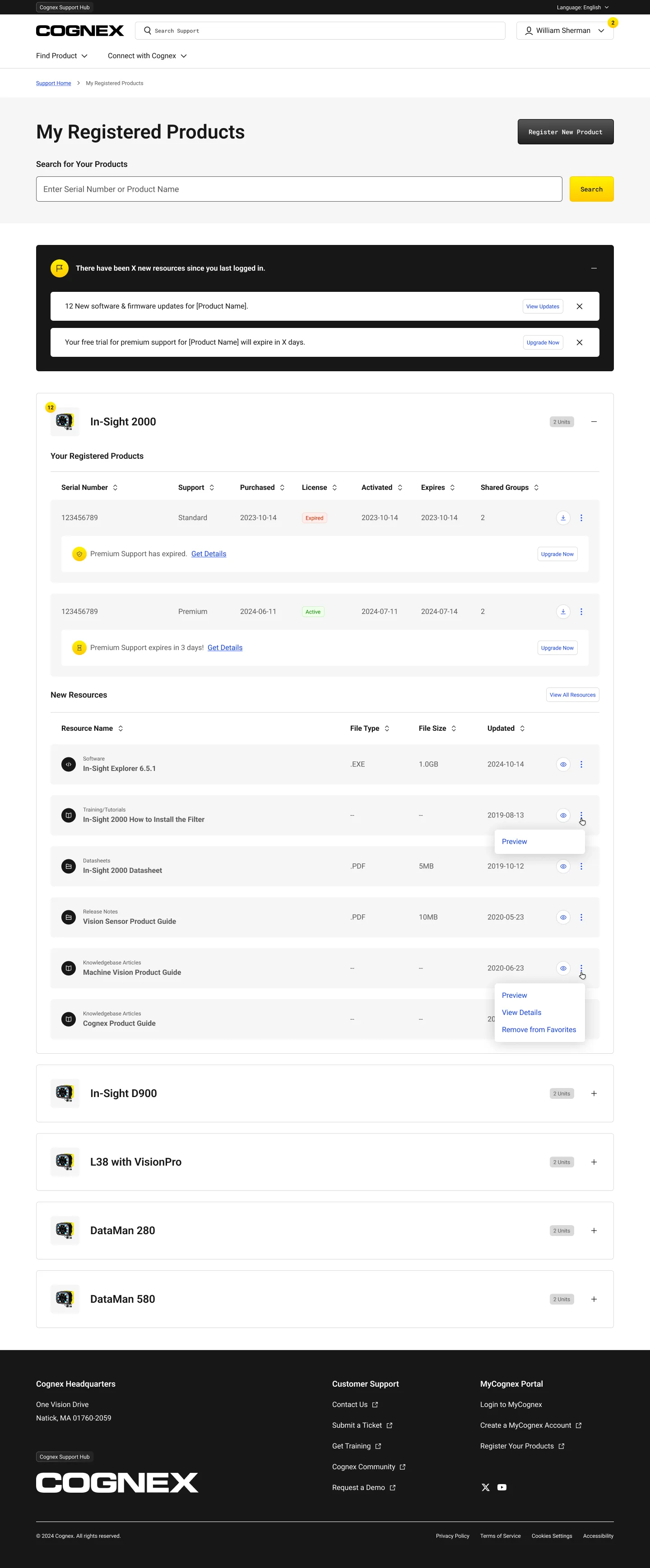
a visual system the product earned
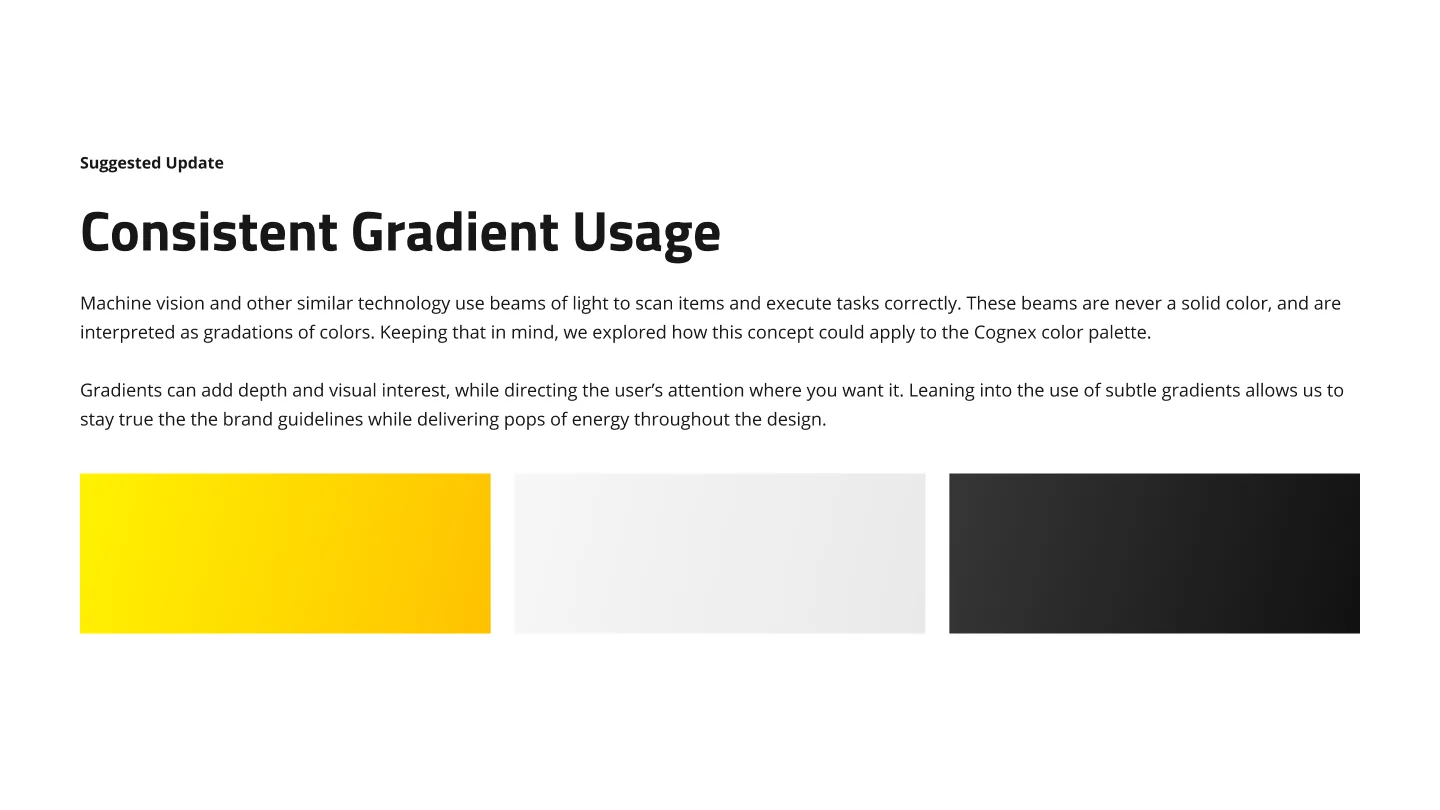
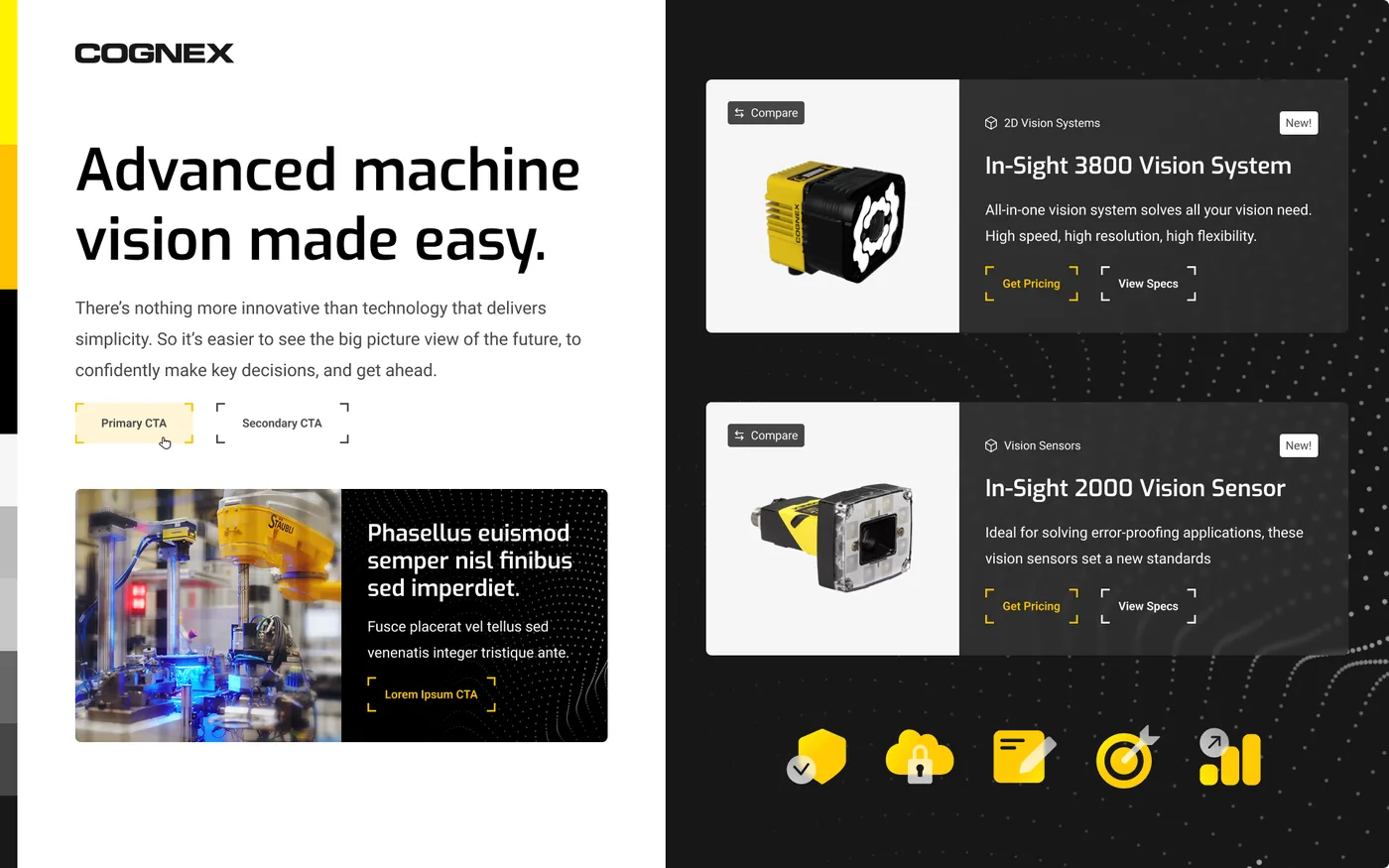
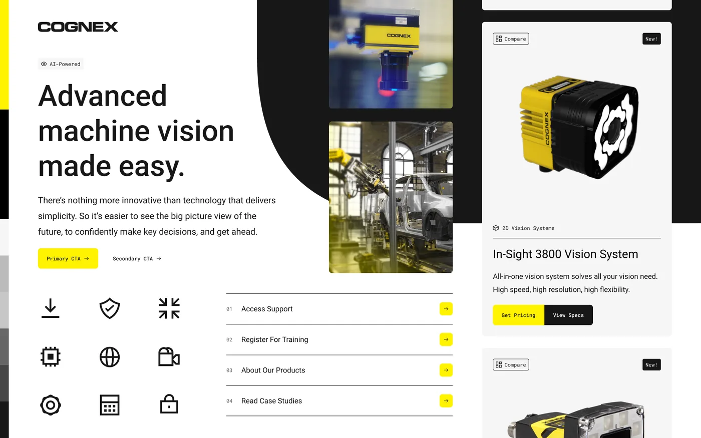
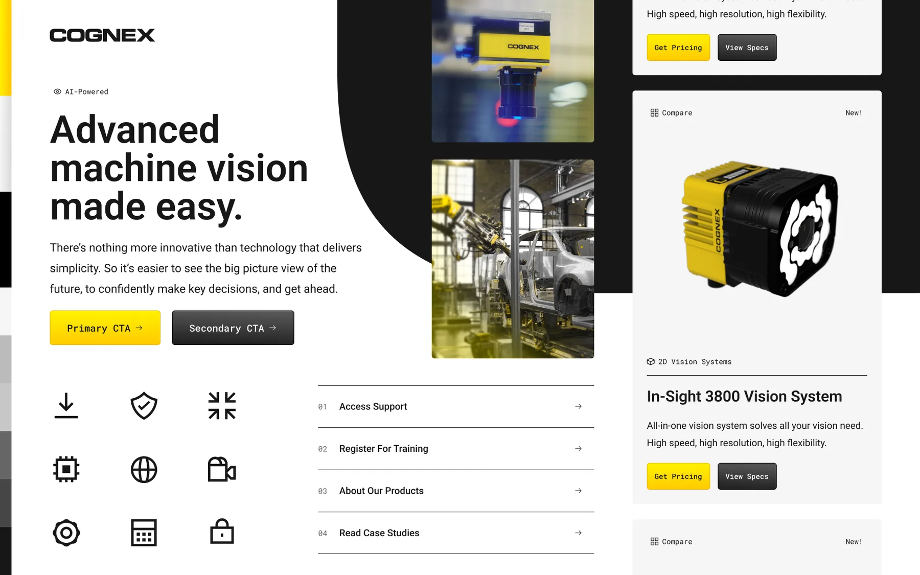
The visual system was inspired by how machine vision reads beams of light as color gradients. We used a subtle gradient system over black, white, and Cognex yellow, and replaced Arial with a geometric, technical sans-serif font.
We didn’t choose the design direction alone. We considered three types of users: those new to the category, moderate users, and automation experts. The design was tested with real client feedback on factors like depth, flatness, and the visibility of a yellow call-to-action against a gray background.
Three directions, one chosen
concept 1 · concept 2 · concept 3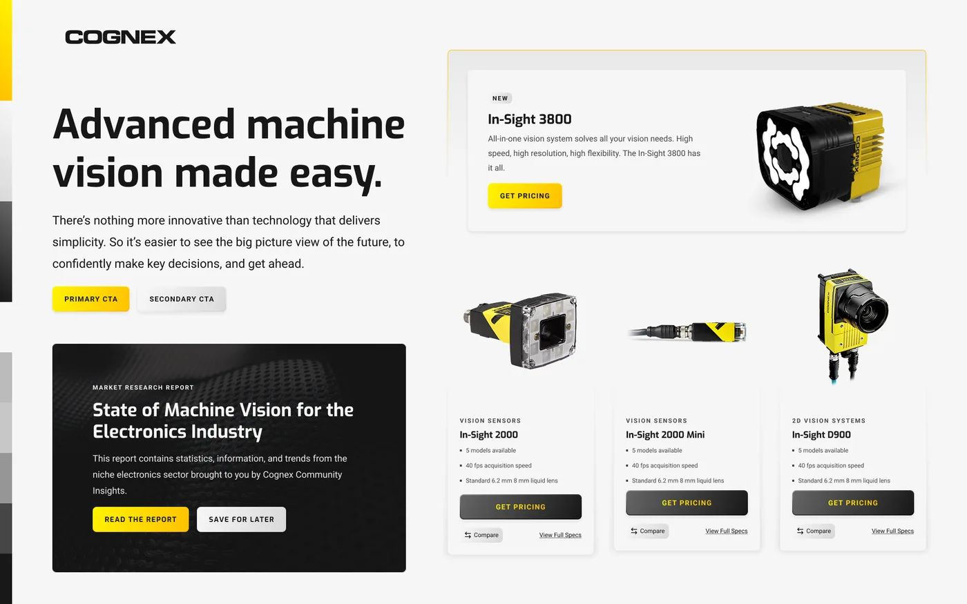
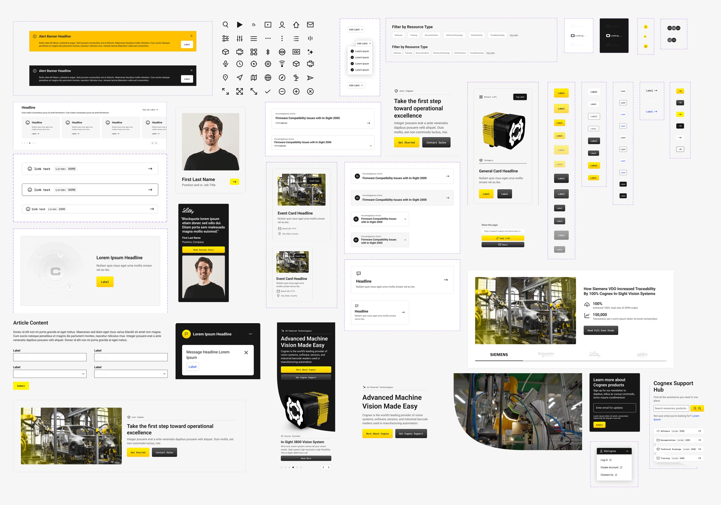
A visual language, built into a component library.
Cognex had to speak to factory operators on cognex.com and procurement engineers inside the MyCognex support portal: one visual language, two very different jobs. I helped define the visual system and turn it into a documented component library both properties share.
Everyone typed a model number. Most users skipped the navigation we had worked hard on.
It’s tempting to put everything into a detailed top navigation and assume discovery is solved. But testing in four languages showed otherwise. Users went straight to the search bar, typed “DM375,” and judged us by the results. Many users ignored the navigation we thought was most important.
We didn’t pick just one approach. We kept and improved the mega-nav for people who like to browse, and made search and the guided Product Finder the main tools for everyone else. We also prototyped an assistant called “ai12z” to help with vague queries like “I bought one, but can’t remember the name” so users don’t need a perfect search term.
Let people search the way they actually do: by the number on the box. Then show them what it is and give them the download.design intent, cognex digital platform
result
live
two sites shipped: cognex.com and support.cognex.com.
4
languages the prototypes and scripts were tested in: English, Japanese, Mandarin, Korean.
~12
moderated interviews per topic, across four core experiences.
1:1
the support hub shipped basically one-to-one with the designs.
Three calls that shaped the platform.
Designed for search-first, not nav-first.
Testing showed that users typed model numbers before using the navigation. We kept and improved the mega-nav, but made search and the Product Finder the main focus of both sites.
Put support on the product, not three clicks away.
The main tasks were finding documentation and drawings. So product and application pages now start with the support path, the datasheet, and a jump-to navigation, all designed to answer questions before they become support tickets.
Cut the wasted space, lead with what’s useful.
Users said the old profile was a waste of space. Now, the MyCognex hub starts with personalized, popular, and recently updated resources, adapting to the signed-in user.