Twenty years of growth. One system to hold it.
CDM Smith is a $1B+ global engineering firm with twenty years of accumulated content and six regions each doing their own thing. As a user experience designer at Verndale, I worked on the design phase of its multi-year Sitecore XM Cloud transformation: one platform for six regions, five Transformational Growth Areas and five distinct audiences.
live site → cdmsmith.com
goal
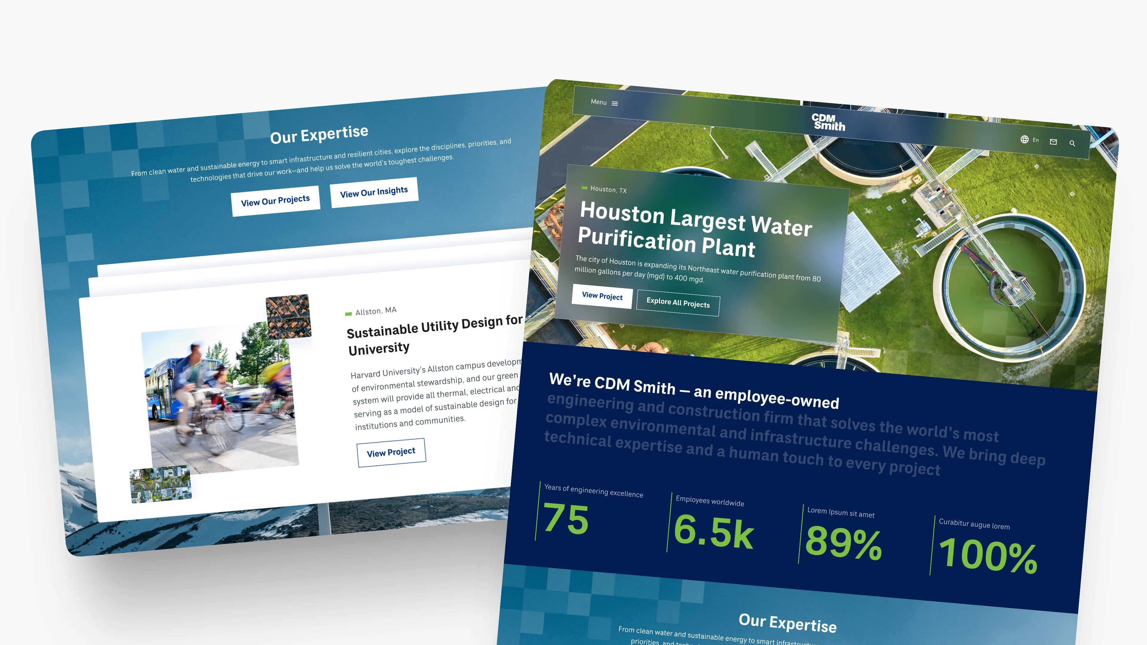
CDM Smith has a stated goal to reach $2B by 2027 and a website that couldn’t carry it. Twenty years of unstructured content, none of it navigable. It was a governance problem as much as a design problem: any author could publish unreviewed content, a real legal risk, with no versioning, no workflow and page loads of seven to eight seconds. The redesign had to bring order to all of it without making a billion-dollar firm feel like a brochure.
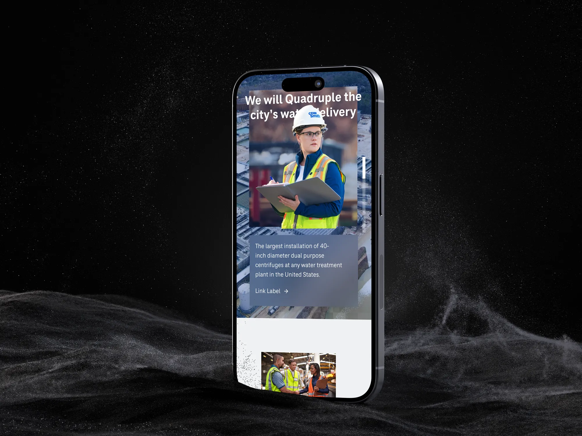
what we did
We started with discovery deep enough to see that this wasn’t a visual refresh. Recorded interviews with country managers in Australia, Latin America, the Middle East and Poland shaped one platform that honors six regional realities. Audience research became a five-persona model, a 61-page synthesis, and then four sprints of wireframes and visual designs from May to August 2025, built so regional marketing teams can run the site without engineering.
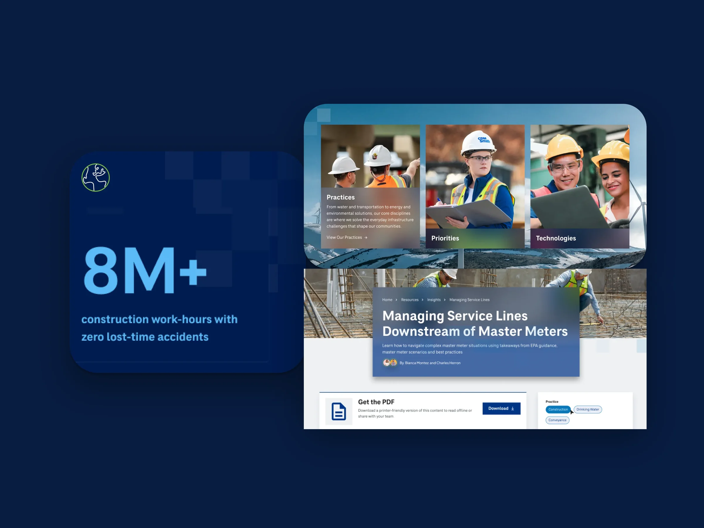
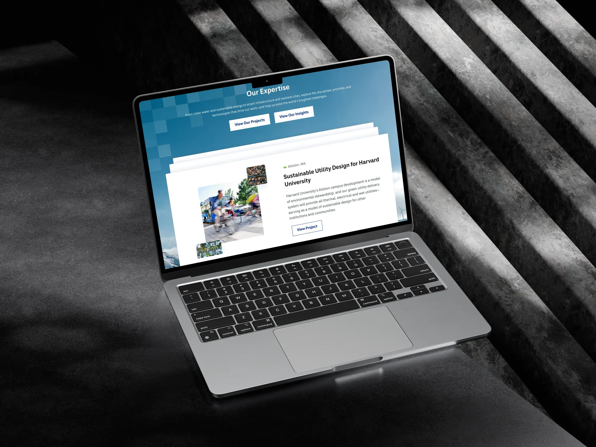
Safety statistic, practices and feature cards from the new component library.
six regions, one system
CDM Smith doesn’t operate as one firm with one website. It operates as six regional realities under one brand: Australia, Europe, Germany, Global, Middle East and Poland, each with different practices, leadership and growth strategies. The tradeoff was one global system against six regional autonomies. We resolved it with one template family, distinct regional codes, and every market landing page anchored by a person to contact.
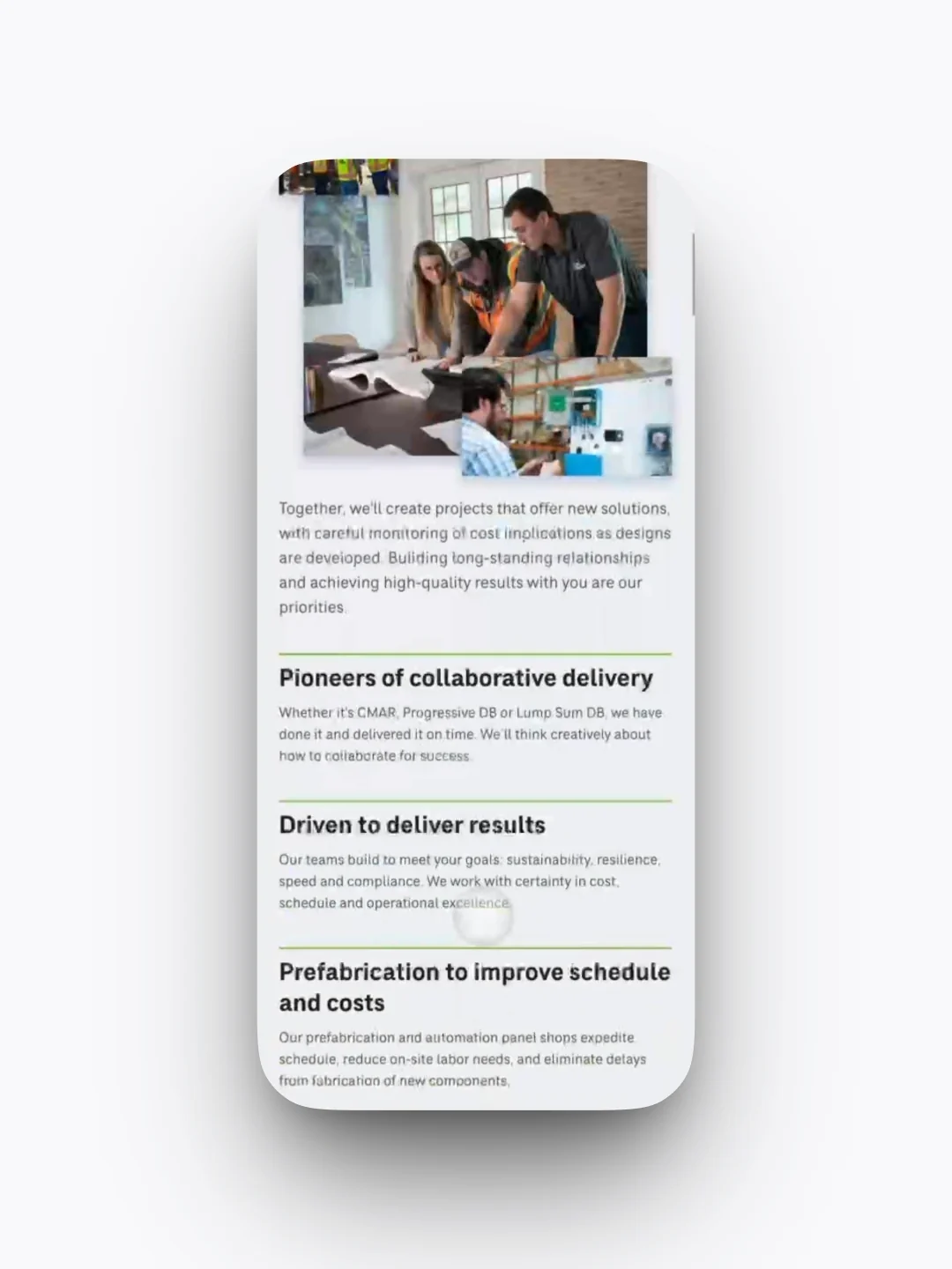
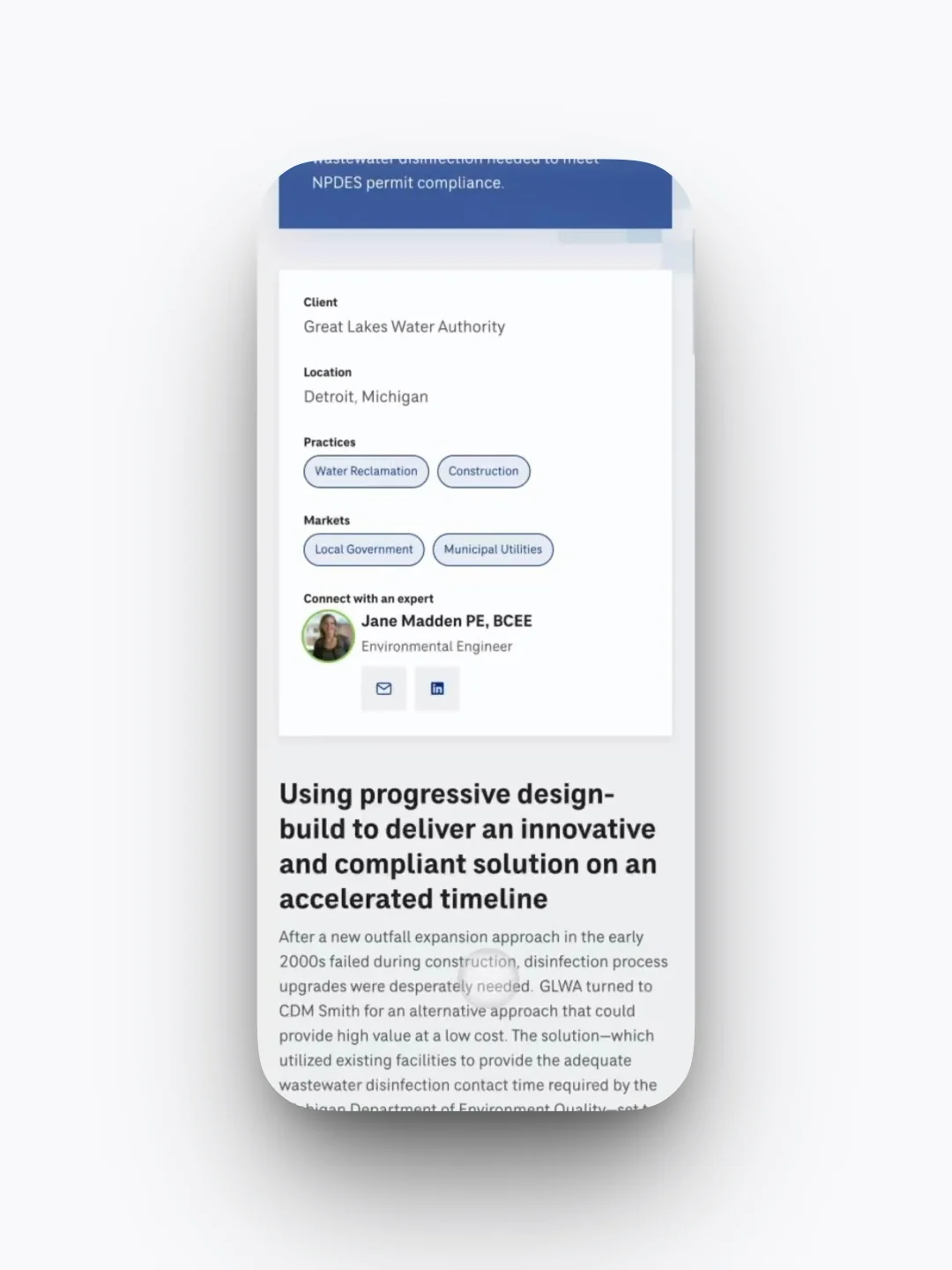
templates organized by job
Every template falls into one of four jobs: built to inform (project detail, news detail, expert bios), built for exploration (global and regional homepages), built for conversion (innovation, services and growth-area pages) and built for discovery (the resource library, news and insights). Each maps to a business outcome it has to support.
a critique that survived the design
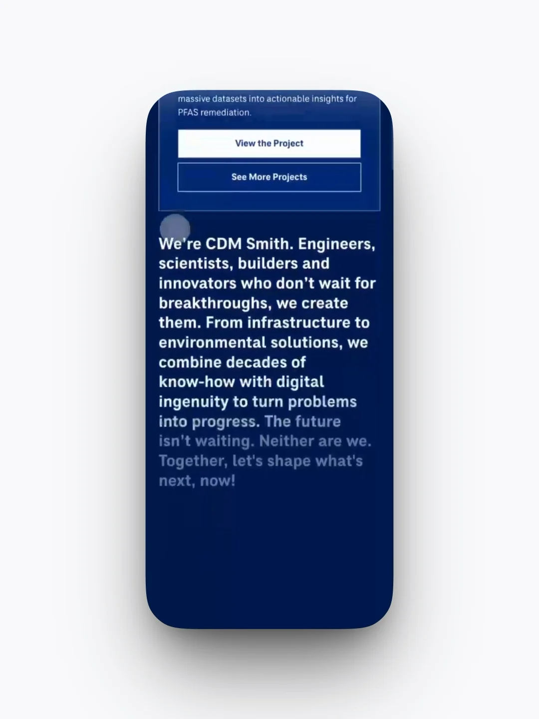
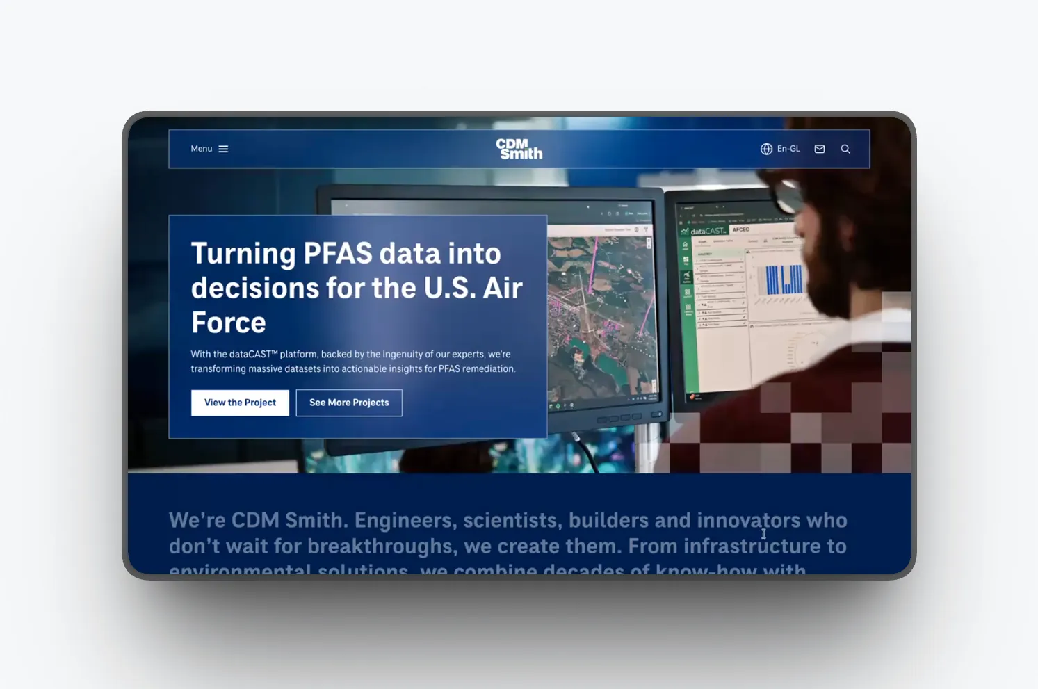
We presented mood boards, and the client came back with hard feedback: the designs didn’t feel like a digital leader or an innovative engineering firm. I treated it as data. Round two was a reframe, not an iteration: innovation moved into interactivity and animation, benchmarked against the firms they compare themselves to.
Round two: innovation shown through motion and interaction.
order for twenty years of content
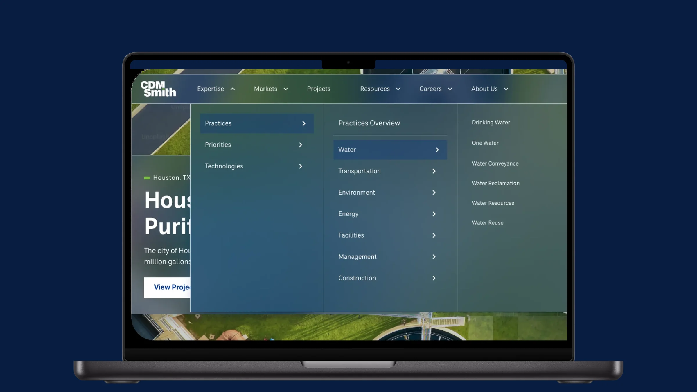
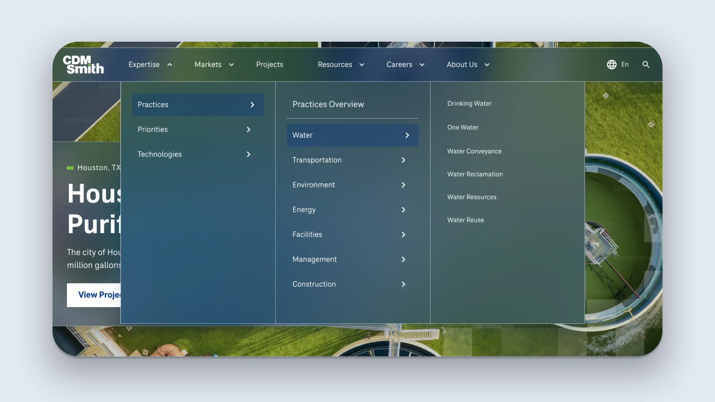
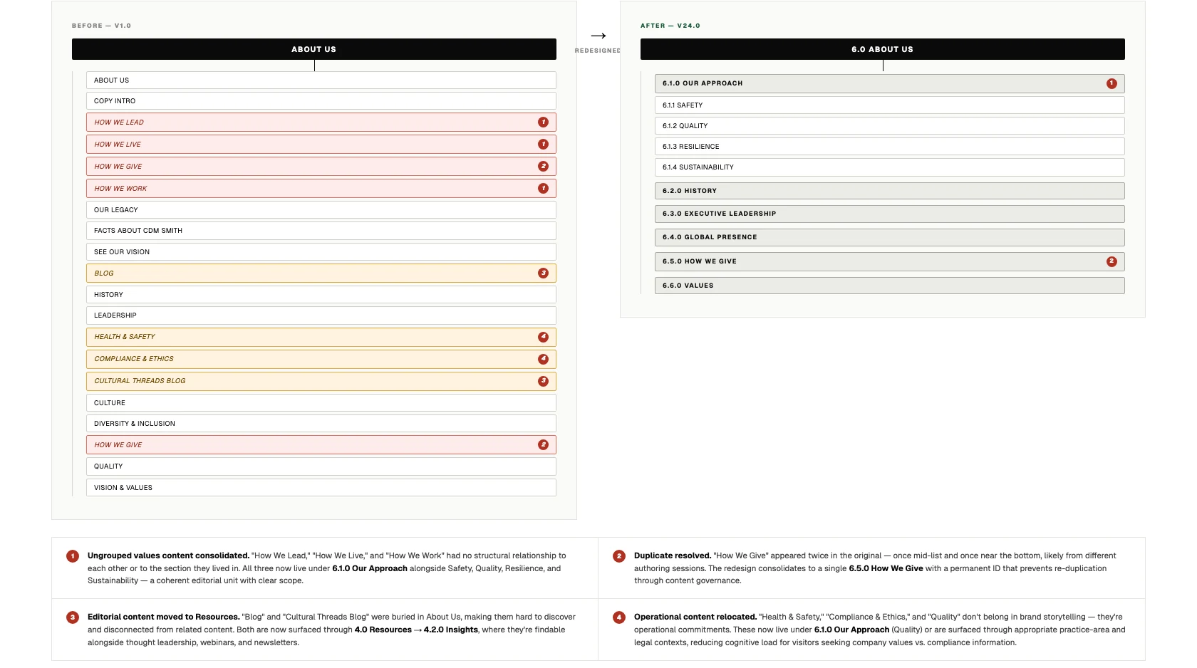
The About Us section was the most structurally problematic: twenty flat pages with no grouping and two duplicates. It became six parent sections with clear scope, and numbered IDs for developer handoff and editorial governance. Expertise had been fragmented across three top-level sections, so a user researching the water practice had to visit three different nav items. It became one hub.
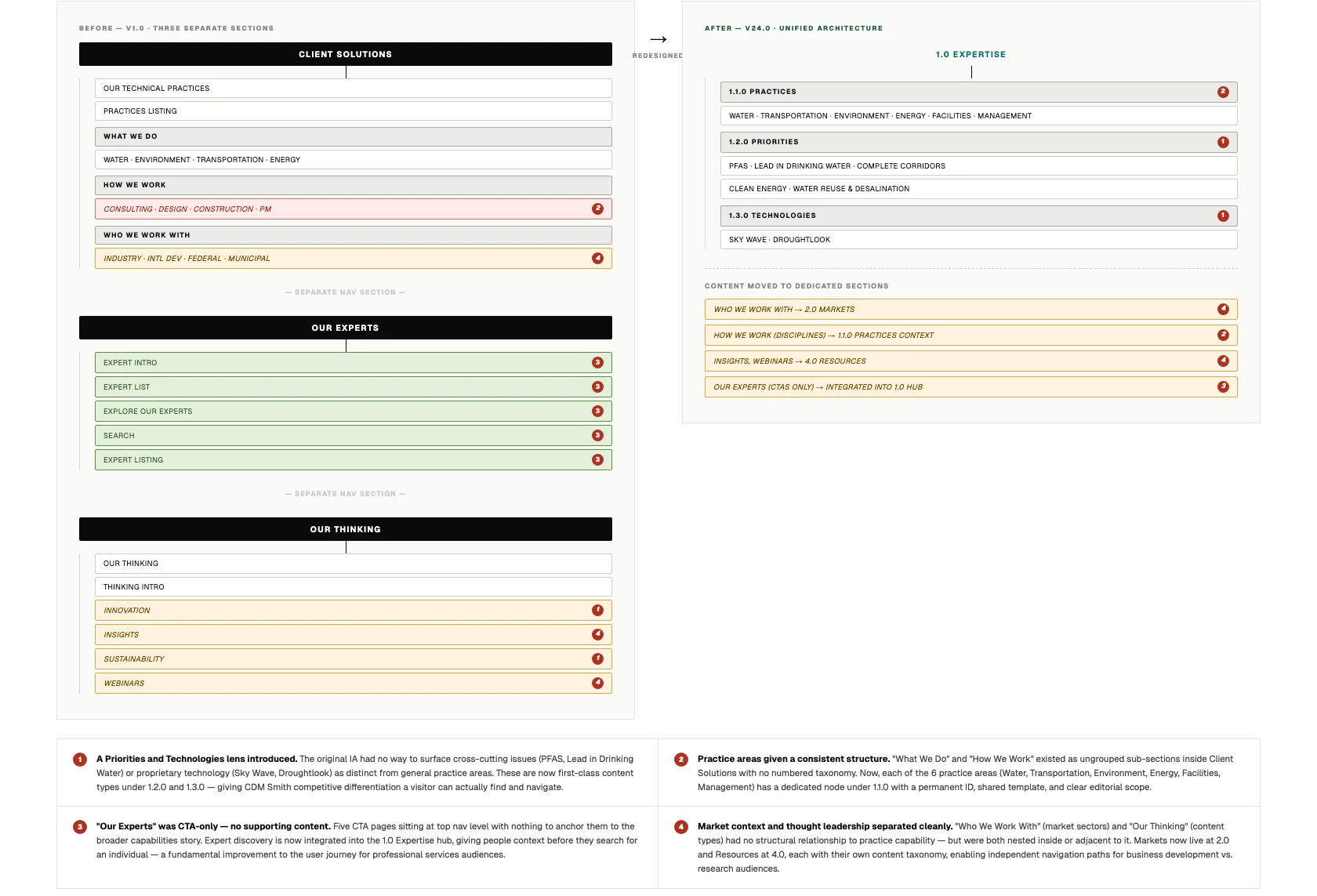
explore the architecture
The full site map is interactive. Move through the markets, practices and regions.
result
13
page templates organized into four jobs-to-be-done categories.
67
components fully documented for engineering handoff.
6
regions in scope: Australia, Europe, Germany, Global, Middle East, Poland.